Open Graph Image Templates
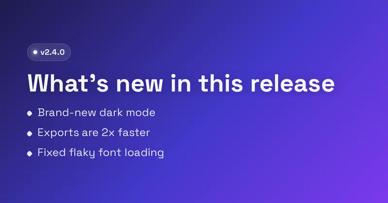
224+ designer-made starting points for the image that shows up when your link is shared. Pick one, customize it, and download — every template is fully editable, and your work never leaves your browser.
Achievement Unlocked
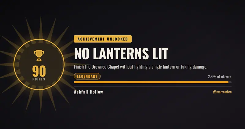
An achievement-unlocked card: a trophy medallion holding the point value beside the achievement name, its description, and a rarity tier whose label, colour and bar are computed from the percentage of players who have it.
Agent Profile
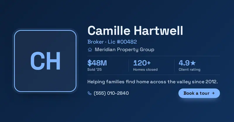
A real-estate agent profile card: a big rounded headshot beside the agent's name, role and license, brokerage, a row of up to three stats, a tagline, a contact line and a booking CTA.
Album Release
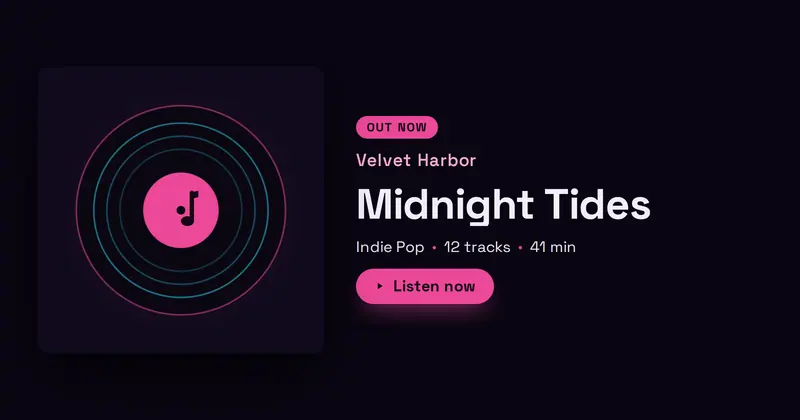
A music release card: a square album-art panel (with a drawn vinyl fallback) beside an out-now badge, an artist name, a big album/track title, a meta row (genre, tracks, runtime), and a listen CTA.
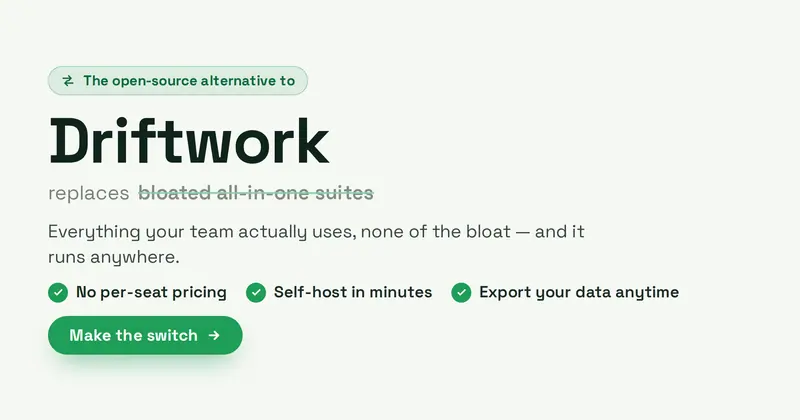
Alternative To
A high-intent switch / SEO comparison card: an eyebrow badge above a big product name, a quieter struck-through generic category it replaces, a subtitle, up to three check-bullet differentiators, and a Make-the-switch CTA pill with a swap motif.
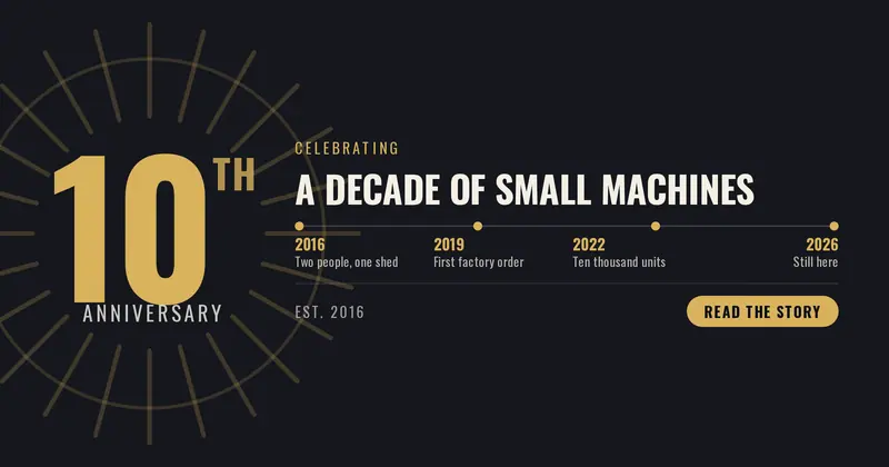
Anniversary
A milestone-anniversary card: the year count set huge with an ordinal suffix derived from the number, beside a headline, a founding line and a timeline of up to four “year | moment” milestones.
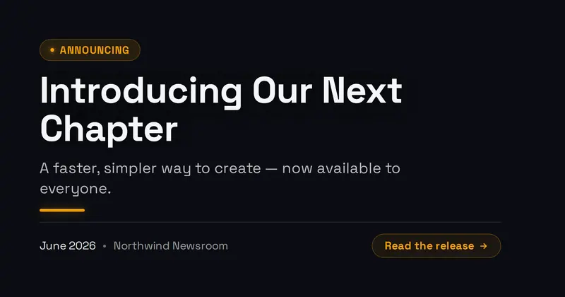
Announcement
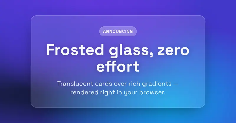
A press announcement card: an 'Announcing' badge, a bold statement headline, a supporting subline, an accent divider, and a date + source row with an optional read CTA.
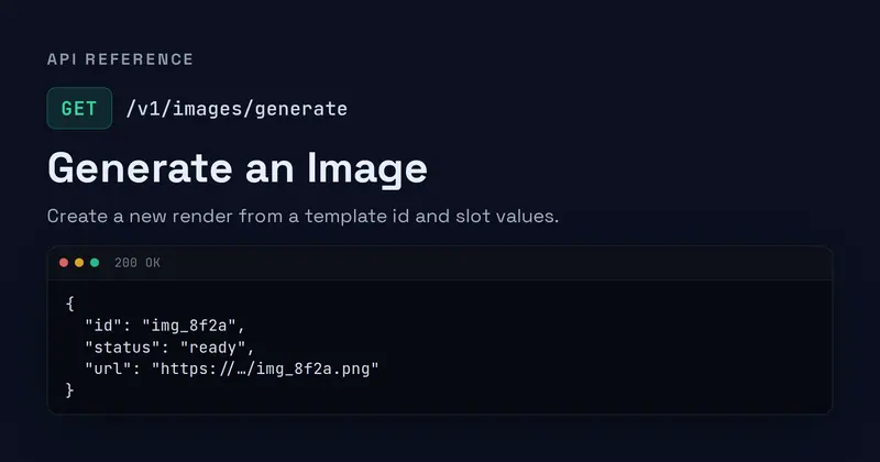
API Reference
An API reference card: an 'API Reference' eyebrow, a METHOD badge with a mono endpoint path, a title and description, and a rounded code panel showing a faux JSON response.
App Onboarding
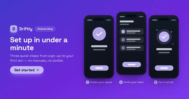
An app onboarding-walkthrough card: an Onboarding badge, product lockup (your uploaded icon/logo, or a letter-mark fallback), value headline, subtitle and get-started CTA over a row of three phone screens, each holding a screenshot with a captioned step.
App Paywall
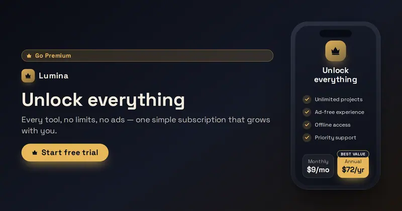
An in-app subscription / go-premium paywall card: a marketing headline and free-trial CTA on the left, and a phone mockup whose screen is the paywall — a premium mark, benefits checklist, and a monthly/annual billing toggle with the featured plan highlighted.
App Privacy
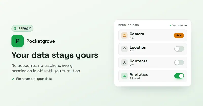
A privacy-first app-permissions card: a Privacy badge, an app lockup, a reassuring headline and subtitle, and a permissions panel of up to four rows whose toggle/state look is derived from each row's on/off/ask state word.
App Reviews
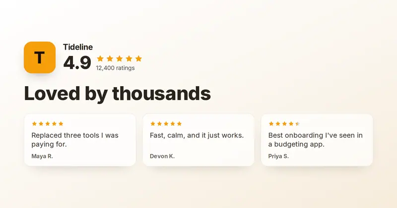
An app-store social-proof card: a product lockup with a big aggregate star rating and ratings count above a bold headline, with up to three short user-review cards below.
App Update
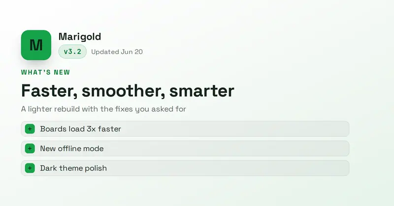
An app-store-style "What's New" card: a rounded app icon, product name, mono version chip and date, an update headline with subtitle, and a list of up to three change lines with accent markers.
App Widget
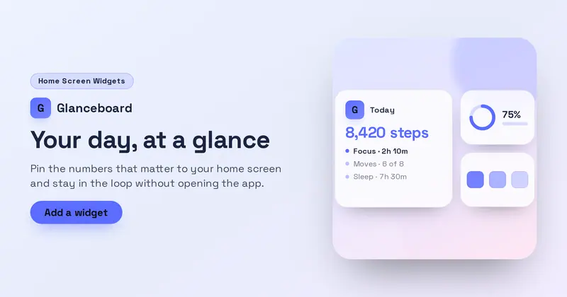
A home-screen widget showcase: a product lockup over a value headline, subtitle and CTA on the left, with a drawn widget cluster — one large 2x2 widget holding the app icon, a title, a big value and up to three rows, plus two small widgets — on a soft wallpaper panel on the right.
Architecture
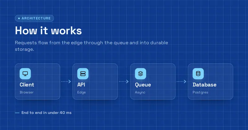
A system-architecture diagram card: an eyebrow, bold title and subtitle above a drawn left-to-right flow of up to four labelled node boxes (each with a glyph, label and sublabel) connected by arrows, plus a detail line.

Article Card
A clean blog/article share card with a category tag, a big headline, an optional excerpt, and an author row (avatar, name, read time).

Beauty Feature
An elegant two-column beauty product feature: a full-height product image (or drawn bottle placeholder) beside a brand label, serif product name, tagline, a detail line, and a price chip.
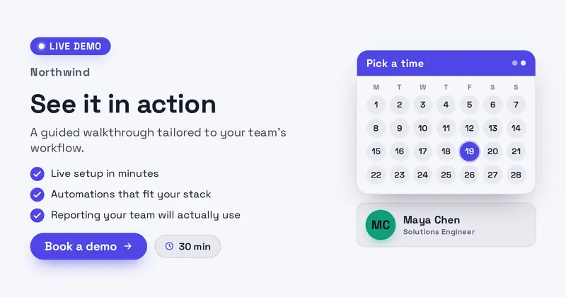
Book a Demo
A confident B2B SaaS demo invite: a Live-demo badge, product lockup, value headline, a 'what you'll see' checklist, and a Book-a-demo CTA with duration chip beside a drawn calendar card and a host row (name + role, with your uploaded avatar or an initials disc).
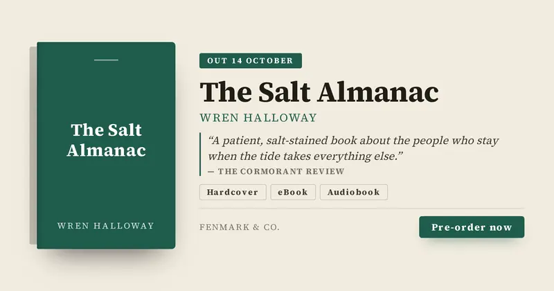
Book Launch
A book release card: the cover shown as a spined tile beside the title, author, a line of praise with its attribution, format chips parsed from one line, the publication date and a pre-order CTA.
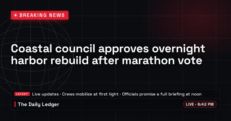
Breaking News
A TV-style breaking-news graphic: a bold accent kicker banner with a pulsing LIVE dot, a big multiline headline over an optional dark-scrimmed news photo, and a lower-third bar holding a ticker crawl, an outlet source, and a live time chip.
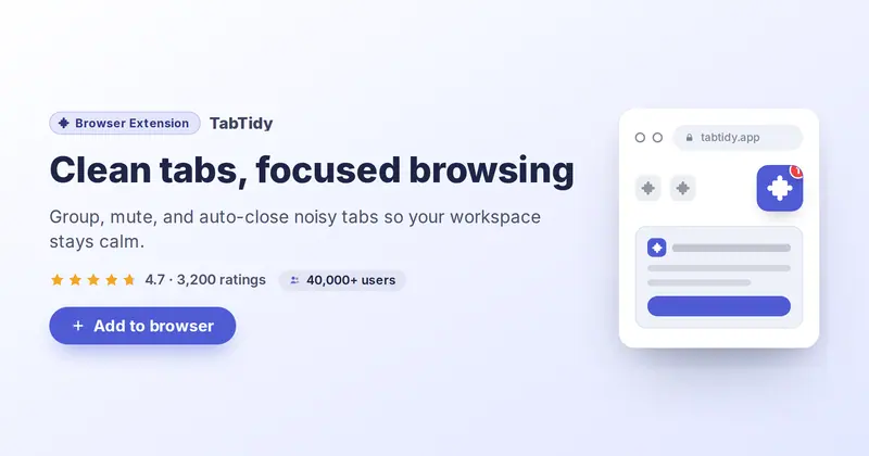
Browser Extension
A brand-neutral browser-extension promo: a drawn toolbar mockup with a pinned extension tile (your icon), beside a badge pill, headline, subtitle, star rating, users-count chip, and an add-to-browser CTA.
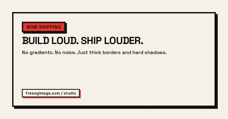
Neo-Brutalist
A flat, raw, high-contrast neo-brutalist card: an accent-blocked badge pill, a huge heavy headline, a plain subtitle block, and a footer tag chip, all framed by a thick border with a hard offset drop shadow.
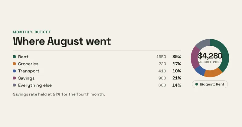
Budget Breakdown
A spending-breakdown card: a donut whose arcs are sized from the “category | amount” rows you enter, with a legend that computes each share as a percentage and calls out the largest.
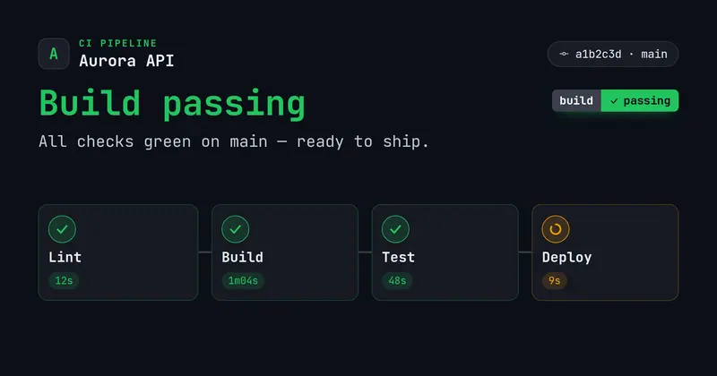
Build Status
A CI build-status card: a product lockup with a 'CI Pipeline' eyebrow and a commit · branch line (your uploaded icon/logo, or a letter-mark fallback), a bold title and a shields-style build badge whose color is derived from the overall state, and a row of pipeline stage nodes each with a state-colored icon and duration.
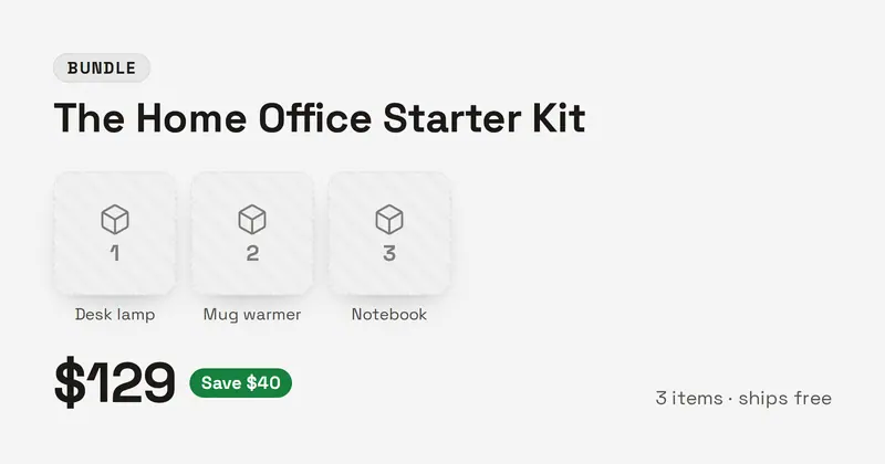
Bundle Kit
A product-bundle card: a bundle badge, kit name, a row of two to four product thumbnails with labelled fallbacks, a large total price with a savings callout, and a short note line.
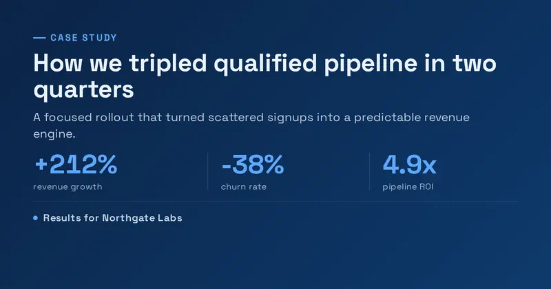
Case Study
A B2B case-study results card: an accent eyebrow, a bold outcome headline, a short summary, a row of up to three big result metrics (value over label), and a client lockup line.
Cause Awareness
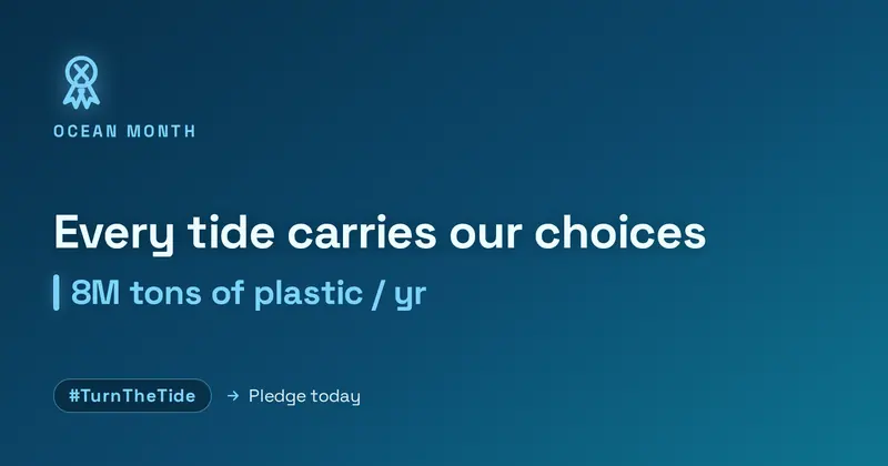
An emotive awareness-campaign card: a drawn ribbon icon and campaign eyebrow over a bold statement title, a highlighted impact stat, and a hashtag chip with a call to action.

Certificate
A formal certificate of completion: an ornamental double-line border with corner flourishes around a centered stack — issuer, an elegant serif title, the recipient name with an underline, a course/date detail line, and a signature row beside a drawn gold seal.
Chalkboard
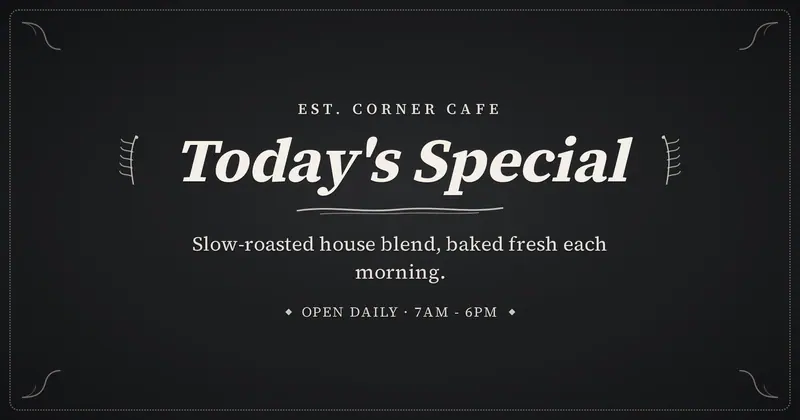
A hand-lettered chalkboard sign: an elegant serif title flanked by drawn chalk flourishes, with a small uppercase eyebrow, a subtitle, and a footer line in soft cream chalk.
Charity Run
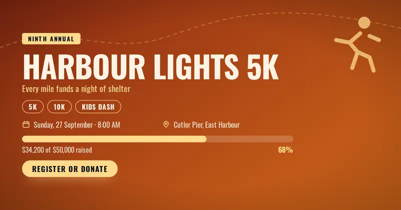
A charity race poster: the event name and cause over a drawn route, distance chips parsed from one line, and a fundraising bar filled from the percentage you enter.
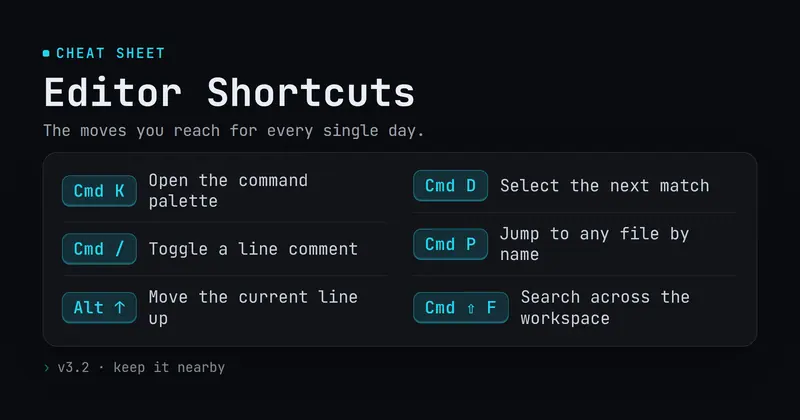
Cheat Sheet
A developer cheat-sheet / quick-reference card: an eyebrow, a bold title and subtitle, then a list of 'key | action' rows each shown as a drawn keycap chip plus its description.
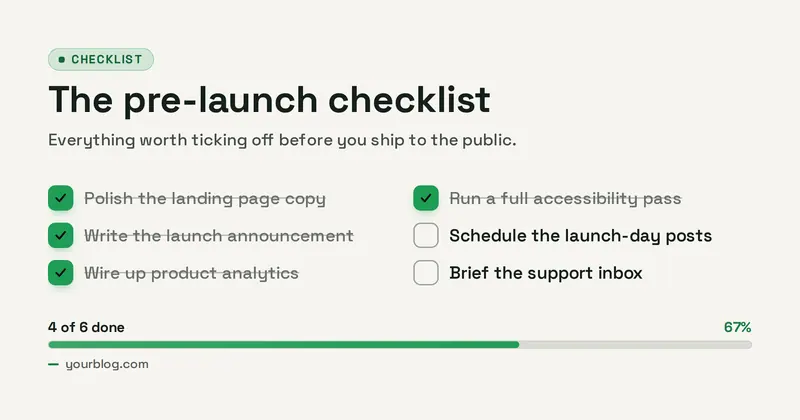

Chrome Type
Y2K liquid-metal headline rendered as polished, reflective chrome on a dark glow.
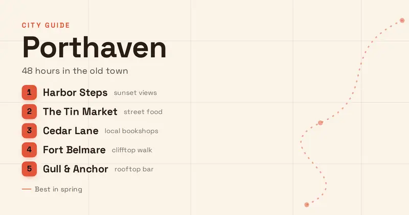
City Guide
A list-forward city travel guide: a small accent eyebrow over a big city name and subtitle, then a numbered list of top spots (place + tag per line) on a subtle drawn street-map backdrop.
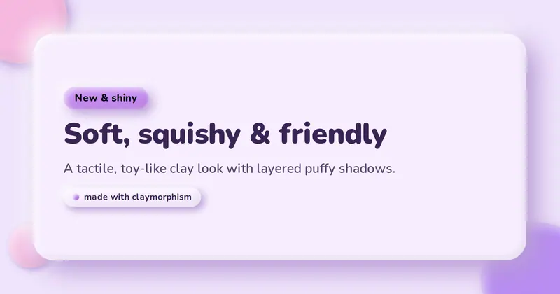
Claymorphism
A soft 3D "clay" card: a big puffy rounded panel with layered highlight + drop + inset shadows on a pastel background, holding a squishy badge pill, a friendly heavy headline, a subtitle, and a clay tag chip.
Code Snippet
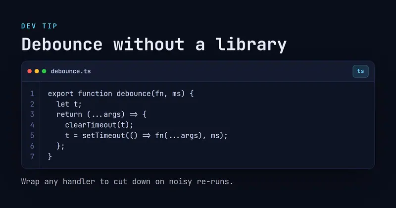
A dev-tip card with an eyebrow and bold title above a rounded code window — traffic-light title bar, filename tab, language chip, and a line-numbered monospace snippet — with a caption below.
Coffee Shop
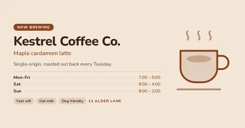
A neighbourhood café card: the shop name and today's signature drink beside a drawn cup, with opening hours parsed from “days | hours” rows and a row of perk chips.
Cohort Course
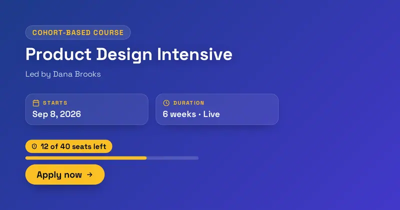
A cohort-based course card: a kicker pill, a big course title, an instructor line, two structured info cards (start date + duration), a 'seats left' urgency pill with a progress bar, and an apply CTA.
Comparison
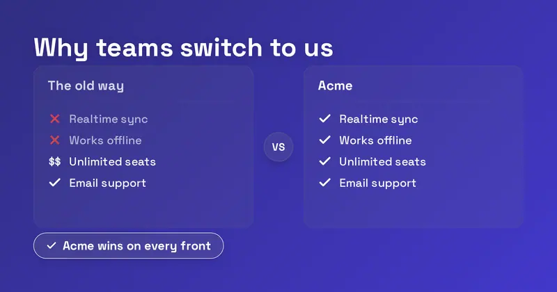
A side-by-side "us vs them" comparison card: a headline over two labeled columns whose per-side check / cross / verbatim-text marks are derived independently from each "Feature | them | us" row, plus a verdict pill.
Comparison Table
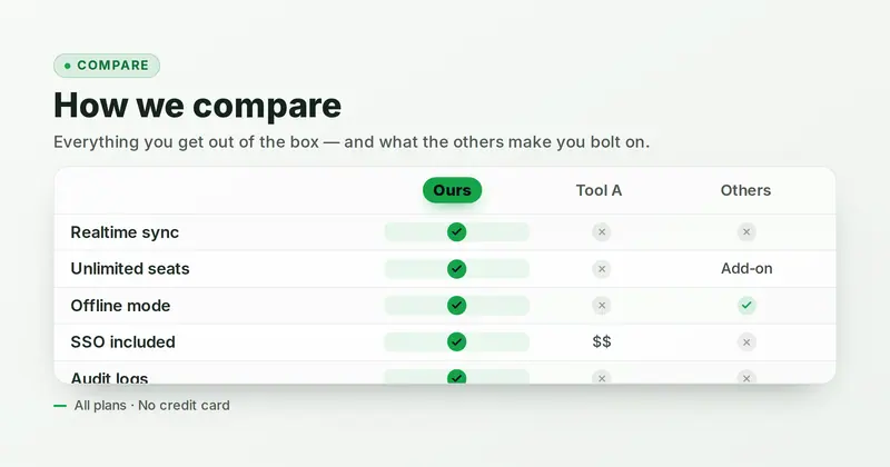
A feature-matrix comparison table whose hero is a grid of up to 4 product columns (the first, your product, highlighted in the accent) against up to 5 feature rows, where each cell renders a green check, a muted cross/dash, or verbatim text derived from its value.
Compliance
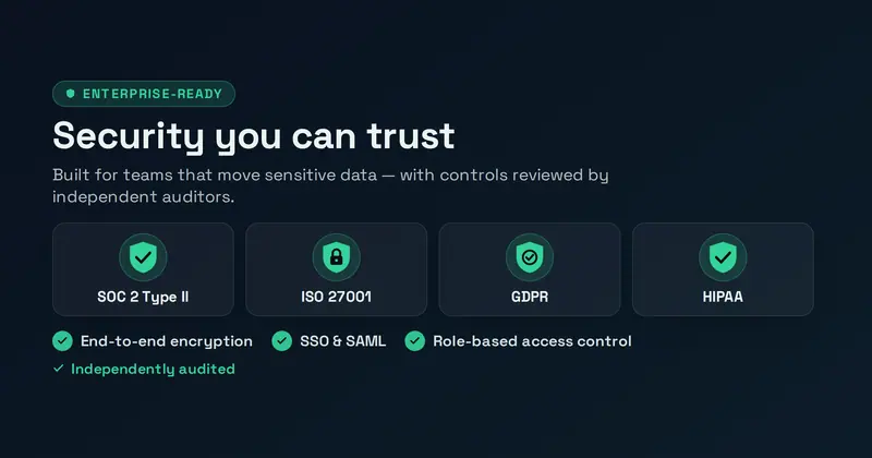
A B2B security & compliance trust card: an eyebrow, a confident headline and subtitle, a hero row of up to four drawn standard badge-shields, up to three assurance points, and an audit detail line.
Concert Poster
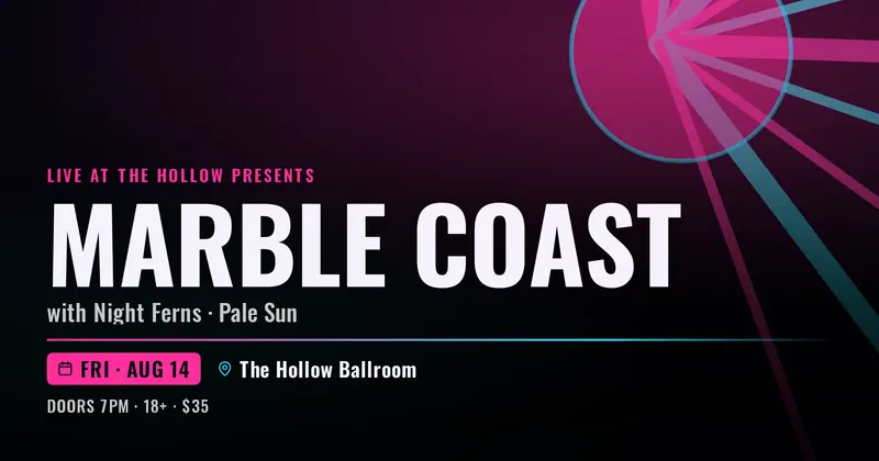
A single-show concert announcement poster: a full-bleed artist photo (with a bold abstract drawn fallback) under an accent-duotone scrim, a huge condensed headliner name, support acts, a divider, and a date + venue row with a small doors/age/price detail line.

Conference
A modern tech-conference hero with an uppercase accent eyebrow, a big bold event name, a date and location row with drawn calendar and pin icons, a tagline, and an optional pill CTA.
Constructivist
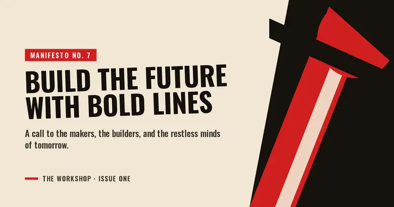
A Russian-constructivist poster card: bold red/black diagonal bands and hard geometric shapes around a heavy condensed uppercase headline set in a strong asymmetric block.

Creator Milestone
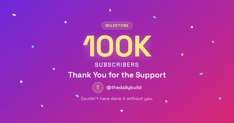
A creator milestone card: a milestone badge, a huge number with a unit label, a thank-you headline, a creator row (avatar + handle), and drawn confetti accents.
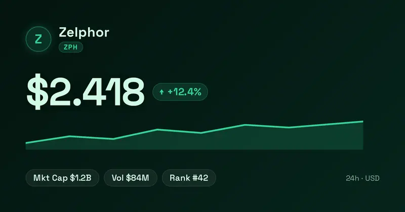
Token Price
A token price card: a token lockup (your uploaded logo or a letter-mark coin, plus name + ticker chip), a big price, a 24h change pill (green up / red down) with arrow, a sparkline that trends up or down with the change, and a stat row of pills (market cap, volume, rank).
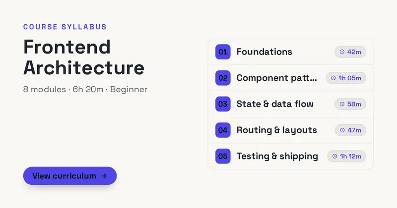
Curriculum
A course curriculum / syllabus card: a left header (kicker, course title, a meta line, and a CTA) beside a right column of numbered modules each with a duration chip.
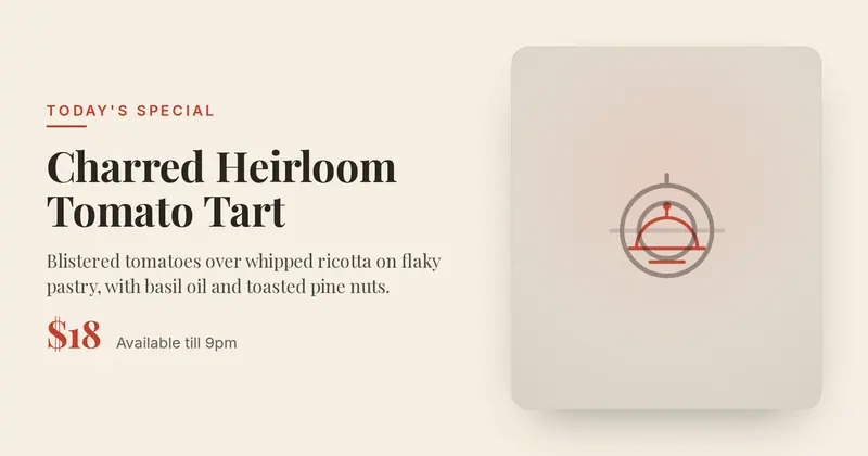
Daily Special
A restaurant daily-special card: an uppercase eyebrow, an elegant serif dish name, a short appetizing description, a prominent accent price, and a detail line, beside a full-height photo of the dish (or a drawn plate placeholder).
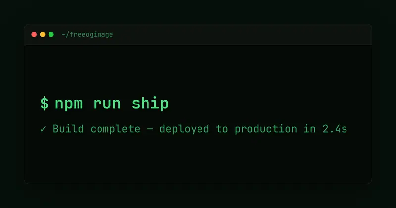
Dark Terminal
Terminal/IDE aesthetic with monospace type, window chrome, and a neon prompt.
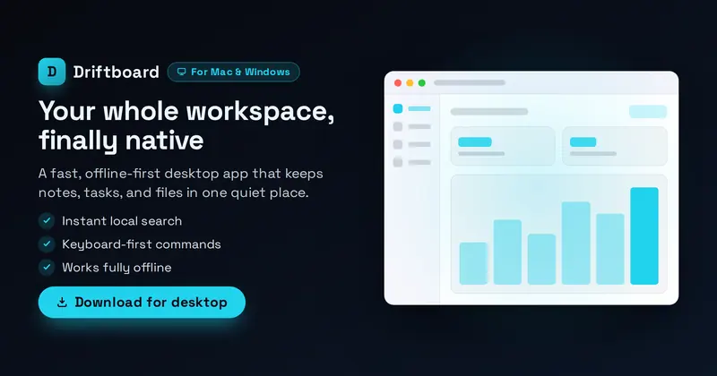
Desktop App
A native desktop-app hero: a product lockup (your uploaded app icon, or a letter-mark fallback), OS badge, value headline, subtitle, up to three feature lines and a download CTA on the left, beside a drawn desktop-window mockup with a title bar, sidebar rail and your screenshot inside.
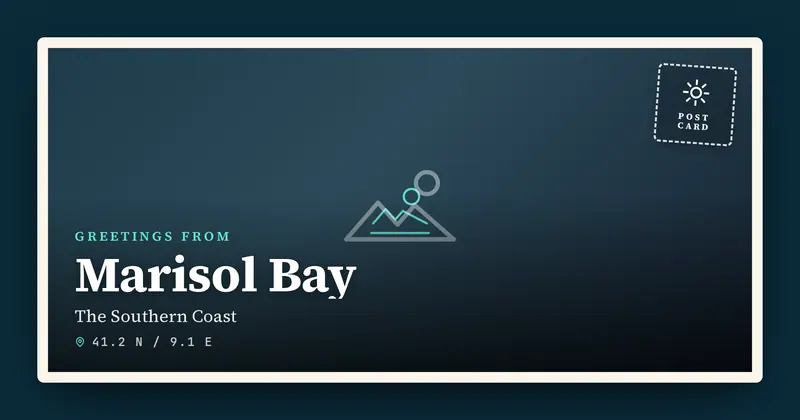
Destination Postcard
A vintage travel-postcard card: a full-bleed destination photo inside a thick postcard border, with a "Greetings from" eyebrow, a big serif place name, a region subline, a coordinates line, and a stamp graphic in the corner.
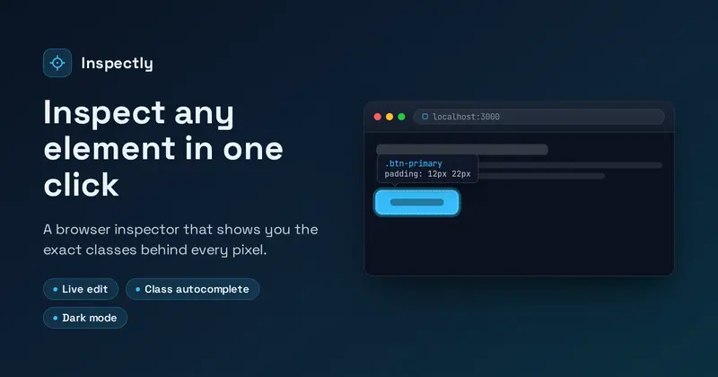
Device Frame
Embed a screenshot inside a browser or phone frame with depth, a title, and a caption.
Donation Match
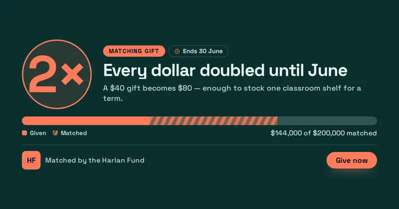
A matching-gift appeal: an oversized multiplier beside the campaign headline, a two-tone meter split into gifts and matched funds from the percentage entered, a deadline chip and the sponsor's lockup.

Employee Spotlight
A team-member spotlight: a large headshot beside the person's name, role and tenure, a pull-quote set against an oversized quote mark, and up to three “label | value” facts.
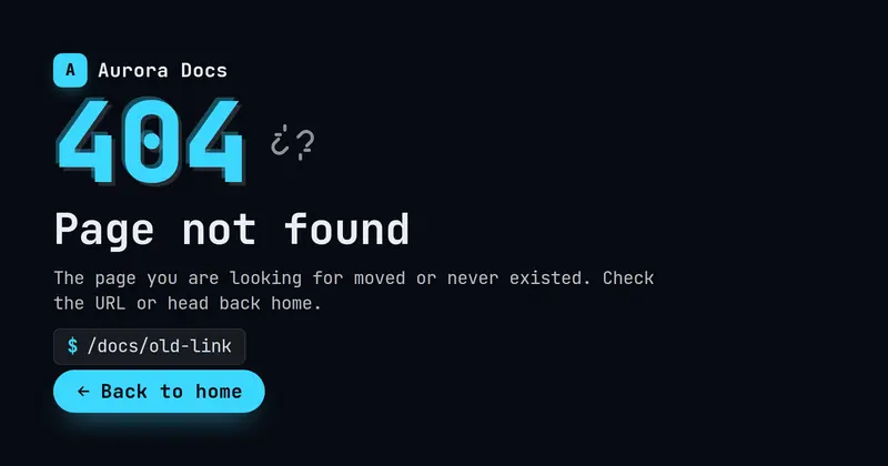
Error Page
A generic error-page share card: a giant accent status code with a light glitch offset, a bold title, a friendly subtitle, an optional mono path chip for the bad route, a 'Back to home' CTA pill, and a small brand lockup (your uploaded icon/logo, or a letter-mark fallback).
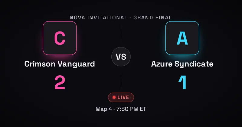
Esports Match-Up
An esports versus card: a tournament eyebrow, two teams with optional logos, a central VS with the score, and a detail line for the round, format, time, or LIVE status.
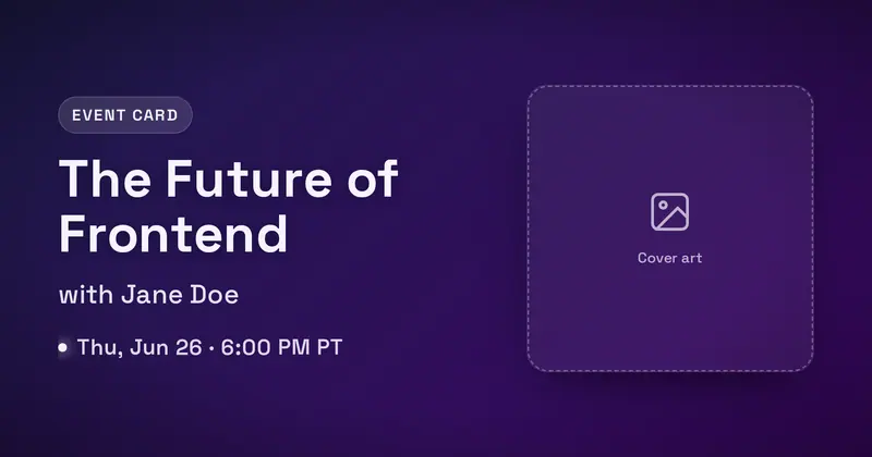
Event Card
Podcast, talk, or webinar card with a title, host, date-time, and a rounded cover image.
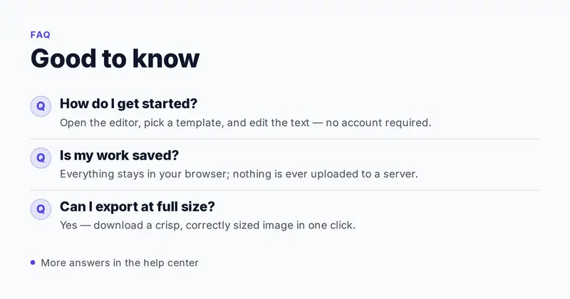
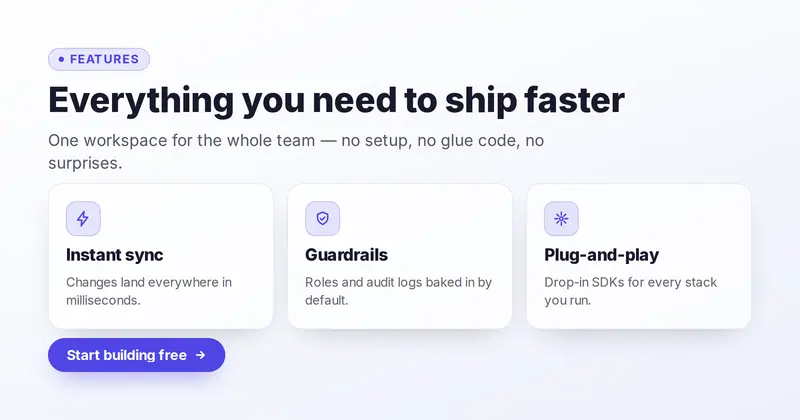
Feature Grid
A 3-up product-marketing card: an eyebrow, bold title and subtitle above a row of up to three feature cards (drawn icon, title, description) parsed from one slot, with an optional CTA pill.
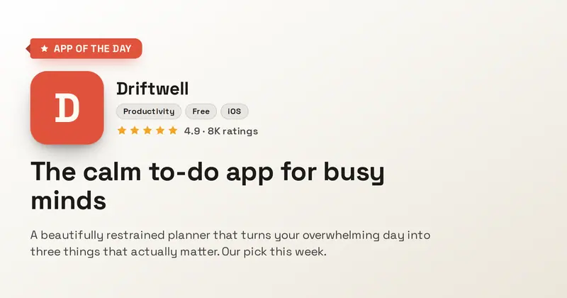
Featured App
An editor's-pick app feature card: an accent feature ribbon, a large rounded app icon beside the product name and genre chips, a curator's blurb, and an optional star rating.
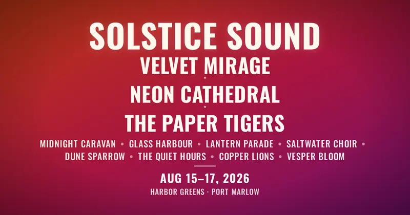
Festival Lineup
A bold condensed music-festival poster: the festival name huge at the top, a tiered bill of large headliners over a denser block of dot-separated support acts, with a dates line and venue at the bottom.
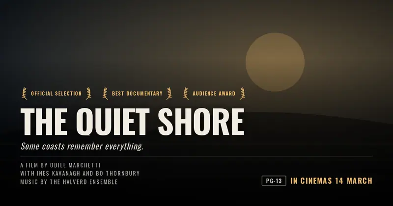
Film Poster
An independent film or documentary poster: key art behind a bottom-anchored title, a tagline, one drawn laurel wreath per festival you list, a condensed billing block and the release line.
Fintech App
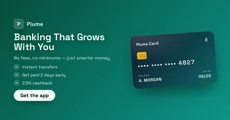
A fintech app hero: a product lockup (your uploaded icon/logo, or a letter-mark fallback), a value headline + subtitle, a short feature list, and a Get-the-app CTA, beside a drawn gradient payment card (label, masked number, holder, chip).
Fitness App
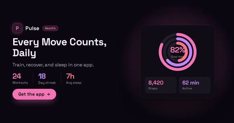
A fitness/health app hero: a product lockup with an app icon (your uploaded icon/logo, or a letter-mark fallback) and a badge, a value headline, a subtitle, a headline stat row, and a get-the-app CTA, beside a drawn activity-rings widget with two mini stats.
Flight Deal
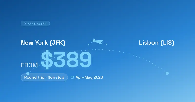
A fare-alert card: a bold FROM → TO route lockup over a dotted flight-path arc, a big accent price, a trip label chip, and a dates line, set on a destination photo hero or a clean gradient sky.
Food Truck
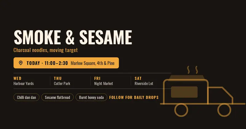
A “find us today” food-truck card: today's stop pinned beside the truck name, a week's worth of “day | spot” rows parsed from one field, menu highlights and a follow CTA, with a drawn truck.
Available for Work
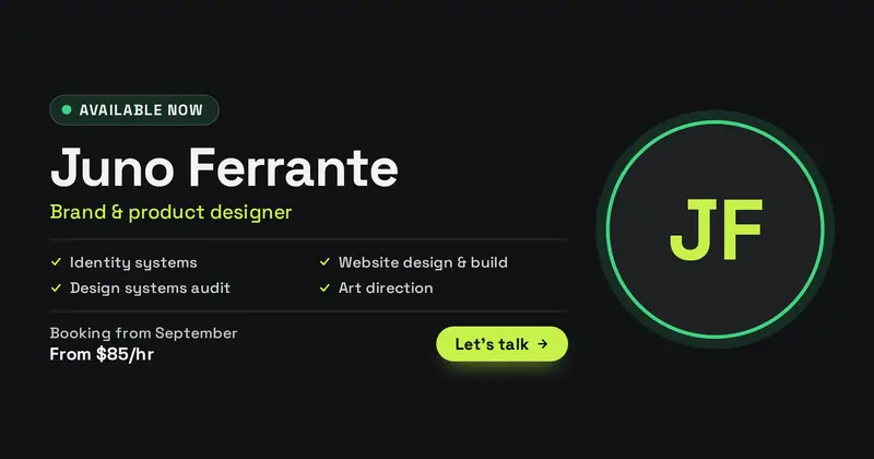
A freelancer's availability card: a status pill whose dot colour is read from the status word, the name and discipline, a services list, booking window and starting rate beside a headshot.
Funding Round
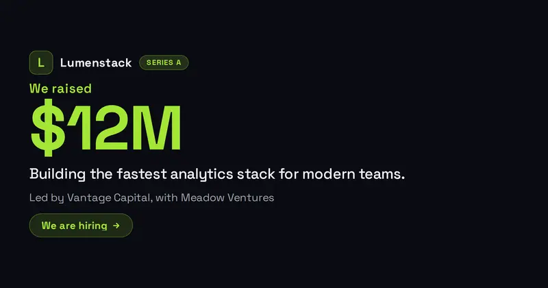
A funding-round announcement card: a round badge, a "we raised" eyebrow, a huge amount, a company lockup, an investors line, a use-of-funds tagline, and an optional CTA.
Fundraiser
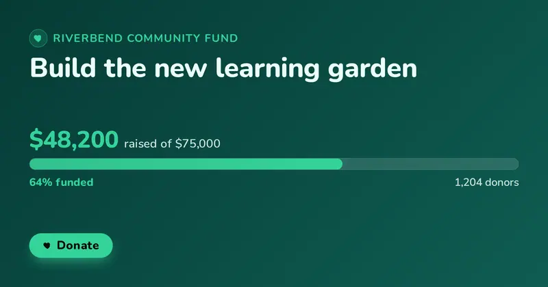
A donation goal card with the campaign title, a progress bar filled to the percent raised, the amount raised against the goal, a supporters line, and an optional Donate pill.
Gala Invite
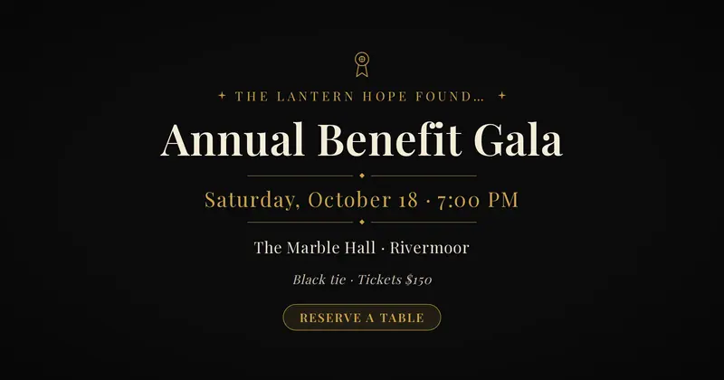
An elegant, centered charity-gala invitation: a host line over a high-contrast serif event title, the date and time set between thin gold rule dividers, a venue and dress-code/ticket detail, and an optional reservation pill.
Game Release
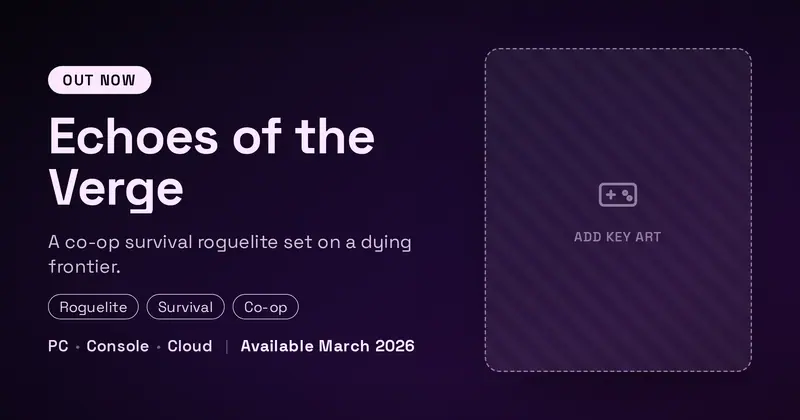
A game announcement card: a status badge, a big game title, a one-line tagline, genre pills, generic platform chips, a release date, and optional key art.
Game Server
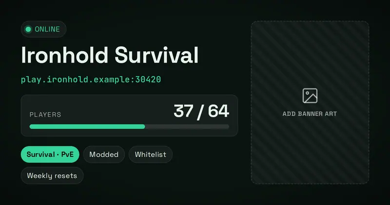
A multiplayer game-server status card with a live online/offline dot, the server name, a mono connect address, a big player count with a capacity bar, the game mode and tag pills, over an optional banner image.
Going Live
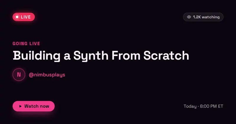
A going-live stream card: a pulsing LIVE badge, a viewer-count chip, a going-live eyebrow, a big stream title, a streamer row (avatar + handle), a schedule line, and a watch CTA, in a neon stream-overlay style.
Graduation
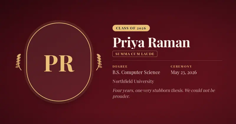
A graduation announcement: a portrait beside the graduate's name, degree, school, an honors chip and ceremony date, framed by a drawn cap-and-laurel ornament.
Happy Hour
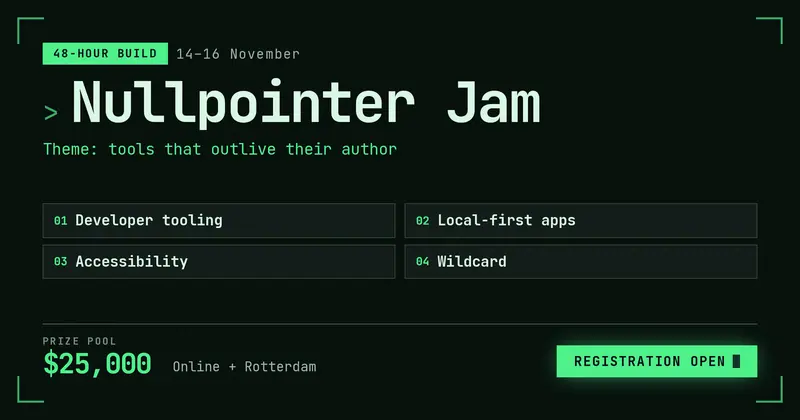
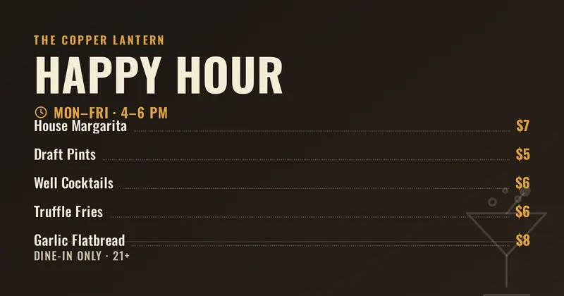
A bar or restaurant happy-hour specials board: the venue name, a big condensed headline, a times line with a drawn clock, a dotted-leader specials list, and a small note.
Open Roles
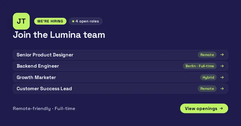
A we're-hiring card listing multiple open positions: a company logo, an eyebrow pill and a content-derived "N open roles" count chip, a big headline, and up to five "Role | location/type" rows above a note and a call-to-action pill.

Holiday Greeting
A brand-neutral festive greeting card: an elegant centered serif greeting with a short warm message and a sign-off, framed by scattered snowflake and sparkle ornaments kept clear of the text.
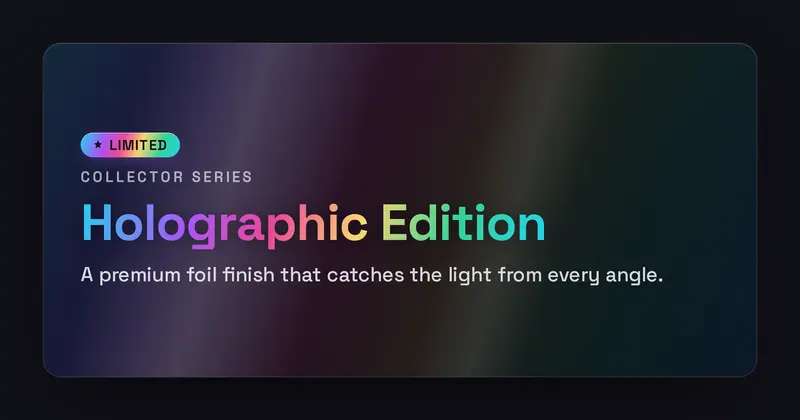
Holographic
An iridescent foil-sticker card: a holographic rainbow sheen and a diagonal specular highlight sweep behind a foil badge, eyebrow, gradient-clipped title, and a high-contrast subtitle.
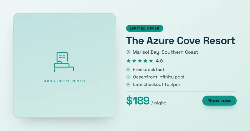
Hotel Deal
A hotel/resort stay-deal card: a full-height room photo (or drawn placeholder) beside an offer badge, hotel name, location row, star rating, a short perks list, and a price block with a Book-now CTA.
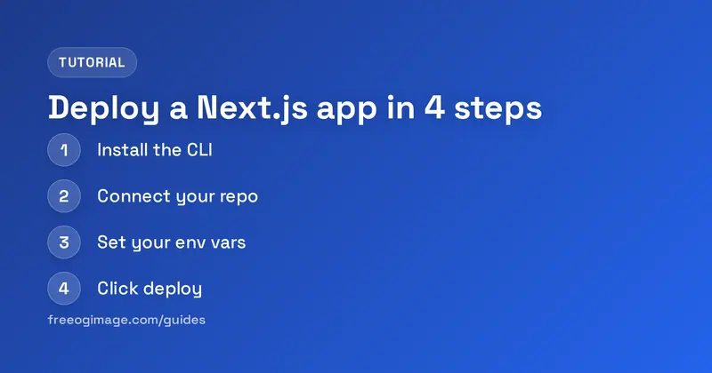
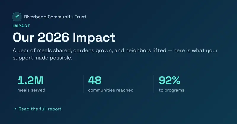
Impact Report
A nonprofit annual impact card: an org lockup and an IMPACT eyebrow over a bold title and summary, with a row of up to three big result metrics (value + label, parsed from the metrics slot) and a closing detail line.
Integration
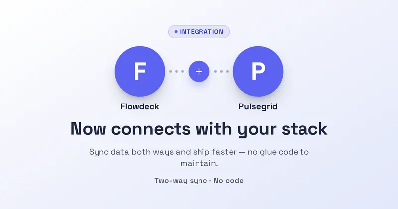
A focused two-party integration card: two round logo tiles joined by a drawn connector node, under an Integration badge, a headline, a subtitle, the two product names, and a detail line.
Integrations Grid
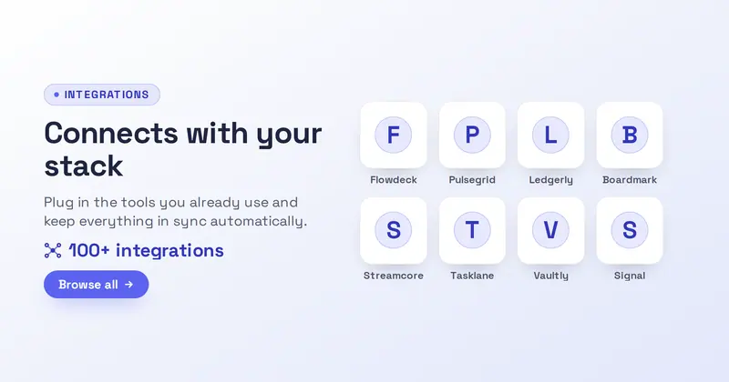
An integrations-marketplace card: a badge, headline, subtitle, accent count line, and CTA beside a 4-up grid of logo tiles parsed from an integration-name list, each tile an uploaded logo or a letter-mark fallback around a drawn hub.
Trip Itinerary
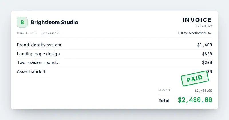
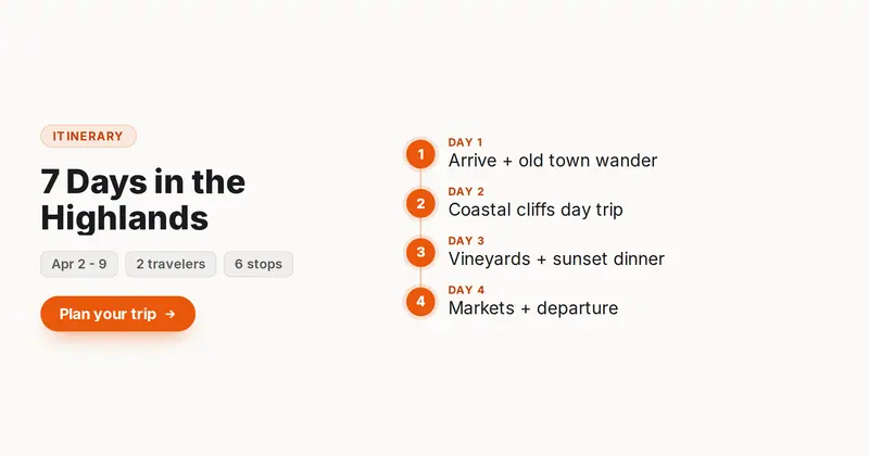
A trip itinerary card: a left summary (kicker, trip title, a meta row of pills) beside a right vertical timeline of auto-numbered days, each a connected dot with a short activity line.

Job Posting
A job posting card: a company lockup (your uploaded icon/logo, or a letter-mark fallback), a big role title, a meta row of pills (location, type, salary), a short list of highlights, and an Apply CTA.
Launch Day
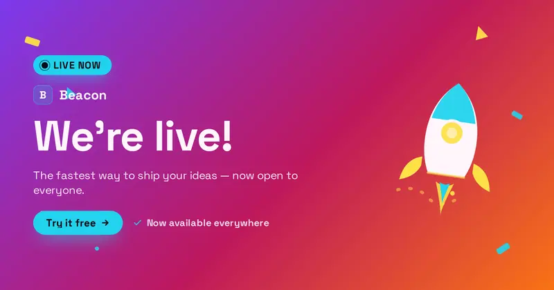
A brand-neutral launch-day card: a LIVE NOW badge with a drawn live-dot, a product lockup (your uploaded icon/logo, or a letter-mark fallback), a big celebratory headline, a subtitle, a detail line, and a Try-it CTA pill, with a decorative rocket and confetti.
Lead Magnet
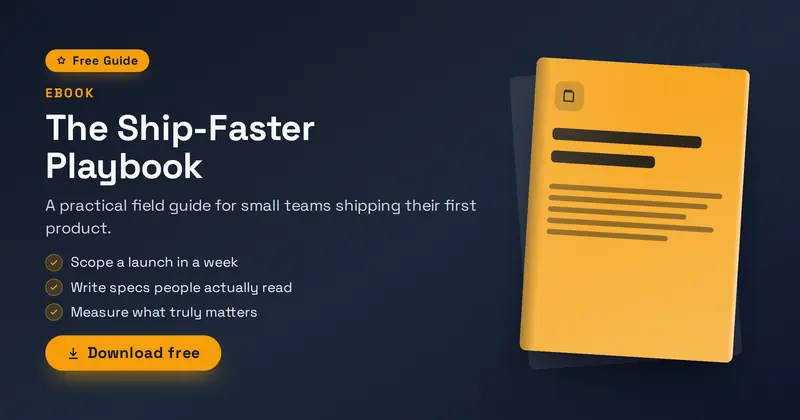
A content-marketing gated-download cover: a Free Guide badge, a kicker and big title, a subtitle, up to three what-you'll-learn bullets, and a download CTA beside a tilted ebook/PDF book mockup.
Leaderboard
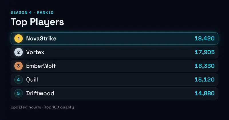
A gaming leaderboard card: a season eyebrow and title over a ranked list of players with rank numbers (gold/silver/bronze for the top three), names, and scores, with the leader highlighted.
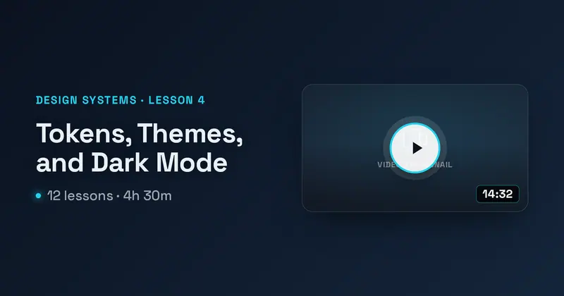
Video Lesson
A single video-lesson card: a series eyebrow, a big lesson title, a course meta line, beside a video thumbnail panel with a centered play button and a duration badge.
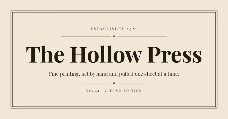
Letterpress
A vintage press card: ruled border, ornamental dividers, a centred high-contrast serif display line, and small-caps supporting type set on warm stock.
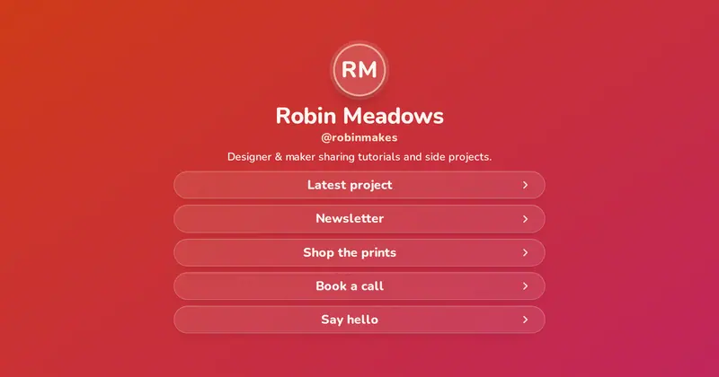
Link in Bio
A centered link-hub share card: a round avatar (or initials disc), a display name, an accent handle, a short bio, and a vertical stack of up to five full-width link pills.
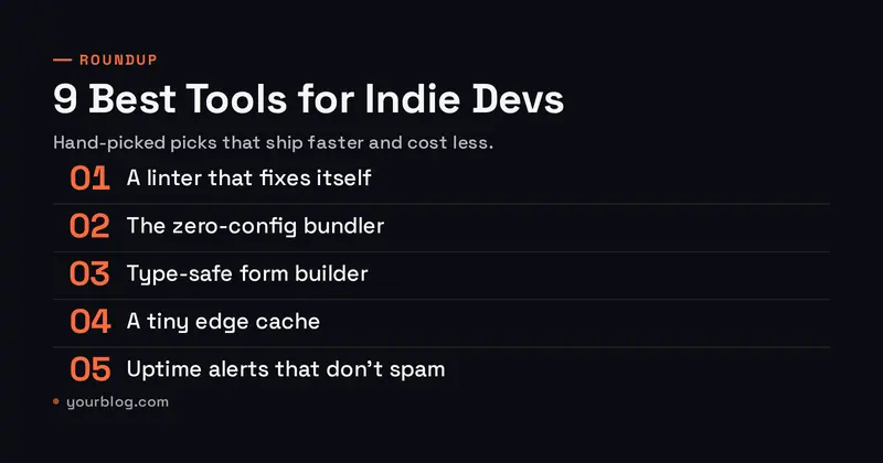
Magazine Cover
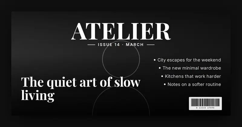
A glossy magazine cover: a full-bleed cover photo under a soft scrim, a huge serif masthead across the top with an issue/date line, a large lower headline, a stack of cover-line teasers down one side, and a drawn barcode in the corner.
Market Update
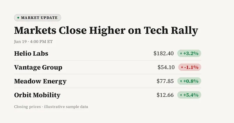
A market update card: an eyebrow, a headline, a date, then a clean movers list (invented company name + price + green/red % change), and a muted footnote.
Marketplace Listing
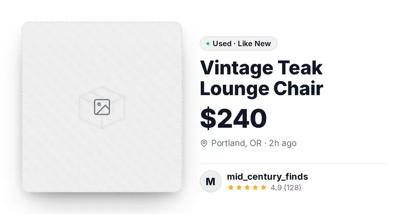
A peer-to-peer marketplace listing card: an item photo, the title and a big price, a condition pill, a location and posted-time line, and a seller row with a round avatar, name, and star rating.
Meditation Session
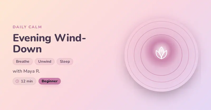
A calm, spa-like meditation session card: a soft eyebrow, a gentle session title, a focus phrase split into soft chips, a guide line, and duration + level chips beside a glowing breathing-circle motif (or an optional session cover).
Memphis
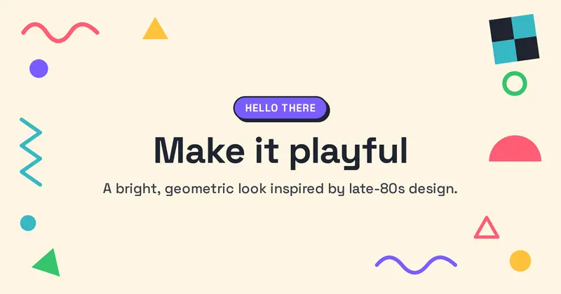
A late-80s Memphis Group card: playful geometric shapes (squiggles, triangles, dots, zigzags, half-circles and a checker block) scattered around the edges of a bright solid background, with a colorful badge pill, a heavy headline and a subtitle in a clean central column.
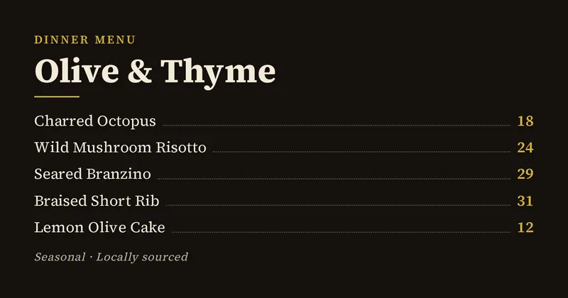
Restaurant Menu
A restaurant menu card: a section eyebrow, the restaurant name, a list of dishes each with a name and price (dotted leader between), and a muted note.
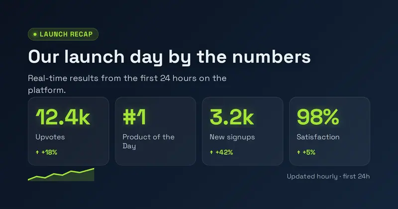
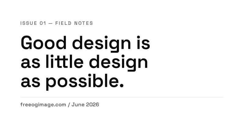
Minimal Type
Whitespace-forward Swiss editorial layout with a tiny eyebrow, a very large headline, and a quiet footer line.
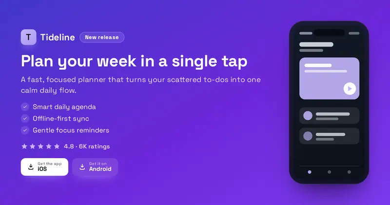
Mobile App
A brand-neutral mobile-app store hero: a product lockup and badge over a value headline, subtitle, up to three feature lines, a star rating and two generic download pills, with a phone mockup on the right. The lockup shows your uploaded icon/logo, or a letter-mark fallback.
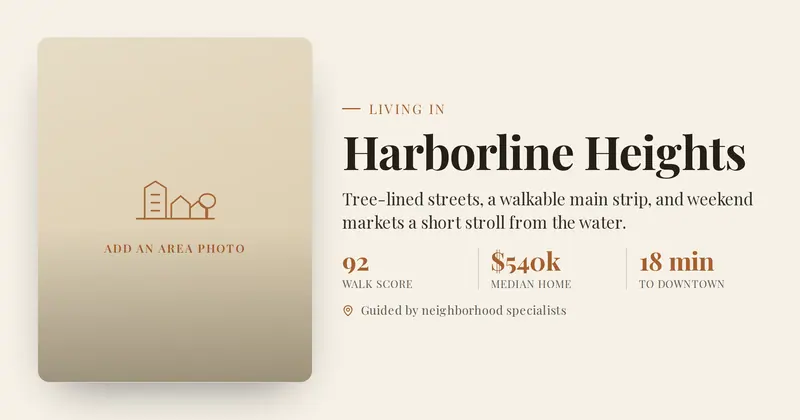
Neighborhood Guide
A lifestyle real-estate area guide: a side photo panel beside a "Living in" eyebrow, a big elegant serif area name, a short summary, a row of up to three area stats (value | label), and a detail line.
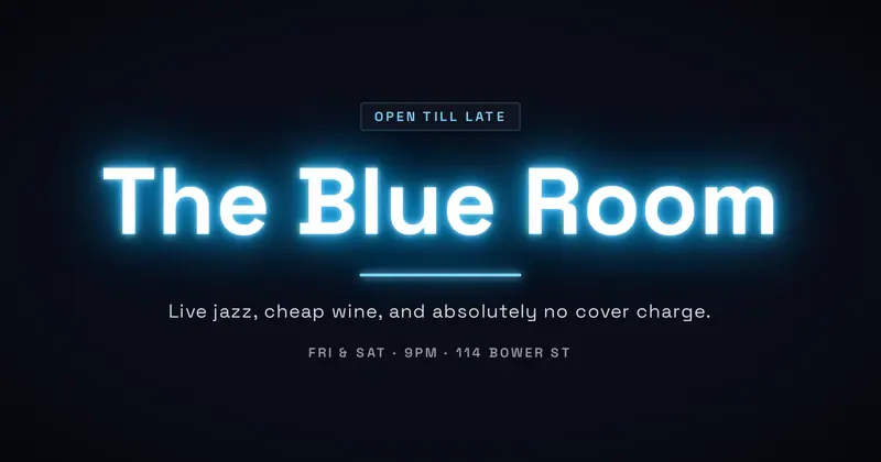
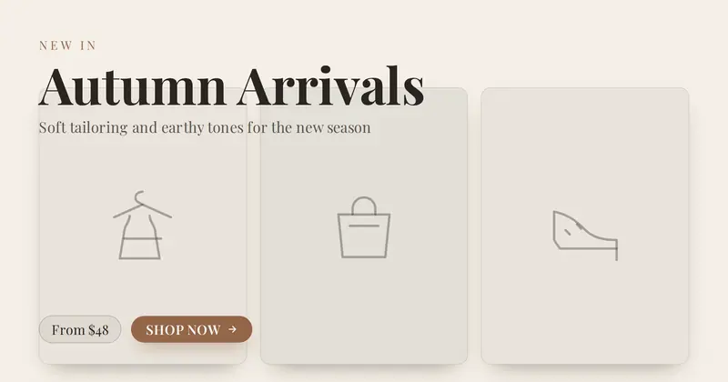
New Arrivals
A premium editorial-retail "new arrivals" mini-catalog: a letter-spaced eyebrow over an elegant serif collection title and subtitle, a row of three portrait product tiles (your photos, or distinct drawn garment placeholders), and a "from" price chip beside a shop-now CTA pill.
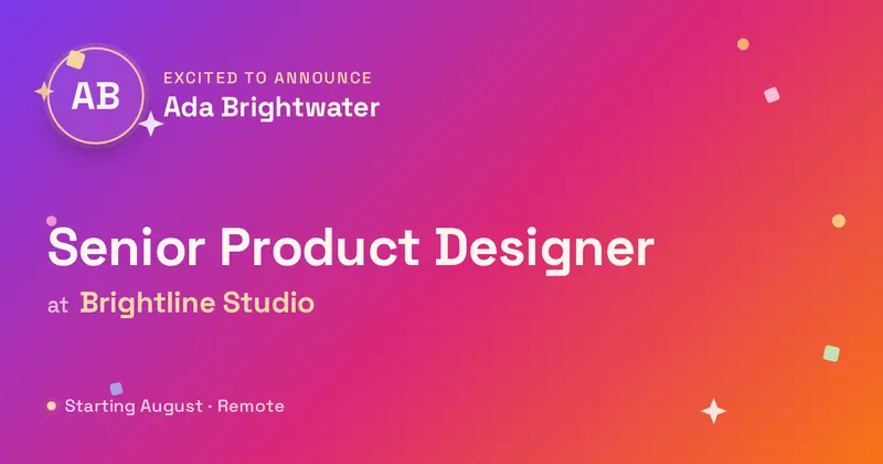
Newsletter
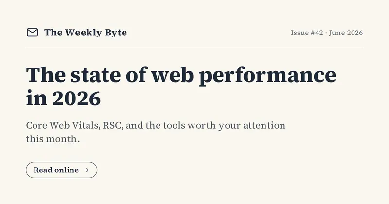
A newsletter-issue share card: a masthead with an envelope mark, an issue/date line, a big headline, and a dek, with an optional read-online CTA.
Now Playing
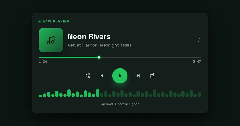
A now-playing music-player card: a small album thumbnail, the track and artist, a progress bar with elapsed and total timestamps, drawn transport controls, and a waveform, styled as a streaming player.
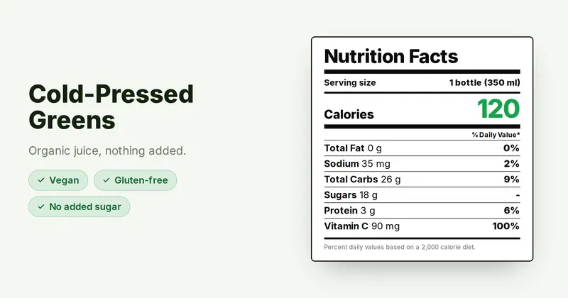
Nutrition Facts
A nutrition-facts card: a left product column (name, tagline, highlight pills) beside a classic nutrition-label panel with a serving size, a big calories number, nutrient rows with percent daily value, and a footnote.
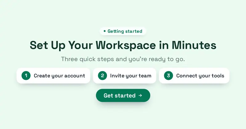
Onboarding
A clean onboarding card: an eyebrow chip, a friendly headline, a subtitle, three numbered step chips, and a get-started CTA on a soft pastel background.
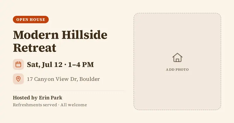
Open House
An open-house flyer: a bold OPEN HOUSE badge, the home title, a property photo, a prominent date/time and address, and a host line with an optional detail.
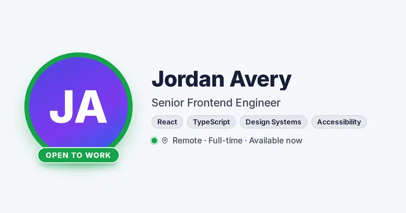
Open to Work
A candidate availability card: a circular headshot ringed in green with an "Open to Work" badge along its lower edge, beside the person's name, professional role, a row of skill chips, and a detail line with a live availability dot.
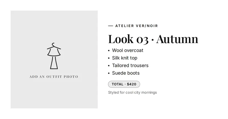
Outfit of the Day
An editorial outfit-of-the-day styling card: a full-height fashion photo on one side and, on the other, a small brand wordmark, an elegant serif look title, a list of itemized garments, an optional total-price chip, and a detail line.
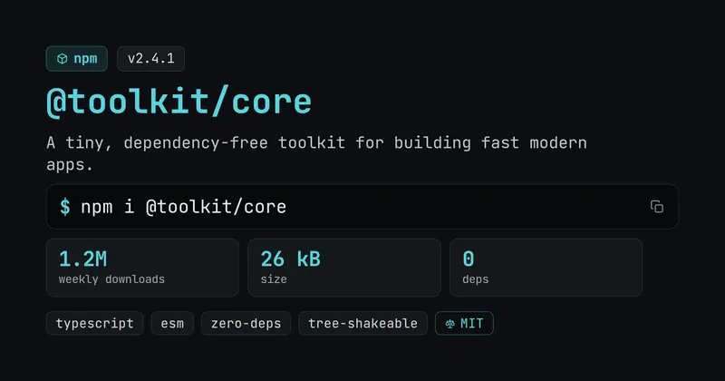
Package Card
A package-registry card: a registry chip with the package name and version, a description, a prominent mono install command, a parsed stat row, keyword tags, and a license chip.
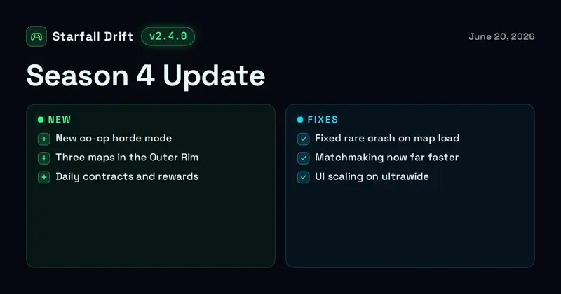
Patch Notes
A game patch-notes card: a game lockup with a mono version chip and date over a bold update title and two columns, NEW additions and FIXES, each parsed one per line.
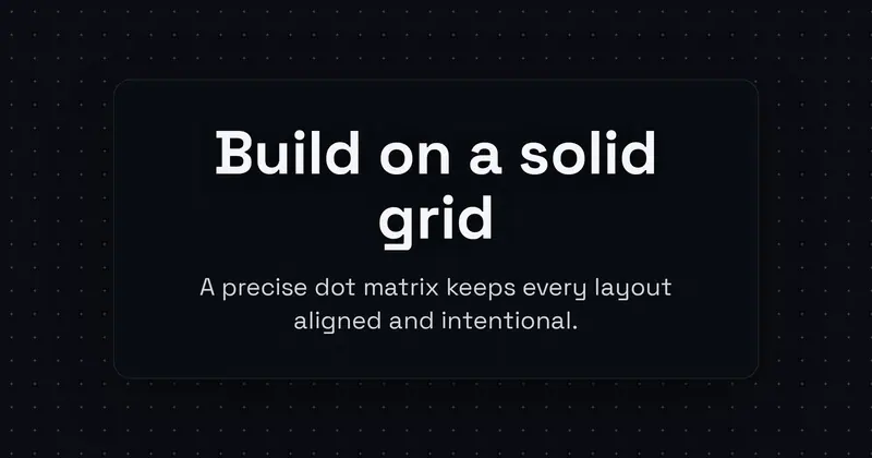
Pattern Grid
Structured, centered type laid over a dot, blueprint, or isometric grid pattern.
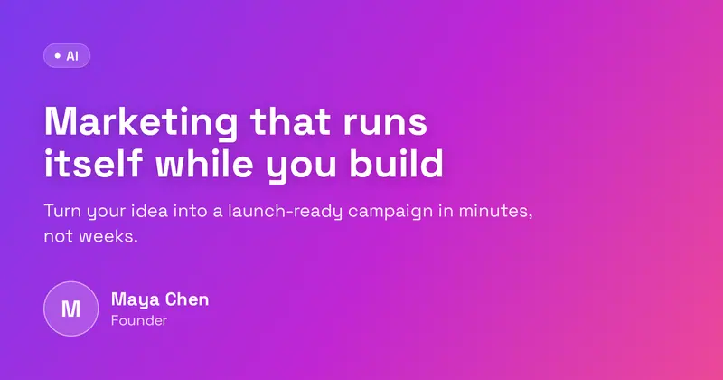
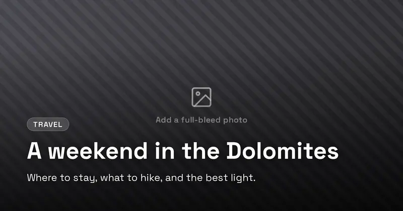
Photo Overlay
A full-bleed background photo with a legibility scrim and a bold bottom-anchored headline, eyebrow, and subtitle.

Pixel Art
A chunky 8-bit retro pixel-art card: a stepped pixel border frame, a faint pixel-grid background and a few blocky CSS pixel icons (heart, star, coin) around a mono uppercase title with a hard offset drop-shadow, a blocky badge chip, a subtitle and a blinking-cursor "press start" tag.
Podcast Episode
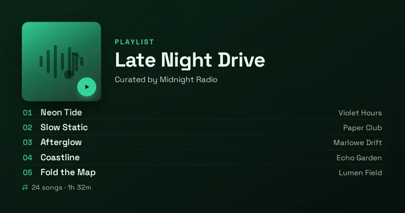
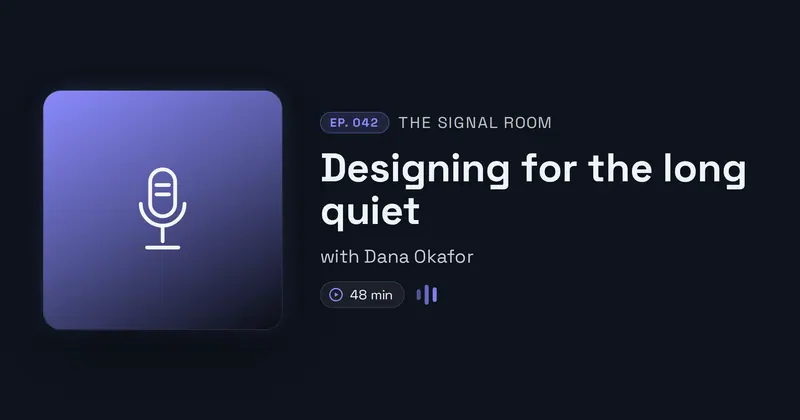
A podcast episode announcement card: a square cover-art tile beside the show name, an accent episode chip, the bold episode title, a guest line, and a duration chip with a small waveform accent.
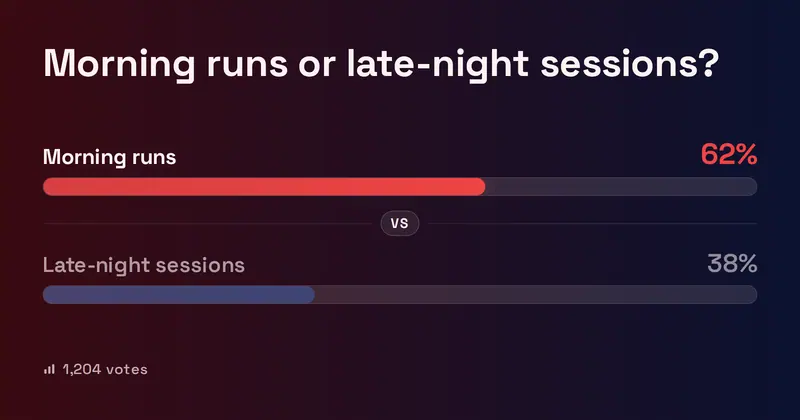
This or That Poll
A this-or-that poll-result card: a bold question over two option rows, each with a percentage bar whose fill is computed from the slots, the leading option highlighted, and a total-votes footer.
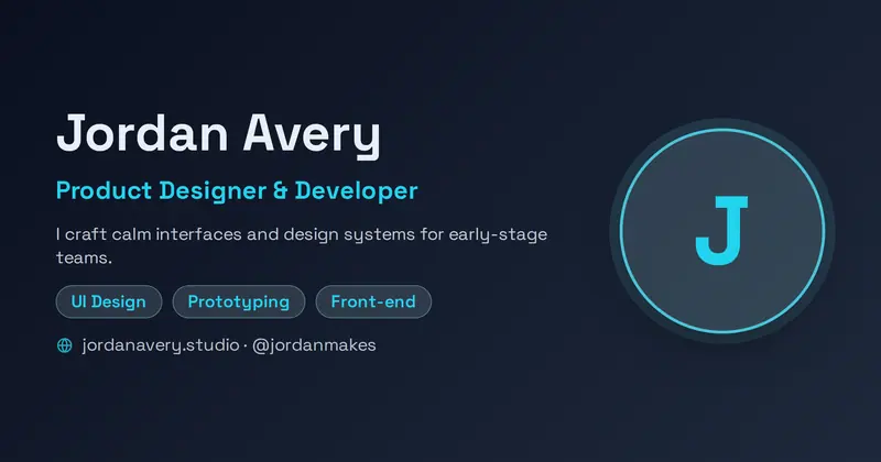
Personal Brand
A personal-brand card: a big name, a role line, a short bio, a row of skill chips, and a handle/URL line, beside a large circular avatar (letter-mark fallback).
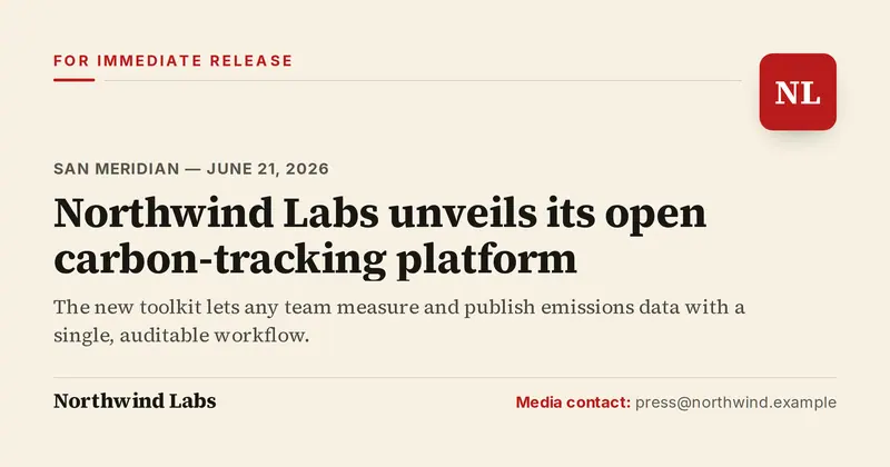
Press Release
A formal press-release / official-announcement card: a "FOR IMMEDIATE RELEASE" tag and thin rule with the company logo at top-right, a dateline, a big editorial headline, a muted subhead, and a company + media-contact lockup in the footer.
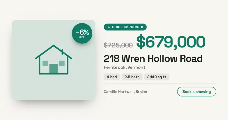
Price Reduced
A price-drop listing card: the old price struck through beside the new one, with the percentage saved computed from the two figures, the address, bed/bath specs and a property photo.

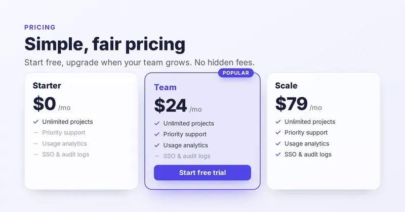
Pricing Table
A multi-tier SaaS pricing table: an eyebrow, title and subtitle above a row of up to three plan columns (name, big price + period, and a feature checklist whose per-feature check/dash is derived from each plan's y/n inclusion mask over the master feature list), with the named plan highlighted by an accent border, a Popular ribbon and a CTA pill.
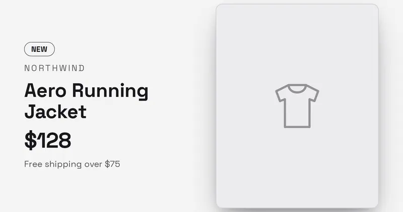
Product Card
An e-commerce product card: brand eyebrow, product name, a prominent price, a note and an optional badge beside a clean product photo with a soft shadow.
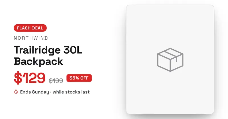
Product Deal
A price-drop deal card: a deal badge, brand eyebrow, product name, a struck-through was-price beside a big accent now-price, a percent-off badge, an urgency line and an optional product photo with a soft shadow.
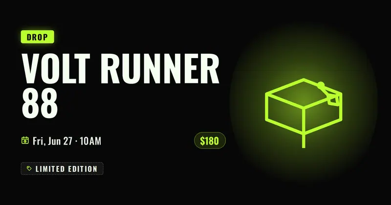
Product Drop
A loud streetwear product-drop hype card: a bold badge over a huge condensed product name, a drop-date line with a calendar icon and a price chip, a "limited" tag, and a centered product image on a radial accent glow (or a drawn shoebox placeholder).
Product Launch
A launch announcement with a 'New' badge, bold title, subtitle, CTA chip, and an optional product image.
Product Review
A square-first physical-product card: a bestseller badge, product photo, name, a now/was price, a star rating with review count, a checkmark feature list, and a brand logo in the bottom-left.
Progress Transformation
A fitness transformation card: side-by-side BEFORE/AFTER photos with an eyebrow program line, a bold title, a big accent stat, and a progress bar whose fill is driven by a percent, plus a motivational detail line.
Property Listing
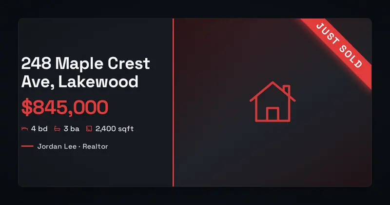
A real-estate listing card: a property photo, a status pill, a big price, the home title, an address line, a specs row (beds · baths · sqft with icons), and an agent line.
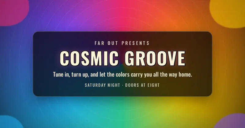
Psychedelic
A 1960s/70s psychedelic poster card: a radiating rainbow sunburst backdrop with wavy decorative blobs framing a centered, outlined uppercase display title plus an eyebrow, subtitle, and footer line.
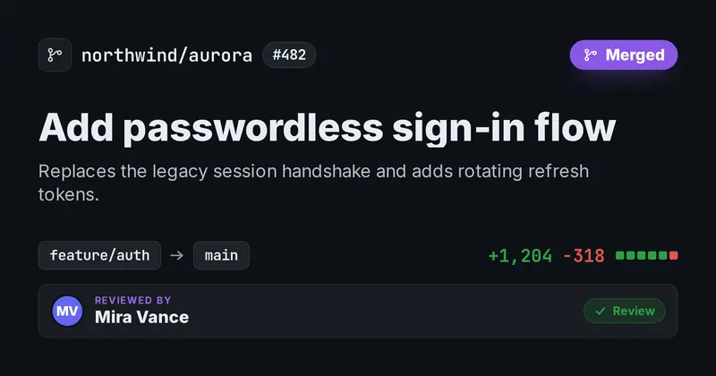
Pull Request
A code-review / pull-request card: a repo lockup with a PR number chip, a status pill whose color + icon are derived from the status word, a PR title and summary, a branch-from → branch-to row, a green/red diff stat, and a cluster of reviewer avatars.
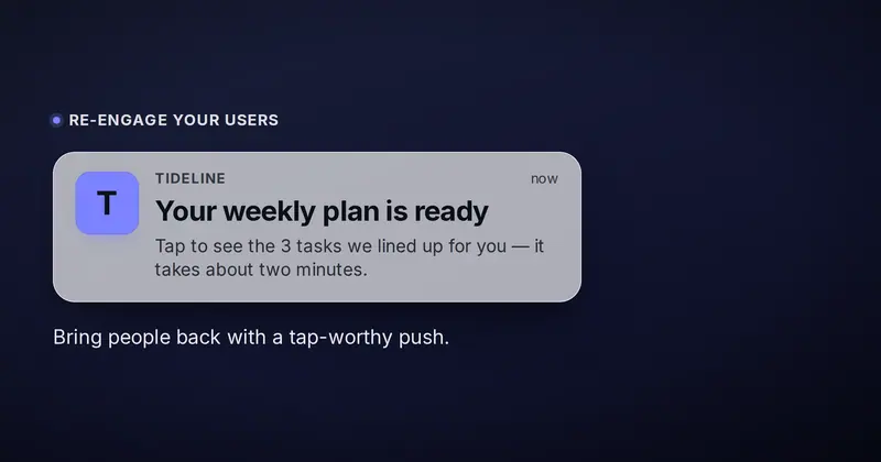
Push Notification
A realistic lock-screen push-notification banner floating on a soft wallpaper — app icon, app name and time header, a bold notification title and 1-2 line body, with a marketing eyebrow and caption around it.
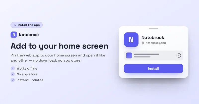
PWA Install
A web-app install card: an 'Install the app' badge, a product lockup, a value headline, a subtitle and up to three feature lines on the left, with a drawn browser install prompt (app icon, name, url and Install button) on the right.
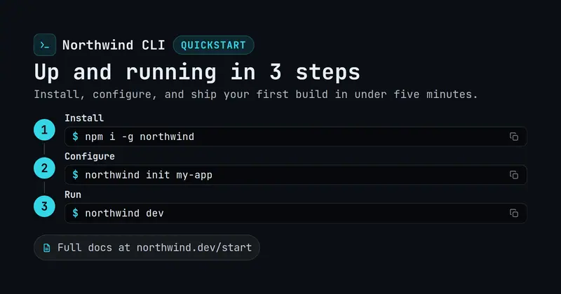
Quickstart
A getting-started / README OG card: a product lockup, a Quickstart eyebrow and bold title, a subtitle, and a numbered step list whose accent step numbers are computed from index, each pairing a short label with a mono command in a drawn code pill.
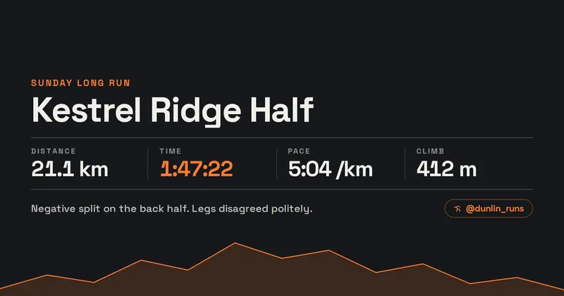
Race Result
A run or ride recap: the route name over a drawn elevation profile whose height scales with the climb you enter, plus a tabular row of distance, time, pace and elevation.
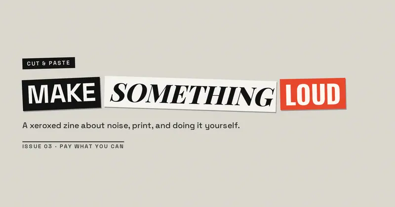
Ransom Note
Punk-zine cut-out lettering: every word snipped from a different magazine, set at its own angle on torn paper chips over a photocopied ground.
Rental Listing
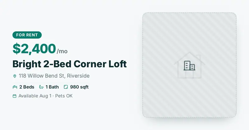
A for-rent listing card with a property photo hero, a status pill, a big monthly price, the title, an address with a pin, a beds/baths/sqft specs row, and an availability detail line.
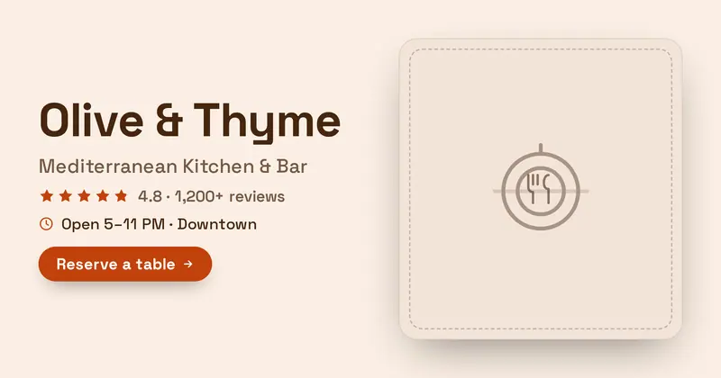
Restaurant Hero
A restaurant brand hero: the restaurant name, a cuisine tagline, a star rating with review count, a details line (hours/location), and a reserve CTA, beside a food photo.
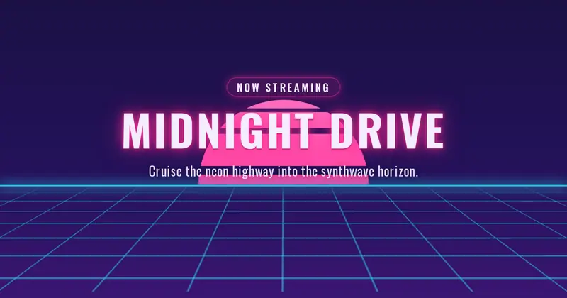
Retro Wave
An 80s synthwave card: a neon banded sun and a perspective grid floor under a big centered uppercase title with a glowing eyebrow pill and subtitle.
ROI Result
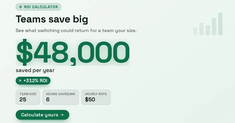
An ROI / savings-result share card whose hero is a giant accent figure with a caption, an optional positive delta chip, and a list of input assumptions framing the math.
SaaS Dark
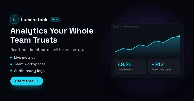
A sleek dark SaaS hero: a product lockup with an app icon (your uploaded icon/logo, or a letter-mark fallback) and a New badge, a bold value headline, a subtitle, a feature dot-list, and a Start CTA, beside a drawn dashboard widget (a mini area chart + two KPI tiles).

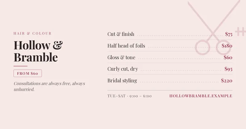
Salon Services
A salon or studio service list: the shop name over a price list parsed from “service | price” rows, with a starting-price chip derived from the lowest price, opening hours and a booking line.
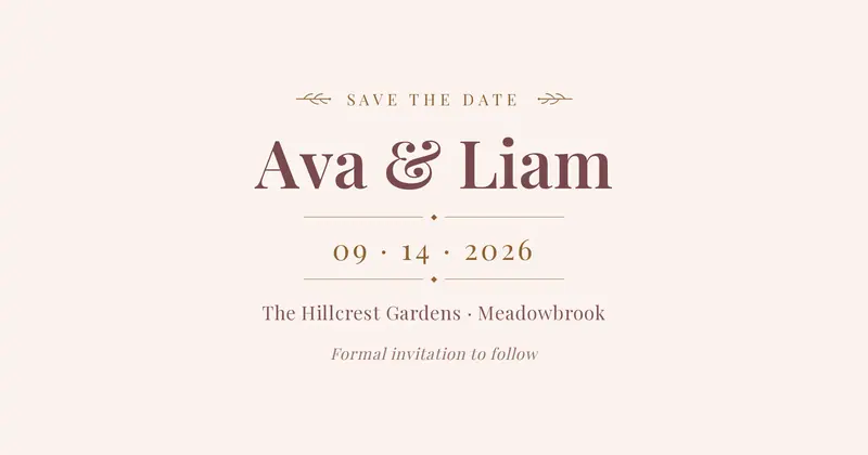
Save the Date
An elegant centered save-the-date for weddings, galas, and celebrations: a small uppercase eyebrow flanked by drawn laurel sprigs, the names in a large serif, a styled date between thin rule dividers, then a location line and a small note.
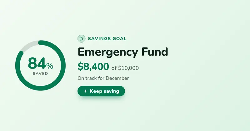
Savings Goal
A personal savings-goal card with a circular progress ring filled to the percent saved, the goal name, the amount saved against the target, an encouraging note, and an optional CTA pill.

Seasonal Sale
A festive seasonal sale promo: a seasonal eyebrow, a huge condensed discount figure, a headline, a dashed-border coupon code chip, a dates line, and a call-to-action pill, framed with light seasonal decor.
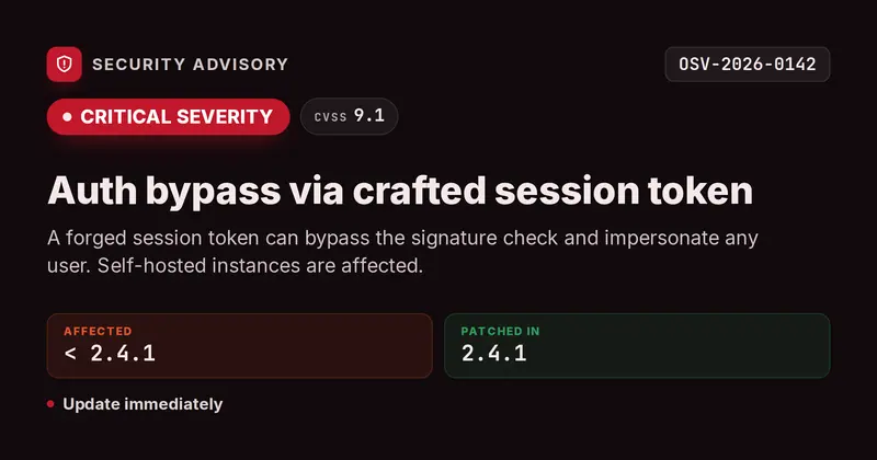
Security Advisory
A CVE-style security advisory card: an eyebrow with a shield glyph plus a mono advisory-id chip, a big severity badge whose color and label are derived from the severity word, an optional CVSS chip, a bold title and summary, an Affected/Patched meta row, and a detail action line.
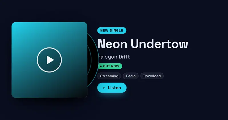
Single Release
A new-single release card: a square cover-art tile (with a vinyl-disc edge and a drawn fallback) beside a NEW SINGLE label, the track title, artist, an OUT NOW status pill, a row of streaming-service chips, and a listen CTA.
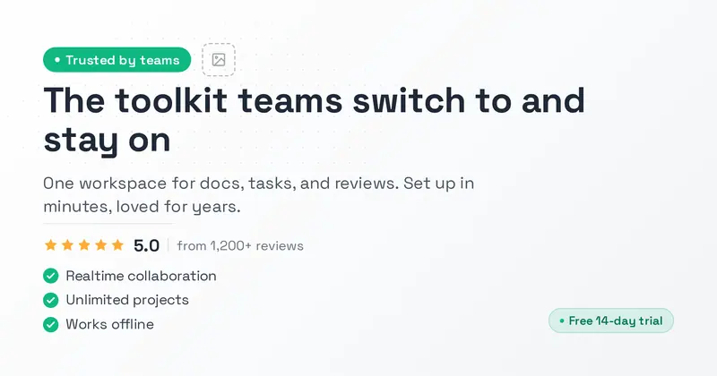
Social Proof
A clean light-mode SaaS marketing card with a status badge, logo, big dark headline, rating stars, and a green-check feature checklist that signals trust and social proof.
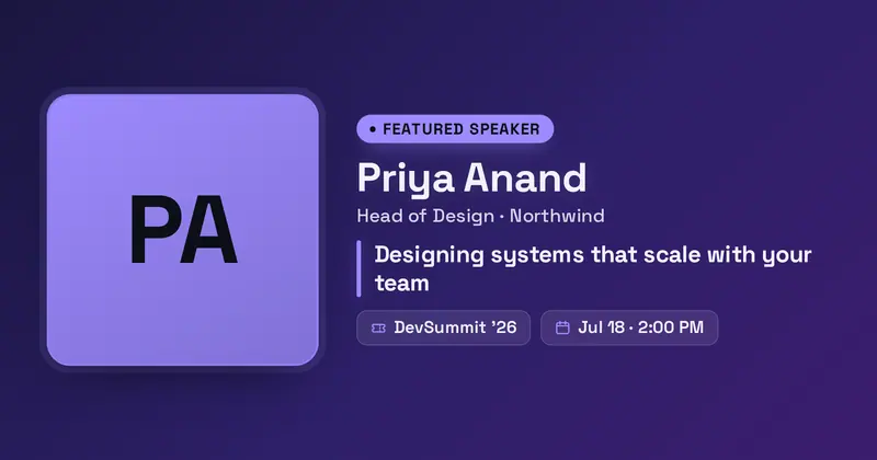
Speaker Card
An event speaker spotlight: a large rounded headshot with an accent ring beside a "Featured Speaker" pill, the speaker's name and role, a highlighted talk title, and an event + date meta row.
State of Report
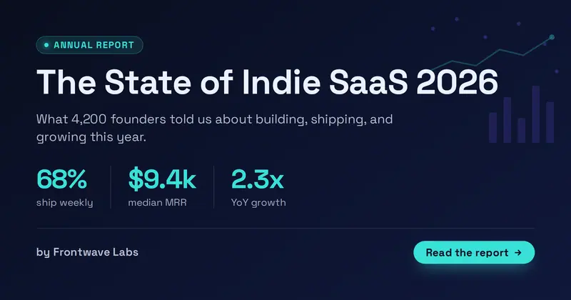
A "State of X" industry / survey report cover: an eyebrow, a big report title, a subtitle, a row of up to 3 headline stats (value | label), a byline, and a CTA — with faint drawn data motifs.
Status Page
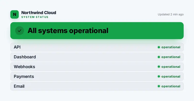
A system-status card: an org lockup with a 'System Status' eyebrow and an updated timestamp, a big status banner whose color and icon are derived from the overall state, and a list of component rows each with a state-colored status dot.
Sticker Bomb
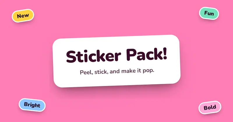
A playful sticker-pack look: the title and subtitle sit on a big rounded white sticker with a soft drop-shadow, ringed by smaller rotated tag chips in bright colors.
Stock Ticker
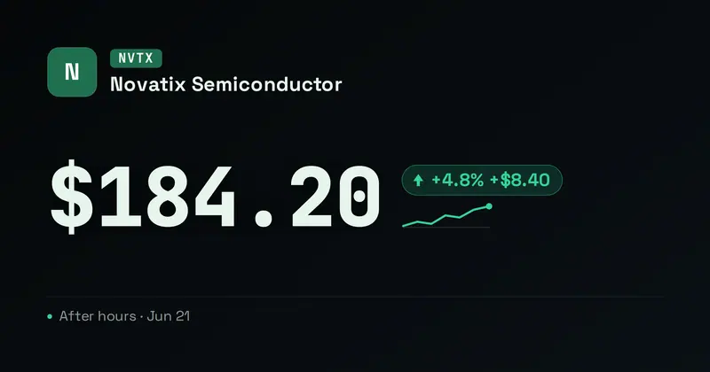
A single-equity stock / earnings ticker card: a company logo (or a symbol monogram), a mono ticker chip and company name, a huge price, and a green-up / red-down trend (arrow + sparkline + colored delta pill) derived from the change.
Stream Schedule
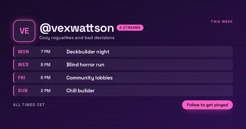
A streamer's weekly schedule: the channel lockup with a stream-count chip counted from the rows, over up to four “day | time | game” slots rendered as a stacked run-sheet.
Swiss Grid
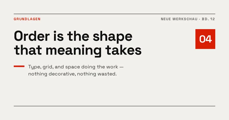
International Typographic Style: a strict four-column grid, a flush-left headline set tight and heavy, hairline rules, and a single spot-colour block for emphasis.
Meet the Team
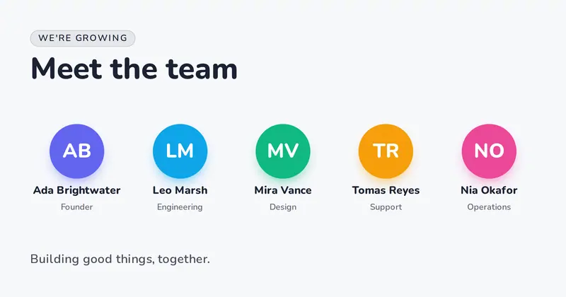
A friendly roster card: an eyebrow and bold title over a row of avatar discs — each person's uploaded photo, or a colored disc with their initials — with their name and role, plus a closing tagline.
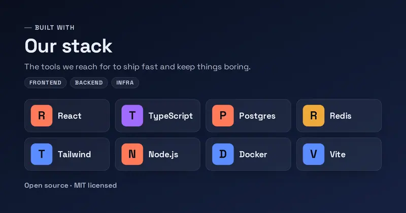
Tech Stack
A "built with" tech-stack card: an eyebrow, bold title, and subtitle over a tidy 4-up grid of tech tiles parsed from a list, each showing an uploaded logo or a letter-tile fallback, with optional layer labels and a detail line.
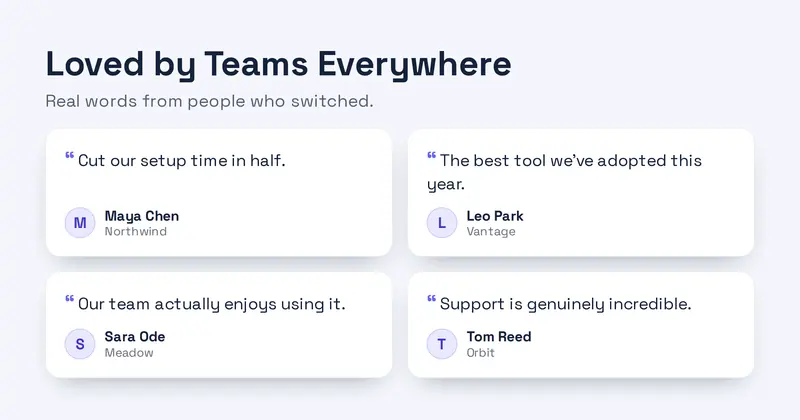
Testimonial Wall
A testimonial wall: a headline and subtitle over a 2×2 grid of short quote cards, each with a small avatar letter-mark, a name, and a role.
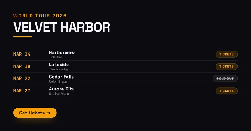
Tour Dates
A concert tour poster card: a tour eyebrow, a big artist/tour name, a list of tour stops (date, city/venue, and a tickets or sold-out tag), and a get-tickets CTA.
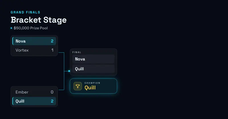
Tournament Bracket
A tournament bracket card: an eyebrow and title over a drawn four-team single-elimination bracket (two semifinals with scores, connector lines feeding a final), ending in a highlighted champion slot.
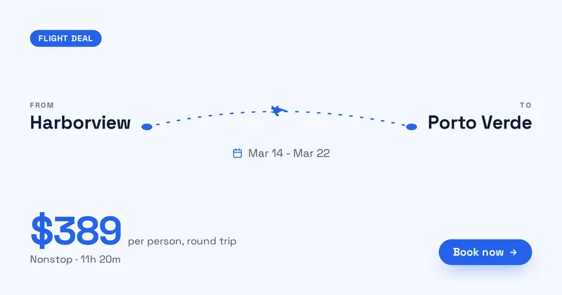
Travel Deal
A travel deal card: a deal badge, an origin to destination route drawn as a dotted flight arc with a plane icon, a travel-dates line, a big fare price with a per-person note, an optional detail line, and a book CTA.
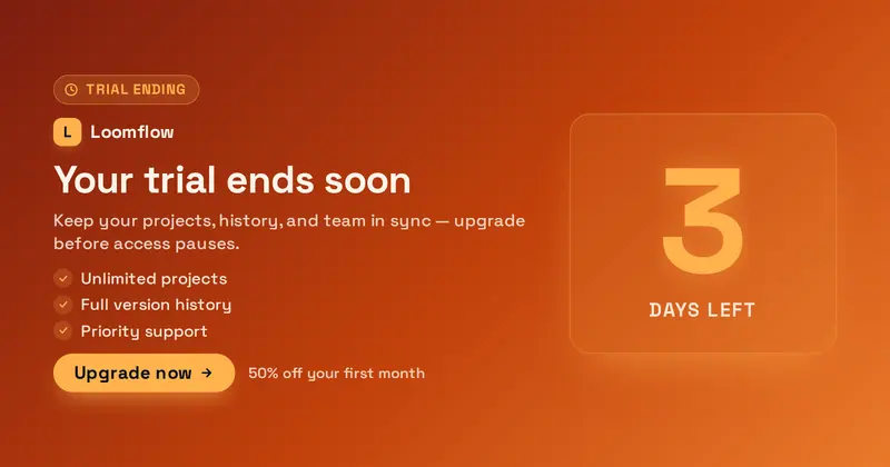
Trial Ending
A friendly trial-ending upgrade nudge: a huge days-left figure (derived from the value), a product lockup (your uploaded icon/logo, or a letter-mark fallback), a reminder title and subtitle, a short perks list of what upgrading keeps, an Upgrade pill, and an offer detail line.
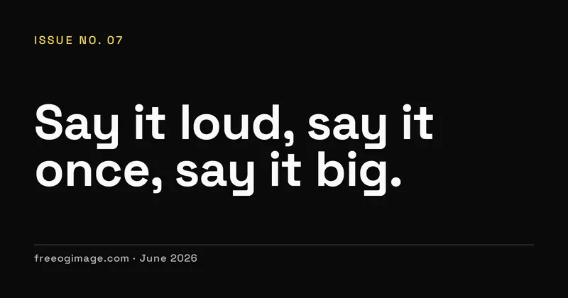
Typographic Poster
An oversized typographic statement poster where a gigantic, tightly-leaded headline fills the frame between a tiny eyebrow and a footer byline.
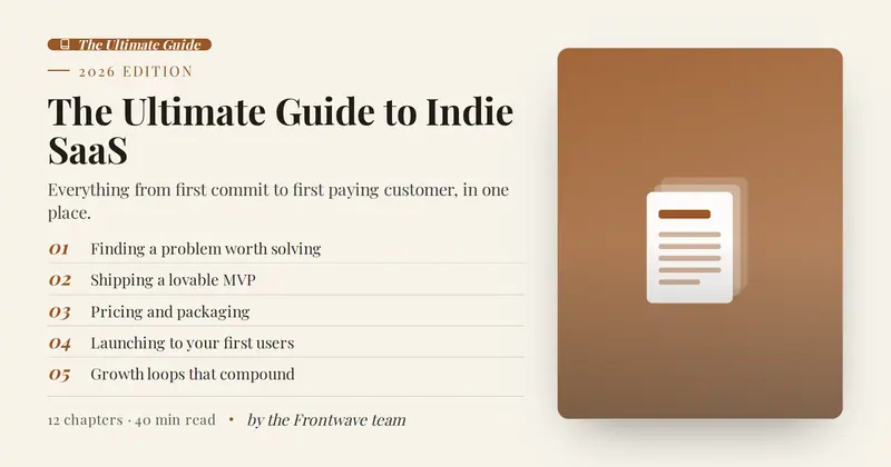
Ultimate Guide
A flagship long-form pillar-page cover: a 'The Ultimate Guide' badge and edition kicker, a big serif title, a subtitle, a numbered chapters / table-of-contents list, a meta line, and an author byline beside an optional tall hero illustration.
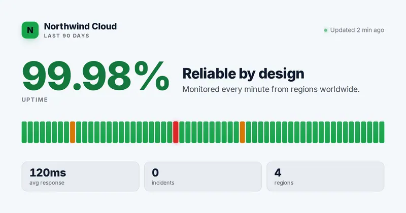
Uptime
An uptime / SLA card: an org lockup with a 'Last 90 days' eyebrow and an updated line, a huge accent uptime percentage beside a title and subtitle, a day-by-day uptime bar strip whose bar colors are derived from per-day state words, and up to three slot-driven stat pills.
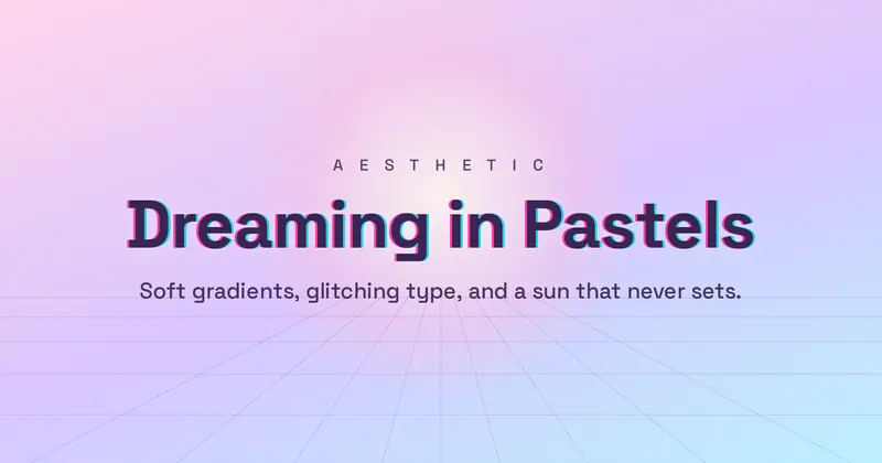
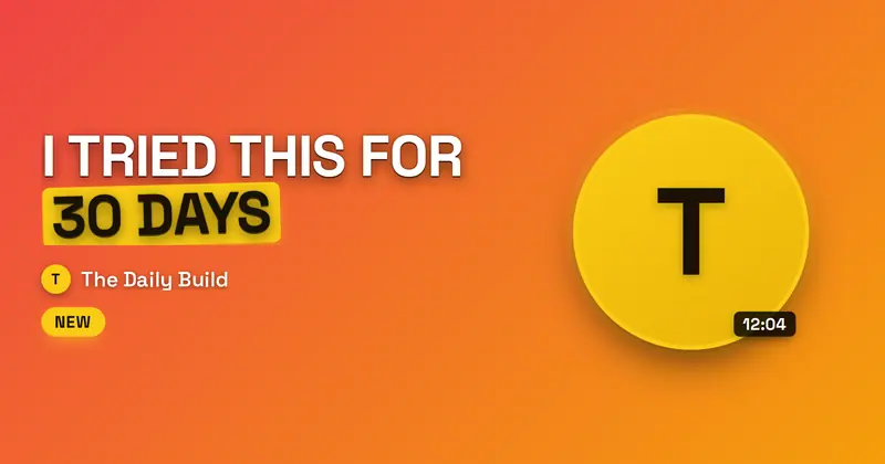
Video Thumbnail
A bold video-thumbnail card: a huge punchy headline with one highlighted accent word, a creator face slot (with an avatar fallback), a circle-and-arrow accent, a channel line with a channel icon (your uploaded icon/logo, or a letter-mark fallback), and a duration badge.
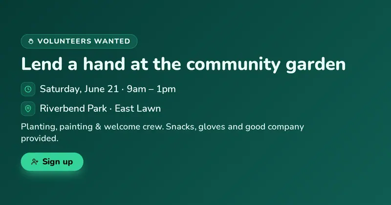
Volunteer Call
A friendly volunteer-recruitment card with an accent eyebrow pill, a bold title, drawn clock (when) and pin (where) rows, a roles/perks detail line, and an optional sign-up CTA pill.

Watercolor
A soft painterly watercolor card: blurred multiply-blended color washes bleeding from the edges of warm paper, around a centered uppercase eyebrow, big serif title, subtitle, and footer line.
Wedding Invitation
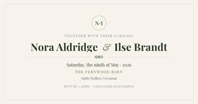
A centered wedding invitation: a monogram drawn from both names' initials, the two names split by an oversized ampersand, botanical rules, and the date, venue and RSVP line.
Wellness App
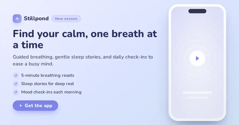
A calm meditation / mindfulness app hero: a product lockup and badge pill over a soft value headline, subtitle, up to three feature lines and a get-the-app CTA, with a phone mockup on the right. The lockup shows your uploaded icon/logo, or a letter-mark fallback.
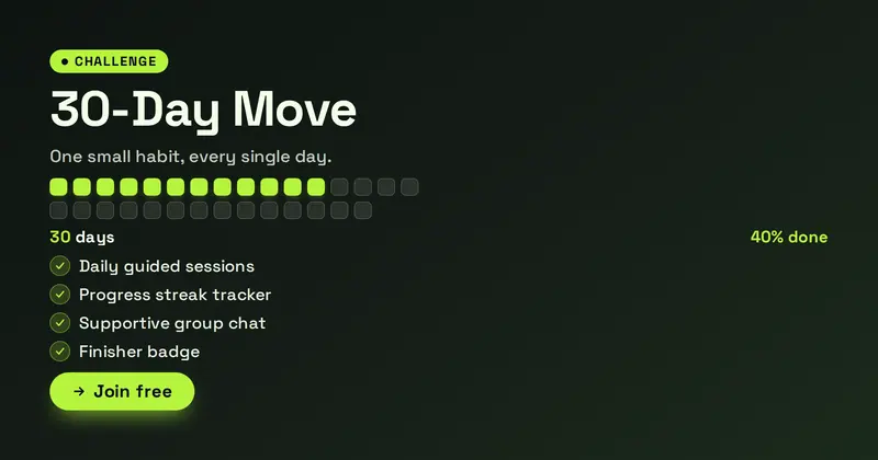
Wellness Challenge
A multi-day wellness challenge card with a day-grid sized to the day count, the first portion filled to the progress percent, a perks list, and a join CTA.

We're Hiring
A bold 'we're hiring' announcement: a hiring badge, a big statement, a list of open roles as pills, a perks line, and a see-roles CTA.
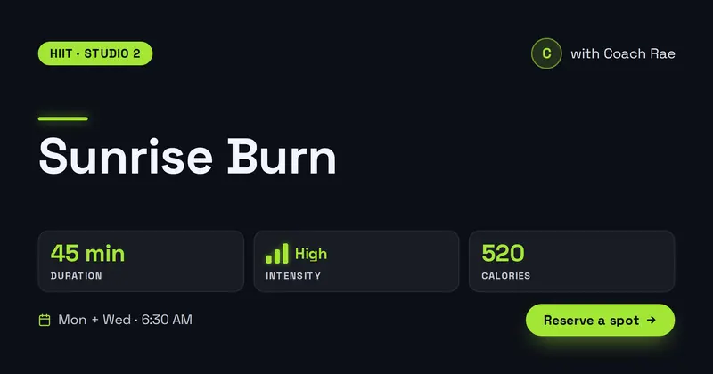
Workout Class
A fitness class card: a class-type kicker, a bold class name, an instructor line, a row of stat blocks (duration, an intensity meter, calories), a schedule line, and a reserve CTA.
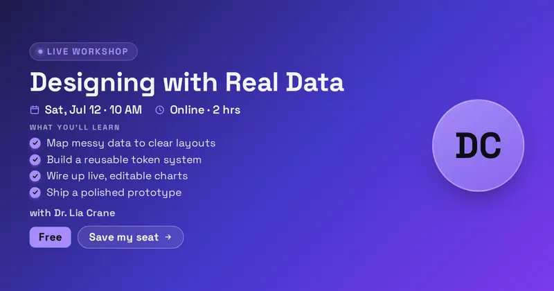
Workshop
A hands-on workshop or masterclass announcement with a live eyebrow pill, big title, a when row and format chip with drawn calendar and clock icons, a 'what you'll learn' checklist, an instructor line, and a price chip plus CTA beside an optional instructor headshot.
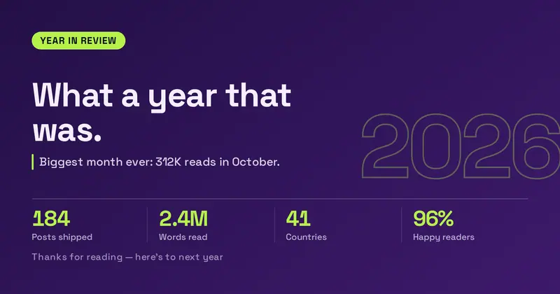
Year in Review
An annual recap card: the year set huge as a ghosted backdrop behind a headline, a grid of up to four “value | label” stats parsed from one field, a highlight line and a closing footer.
Zine Collage
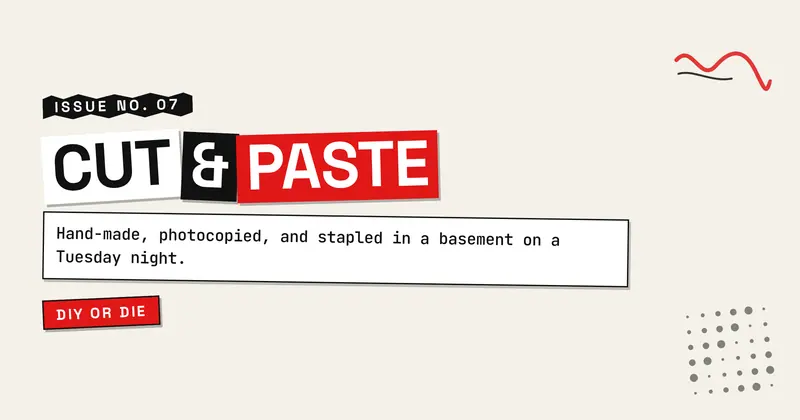
A punk ransom-note zine card: the title cut into boxed letter-blocks with alternating tilts and black/white/accent fills, taped down over photocopied paper, with a torn kicker strip, a typewriter subtitle block, and a tag chip.
What is an Open Graph image template?
An Open Graph image — the og:image — is the picture that appears when someone shares your link on Facebook, X, LinkedIn, Slack, Discord, or in a text message. A good one makes a link look like a real product or a worth-reading article; a missing or broken one makes it look like spam. A template gives you a designed starting layout — headline, supporting text, logo placement, background, and type already arranged — so you only have to drop in your own words instead of designing from a blank canvas.
Every template here is built for the standard share-card size, 1200×630 pixels (a 1.91:1 ratio), and exports at 2× (2400×1260) so it stays crisp on high-DPI screens. That one size covers almost every platform, because they all read the same Open Graph tags — see the full size cheat sheet if you need the per-platform specifics.
How to choose a template
- Start from your use case. Launching a product, announcing a feature, promoting an event, shipping a blog post, or hiring? Browse the matching category rather than scrolling everything.
- Match your brand's mood. Dark and technical, bright and playful, editorial and serif-heavy — pick the look first, then tune colors and fonts to your palette.
- Keep the important content centered. Some platforms crop the edges, so templates keep your headline and logo inside the safe area by default.
- Use a preset. Each template ships with named presets — one click jumps you to a polished color and type combination you can still customize.
Once you've picked one, the editor handles the rest, and the meta tag generator gives you the tags to point at your finished image.
Browse templates by category
Prefer to start from your use case? Each category has its own page with tailored guidance and a curated grid:
- General (27)
- Product (44)
- Events (8)
- Education (7)
- Finance (8)
- Real Estate (7)
- Jobs (7)
- Food (7)
- Travel (7)
- Fashion & Beauty (6)
- Health & Fitness (8)
- Music (6)
- Video & Creator (8)
- Gaming (8)
- Nonprofit (7)
- Seasonal & Holiday (8)
- Editorial (21)
- Developer (22)
- Social (8)