27 templates
General Open Graph image templates
Versatile share cards that work for any link.
Not every page fits a neat category. These all-purpose Open Graph templates are the safe default for a homepage, a landing page, or a one-off link you just need to look sharp when it's shared. They lean on strong typography and clean backgrounds so your headline carries the card.
Great for:
- A homepage or landing page
- A generic blog or marketing link
- A quick, polished one-off card
Related reading: OG image sizes in 2026 →
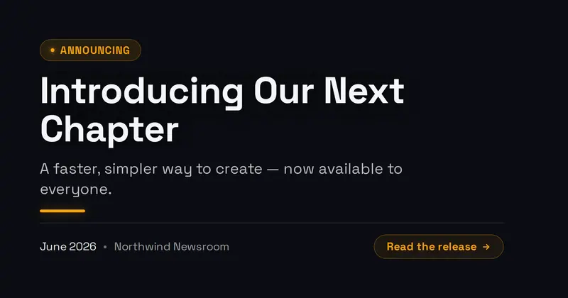
Announcement
A press announcement card: an 'Announcing' badge, a bold statement headline, a supporting subline, an accent divider, and a date + source row with an optional read CTA.

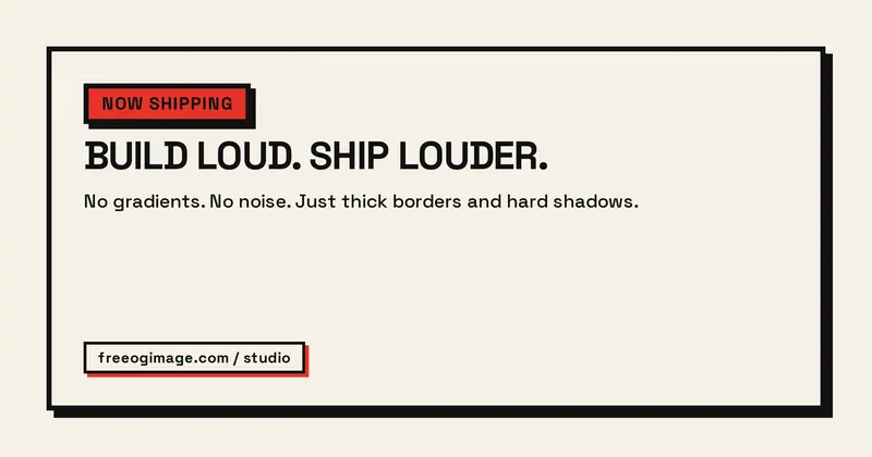
Neo-Brutalist
A flat, raw, high-contrast neo-brutalist card: an accent-blocked badge pill, a huge heavy headline, a plain subtitle block, and a footer tag chip, all framed by a thick border with a hard offset drop shadow.
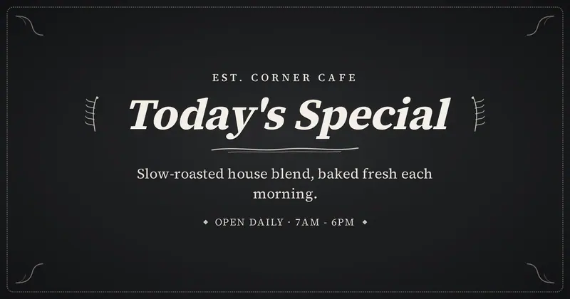
Chalkboard
A hand-lettered chalkboard sign: an elegant serif title flanked by drawn chalk flourishes, with a small uppercase eyebrow, a subtitle, and a footer line in soft cream chalk.

Chrome Type
Y2K liquid-metal headline rendered as polished, reflective chrome on a dark glow.
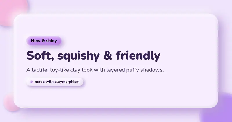
Claymorphism
A soft 3D "clay" card: a big puffy rounded panel with layered highlight + drop + inset shadows on a pastel background, holding a squishy badge pill, a friendly heavy headline, a subtitle, and a clay tag chip.
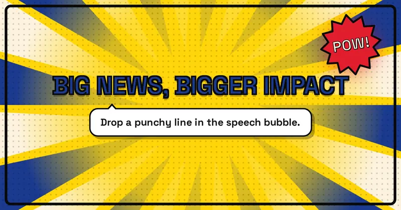
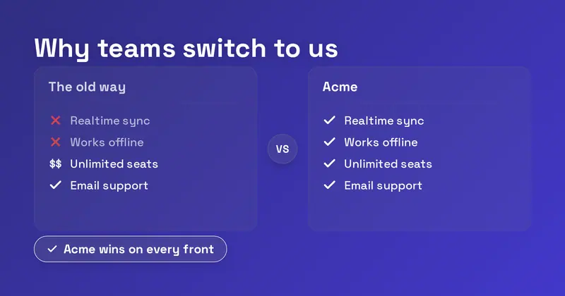
Comparison
A side-by-side "us vs them" comparison card: a headline over two labeled columns whose per-side check / cross / verbatim-text marks are derived independently from each "Feature | them | us" row, plus a verdict pill.
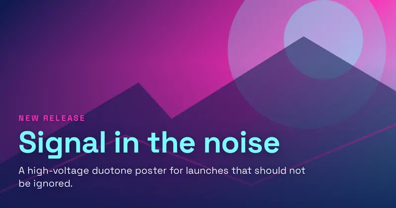
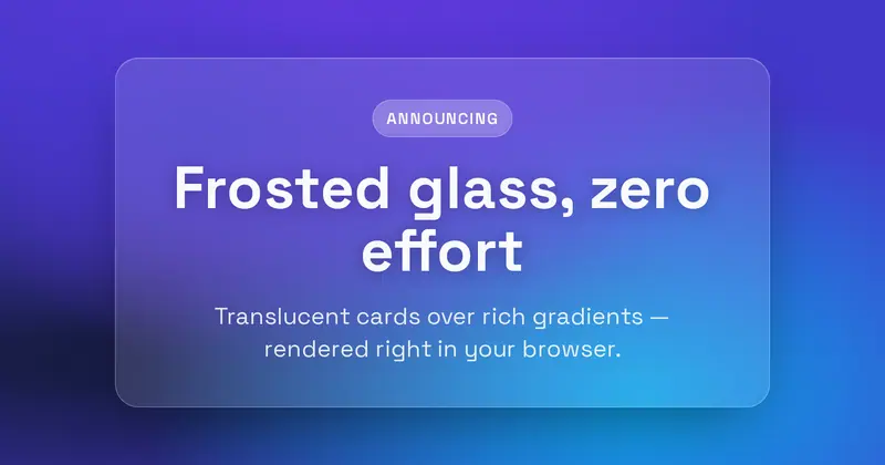
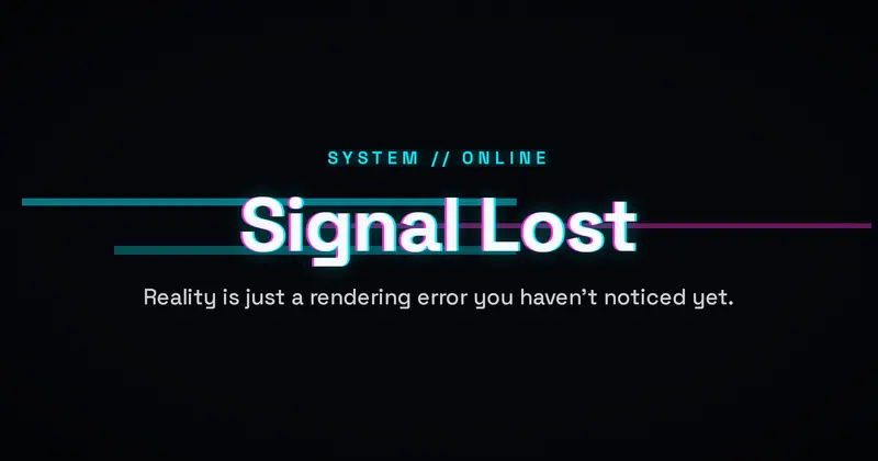
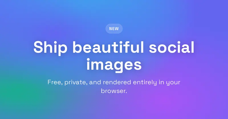
Holographic
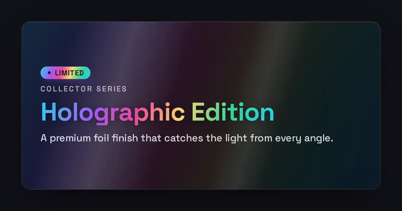
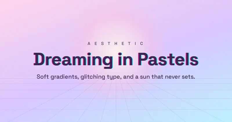
An iridescent foil-sticker card: a holographic rainbow sheen and a diagonal specular highlight sweep behind a foil badge, eyebrow, gradient-clipped title, and a high-contrast subtitle.
Memphis
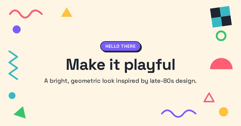
A late-80s Memphis Group card: playful geometric shapes (squiggles, triangles, dots, zigzags, half-circles and a checker block) scattered around the edges of a bright solid background, with a colorful badge pill, a heavy headline and a subtitle in a clean central column.
Pattern Grid
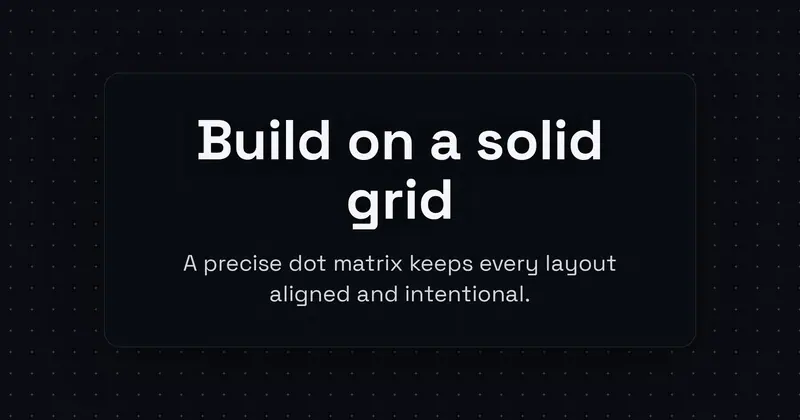
Structured, centered type laid over a dot, blueprint, or isometric grid pattern.
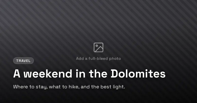
Photo Overlay
A full-bleed background photo with a legibility scrim and a bold bottom-anchored headline, eyebrow, and subtitle.

Pixel Art
A chunky 8-bit retro pixel-art card: a stepped pixel border frame, a faint pixel-grid background and a few blocky CSS pixel icons (heart, star, coin) around a mono uppercase title with a hard offset drop-shadow, a blocky badge chip, a subtitle and a blinking-cursor "press start" tag.

Personal Brand
A personal-brand card: a big name, a role line, a short bio, a row of skill chips, and a handle/URL line, beside a large circular avatar (letter-mark fallback).
Psychedelic
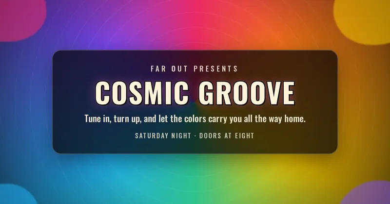
A 1960s/70s psychedelic poster card: a radiating rainbow sunburst backdrop with wavy decorative blobs framing a centered, outlined uppercase display title plus an eyebrow, subtitle, and footer line.
Retro Wave
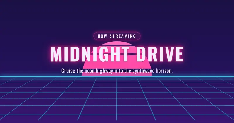
An 80s synthwave card: a neon banded sun and a perspective grid floor under a big centered uppercase title with a glowing eyebrow pill and subtitle.
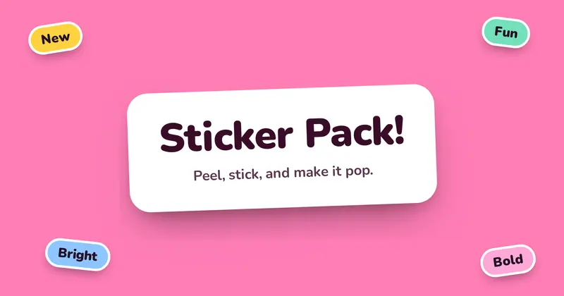
Sticker Bomb
A playful sticker-pack look: the title and subtitle sit on a big rounded white sticker with a soft drop-shadow, ringed by smaller rotated tag chips in bright colors.
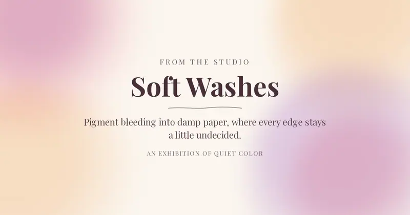
Watercolor
A soft painterly watercolor card: blurred multiply-blended color washes bleeding from the edges of warm paper, around a centered uppercase eyebrow, big serif title, subtitle, and footer line.