44 templates
Product Open Graph image templates
Make launches and features look like a real product.
When you ship something, the link preview is the first impression — often before anyone reads your post. Product templates put the name, the value, and an optional screenshot front and center so a launch, feature, or release reads as polished and intentional in the feed.
Great for:
- A product or feature launch
- A pricing or plan announcement
- A SaaS landing page
- A changelog or release note
Related reading: Best OG templates for SaaS launches →
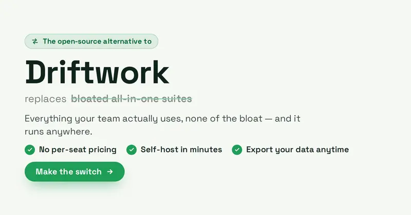
Alternative To
A high-intent switch / SEO comparison card: an eyebrow badge above a big product name, a quieter struck-through generic category it replaces, a subtitle, up to three check-bullet differentiators, and a Make-the-switch CTA pill with a swap motif.
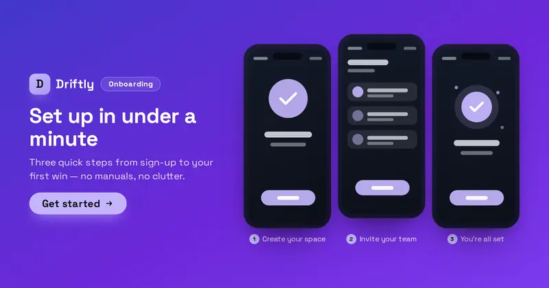
App Onboarding
An app onboarding-walkthrough card: an Onboarding badge, product lockup (your uploaded icon/logo, or a letter-mark fallback), value headline, subtitle and get-started CTA over a row of three phone screens, each holding a screenshot with a captioned step.
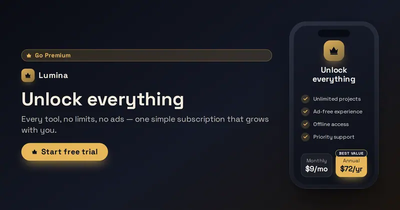
App Paywall
An in-app subscription / go-premium paywall card: a marketing headline and free-trial CTA on the left, and a phone mockup whose screen is the paywall — a premium mark, benefits checklist, and a monthly/annual billing toggle with the featured plan highlighted.
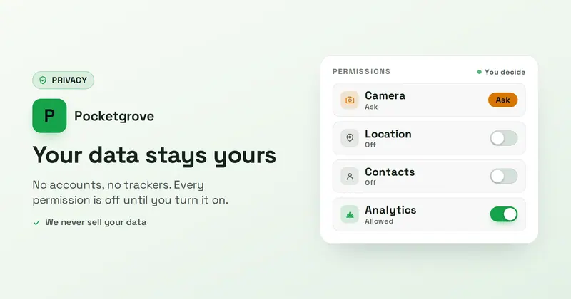
App Privacy
A privacy-first app-permissions card: a Privacy badge, an app lockup, a reassuring headline and subtitle, and a permissions panel of up to four rows whose toggle/state look is derived from each row's on/off/ask state word.
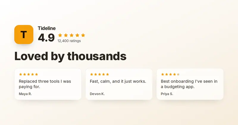
App Reviews
An app-store social-proof card: a product lockup with a big aggregate star rating and ratings count above a bold headline, with up to three short user-review cards below.
App Update
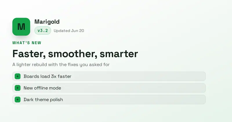
An app-store-style "What's New" card: a rounded app icon, product name, mono version chip and date, an update headline with subtitle, and a list of up to three change lines with accent markers.
App Widget
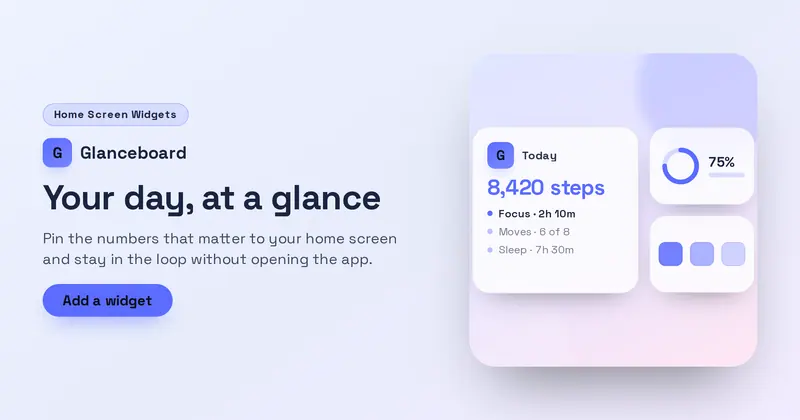
A home-screen widget showcase: a product lockup over a value headline, subtitle and CTA on the left, with a drawn widget cluster — one large 2x2 widget holding the app icon, a title, a big value and up to three rows, plus two small widgets — on a soft wallpaper panel on the right.
Book a Demo
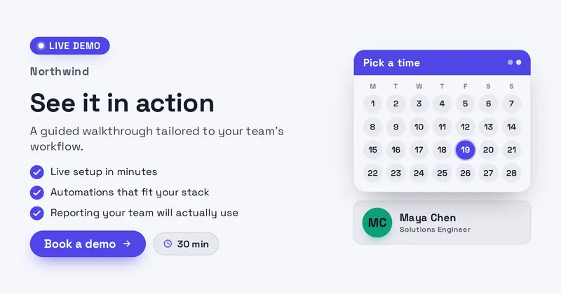
A confident B2B SaaS demo invite: a Live-demo badge, product lockup, value headline, a 'what you'll see' checklist, and a Book-a-demo CTA with duration chip beside a drawn calendar card and a host row (name + role, with your uploaded avatar or an initials disc).
Browser Extension
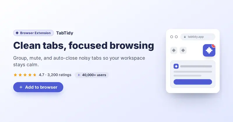
A brand-neutral browser-extension promo: a drawn toolbar mockup with a pinned extension tile (your icon), beside a badge pill, headline, subtitle, star rating, users-count chip, and an add-to-browser CTA.
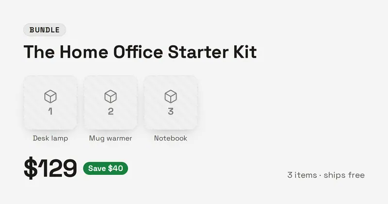
Bundle Kit
A product-bundle card: a bundle badge, kit name, a row of two to four product thumbnails with labelled fallbacks, a large total price with a savings callout, and a short note line.
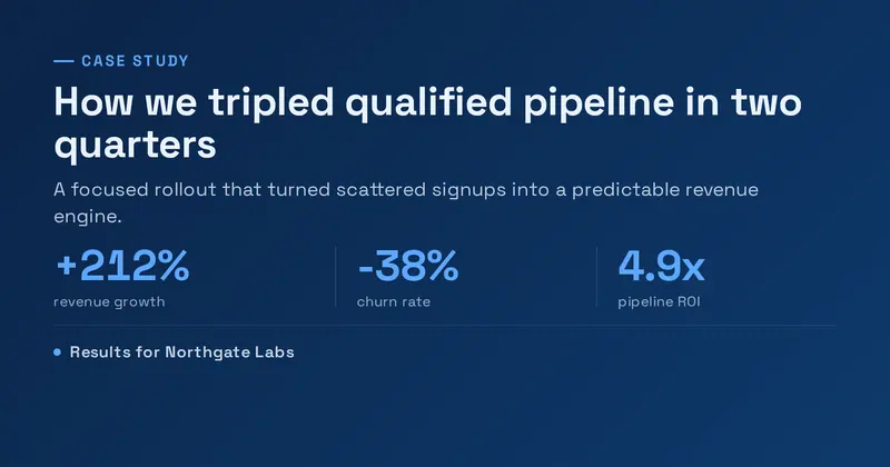
Case Study
A B2B case-study results card: an accent eyebrow, a bold outcome headline, a short summary, a row of up to three big result metrics (value over label), and a client lockup line.
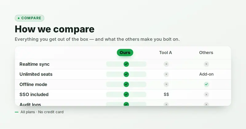
Comparison Table
A feature-matrix comparison table whose hero is a grid of up to 4 product columns (the first, your product, highlighted in the accent) against up to 5 feature rows, where each cell renders a green check, a muted cross/dash, or verbatim text derived from its value.
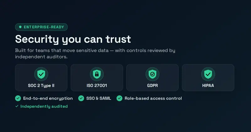
Compliance
A B2B security & compliance trust card: an eyebrow, a confident headline and subtitle, a hero row of up to four drawn standard badge-shields, up to three assurance points, and an audit detail line.
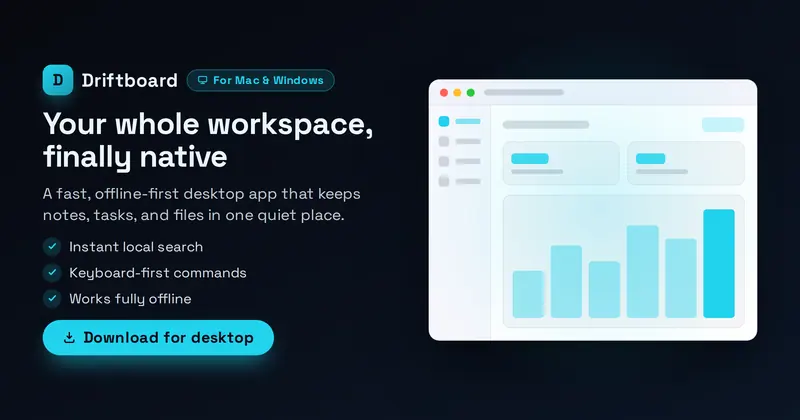
Desktop App
A native desktop-app hero: a product lockup (your uploaded app icon, or a letter-mark fallback), OS badge, value headline, subtitle, up to three feature lines and a download CTA on the left, beside a drawn desktop-window mockup with a title bar, sidebar rail and your screenshot inside.
Device Frame
Embed a screenshot inside a browser or phone frame with depth, a title, and a caption.
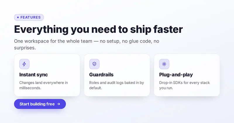
Feature Grid
A 3-up product-marketing card: an eyebrow, bold title and subtitle above a row of up to three feature cards (drawn icon, title, description) parsed from one slot, with an optional CTA pill.
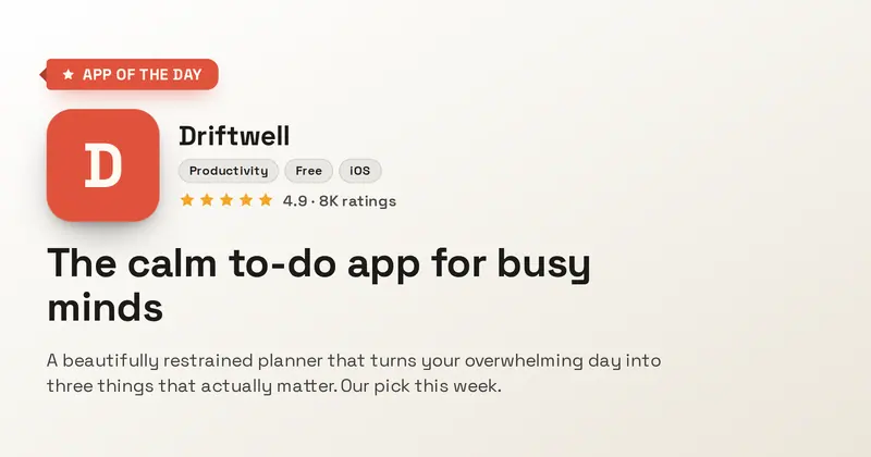
Featured App
An editor's-pick app feature card: an accent feature ribbon, a large rounded app icon beside the product name and genre chips, a curator's blurb, and an optional star rating.
Integrations Grid
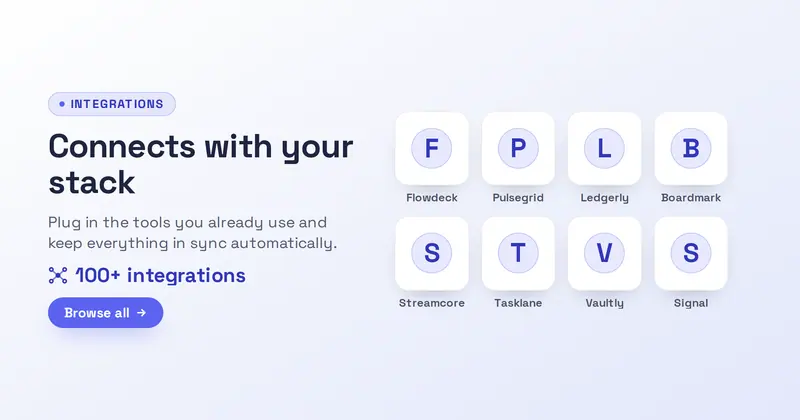
An integrations-marketplace card: a badge, headline, subtitle, accent count line, and CTA beside a 4-up grid of logo tiles parsed from an integration-name list, each tile an uploaded logo or a letter-mark fallback around a drawn hub.

Launch Day
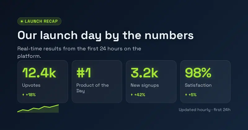
A brand-neutral launch-day card: a LIVE NOW badge with a drawn live-dot, a product lockup (your uploaded icon/logo, or a letter-mark fallback), a big celebratory headline, a subtitle, a detail line, and a Try-it CTA pill, with a decorative rocket and confetti.
Marketplace Listing
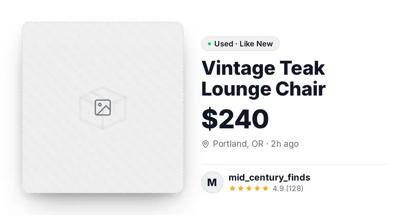
A peer-to-peer marketplace listing card: an item photo, the title and a big price, a condition pill, a location and posted-time line, and a seller row with a round avatar, name, and star rating.
Mobile App
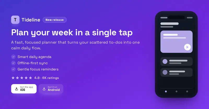
A brand-neutral mobile-app store hero: a product lockup and badge over a value headline, subtitle, up to three feature lines, a star rating and two generic download pills, with a phone mockup on the right. The lockup shows your uploaded icon/logo, or a letter-mark fallback.
Onboarding
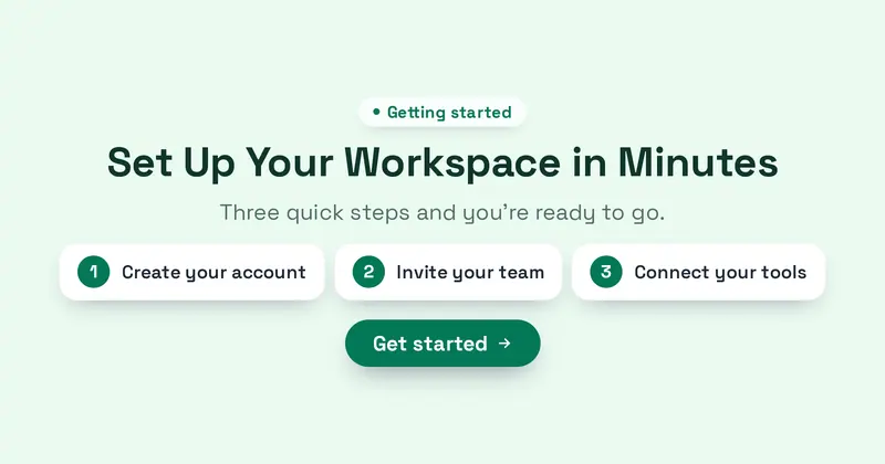
A clean onboarding card: an eyebrow chip, a friendly headline, a subtitle, three numbered step chips, and a get-started CTA on a soft pastel background.

Pricing Table
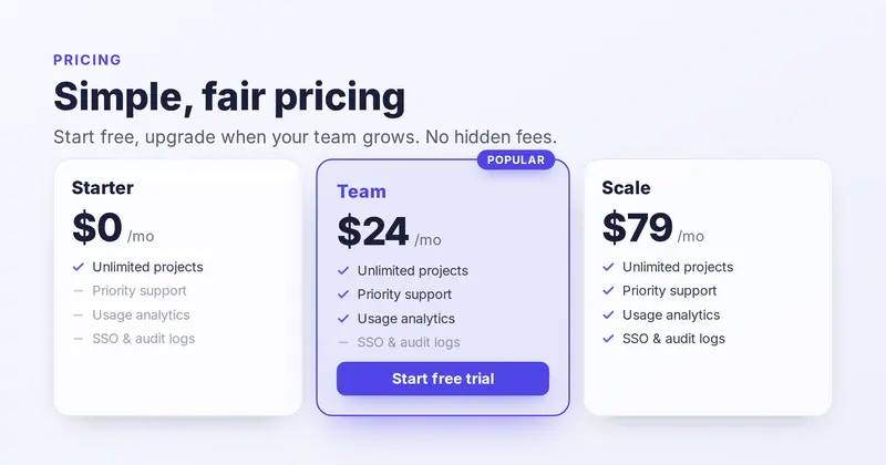
A multi-tier SaaS pricing table: an eyebrow, title and subtitle above a row of up to three plan columns (name, big price + period, and a feature checklist whose per-feature check/dash is derived from each plan's y/n inclusion mask over the master feature list), with the named plan highlighted by an accent border, a Popular ribbon and a CTA pill.
Product Card
An e-commerce product card: brand eyebrow, product name, a prominent price, a note and an optional badge beside a clean product photo with a soft shadow.
Product Deal
A price-drop deal card: a deal badge, brand eyebrow, product name, a struck-through was-price beside a big accent now-price, a percent-off badge, an urgency line and an optional product photo with a soft shadow.
Product Launch
A launch announcement with a 'New' badge, bold title, subtitle, CTA chip, and an optional product image.
Product Review
A square-first physical-product card: a bestseller badge, product photo, name, a now/was price, a star rating with review count, a checkmark feature list, and a brand logo in the bottom-left.
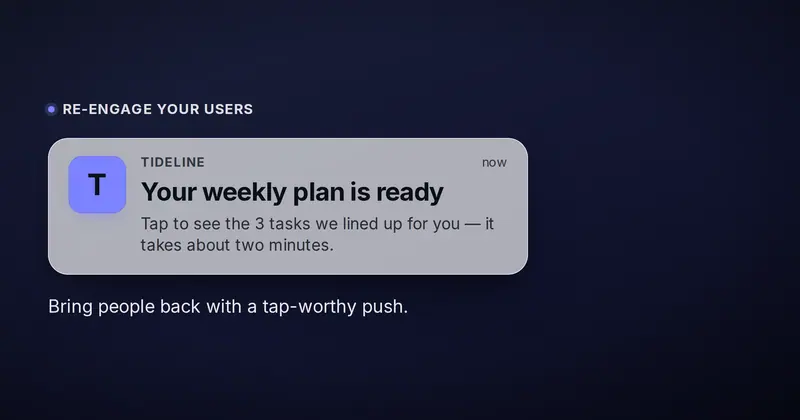
Push Notification
A realistic lock-screen push-notification banner floating on a soft wallpaper — app icon, app name and time header, a bold notification title and 1-2 line body, with a marketing eyebrow and caption around it.
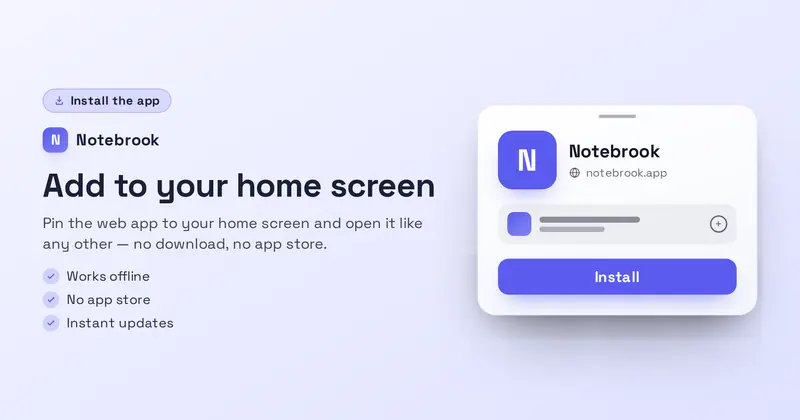
PWA Install
A web-app install card: an 'Install the app' badge, a product lockup, a value headline, a subtitle and up to three feature lines on the left, with a drawn browser install prompt (app icon, name, url and Install button) on the right.
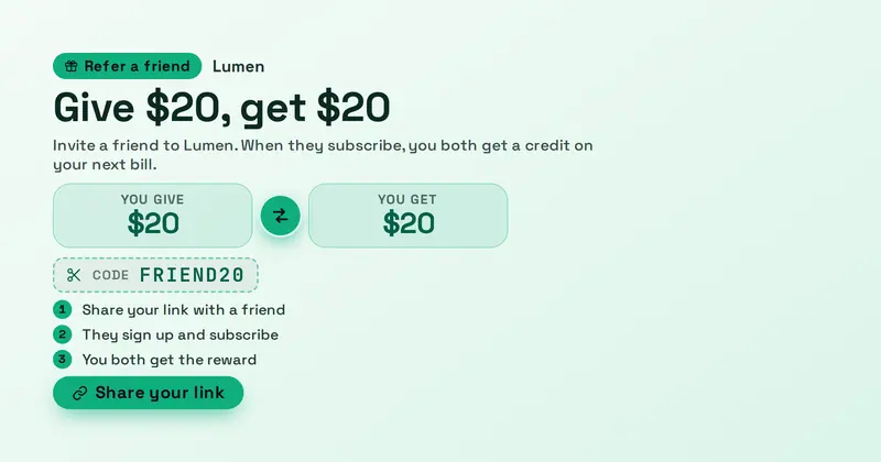
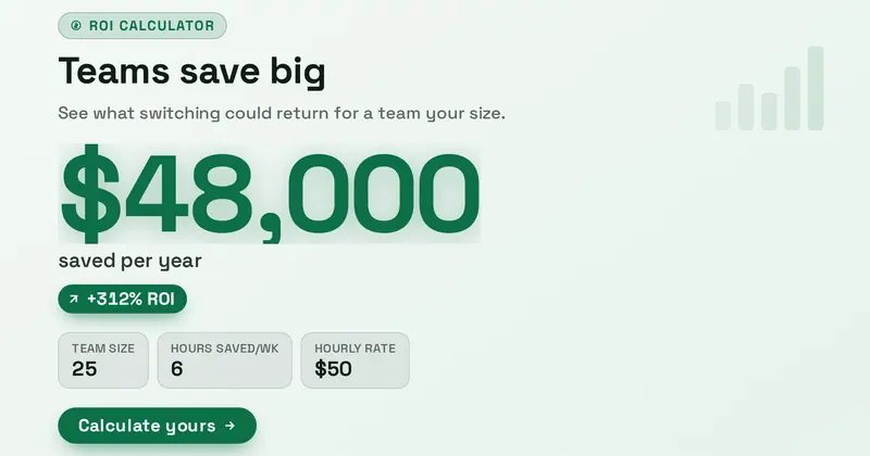
ROI Result
An ROI / savings-result share card whose hero is a giant accent figure with a caption, an optional positive delta chip, and a list of input assumptions framing the math.
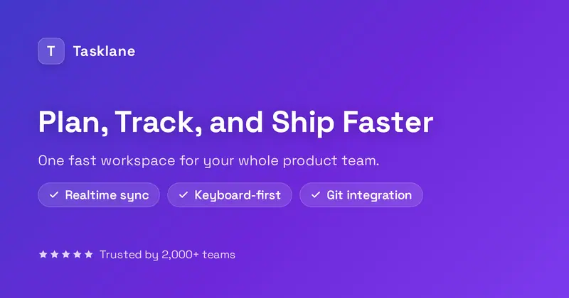
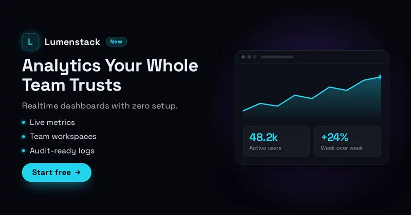
SaaS Dark
A sleek dark SaaS hero: a product lockup with an app icon (your uploaded icon/logo, or a letter-mark fallback) and a New badge, a bold value headline, a subtitle, a feature dot-list, and a Start CTA, beside a drawn dashboard widget (a mini area chart + two KPI tiles).
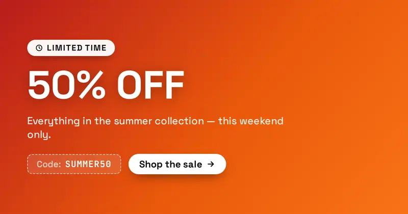
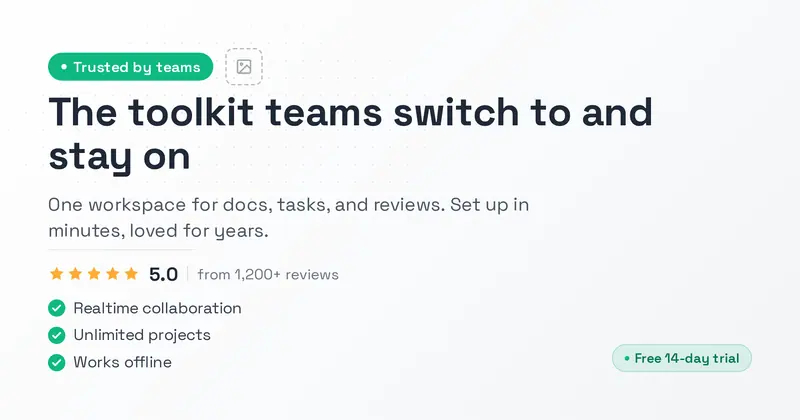
Social Proof
A clean light-mode SaaS marketing card with a status badge, logo, big dark headline, rating stars, and a green-check feature checklist that signals trust and social proof.
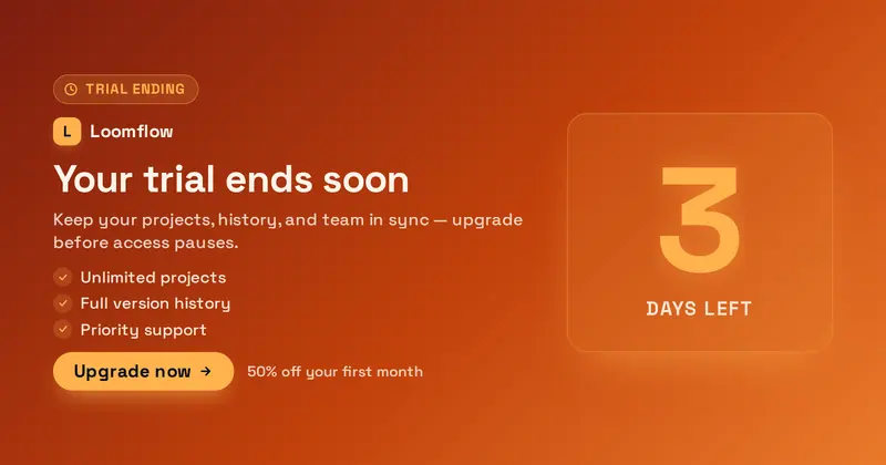
Trial Ending
A friendly trial-ending upgrade nudge: a huge days-left figure (derived from the value), a product lockup (your uploaded icon/logo, or a letter-mark fallback), a reminder title and subtitle, a short perks list of what upgrading keeps, an Upgrade pill, and an offer detail line.