The best OG image templates for SaaS launches
You spent weeks polishing the product. Then someone shares the launch link in a Slack channel, on X, or in a LinkedIn post, and the preview is a blank gray box or a tiny logo on white. That unfurled image is the first thing most people see, and on launch day it is doing a disproportionate amount of your marketing. This guide covers what makes a launch OG image actually work, then walks through the four FreeOGImage template styles best suited to a SaaS launch and when to reach for each.
What makes a great launch OG image
A launch image is a thumbnail that has to land in a crowded feed, often at phone size. Four things separate the ones that get clicked from the ones that get scrolled past.
- One message. Pick a single idea: the product name, the headline benefit, or "now live." Cramming three taglines and a feature list into 1200x630 reads as noise. If a viewer cannot get the point in one second, you have lost.
- Clarity at thumbnail size. Your image will be shown small, in a busy timeline, on a phone screen. Use big, heavy type. If the headline is not legible when the image is 300px wide, rewrite it shorter or size it up.
- Brand, but lightly. A logo in a corner, your accent color, and your typographic style are enough to make the image unmistakably yours. You do not need to repeat your full brand kit.
- Contrast. High contrast between text and background is what makes a preview readable in the feed. Dark text on a light field or light text on a deep gradient both work; mid-tone on mid-tone does not.
Two structural rules apply on every platform. Keep important content centered, treating the outer ~10% as a danger zone that may get cropped, and design for the 1200x630 (1.91:1) default that Facebook, LinkedIn, Slack, Discord, and most link unfurlers expect. FreeOGImage exports at 2x, so a 1200x630 design comes out crisp at 2400x1260 on retina screens.
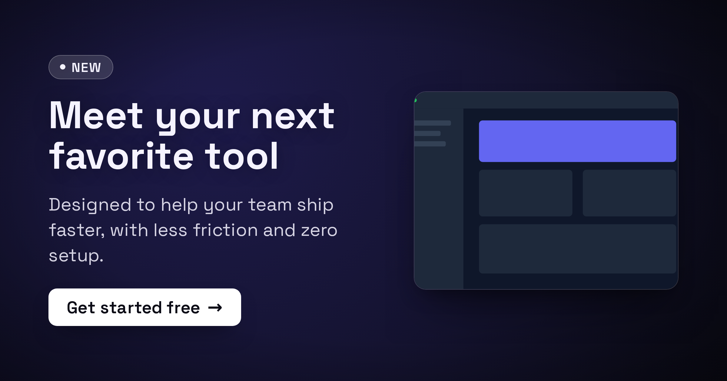
Product Launch — the default choice
The product-launch template is built for exactly this moment. It pairs a "New" badge, a bold title, a subtitle, a CTA chip, and an optional product image, so the layout already says "something just shipped" before anyone reads a word.
Use it when you have a clear launch headline and want the announcement to read instantly. The badge does the "this is news" work, the title carries your one message, and the CTA chip ("Try it free", "Get early access") nudges the click. Its Spotlight, Split, and Centered Hero presets give you a hero-image layout, a side-by-side, or pure centered type depending on whether you want to feature a screenshot.
This is the safest starting point for a SaaS launch. Start here unless you have a reason to go more atmospheric or more screenshot-forward.
Gradient Mesh — atmosphere and bold type
When the star of the show is the message itself rather than a screenshot, reach for the gradient mesh template. Soft multi-color mesh backgrounds with big centered type feel modern and premium, and they make a short, punchy headline pop.
Use it for a teaser ("Coming June 24"), a positioning statement, or a v2 announcement where you want mood over detail. The Aurora, Sunset, Ocean, and Mono presets let you match your brand accent quickly, and the optional noise and vignette effects add depth so the gradient does not look flat. Keep the copy to a few words; mesh backgrounds reward restraint and punish paragraphs.
Glassmorphism — a polished, designed feel
The glass template places a frosted translucent card over a colorful backdrop. It signals "we care about design" without much effort, which suits a developer tool, a design-adjacent product, or any launch where craft is part of the pitch.
The Frosted Light, Frosted Dark, and Neon Glass presets cover everything from clean SaaS to a more vibrant, energetic look. The card gives your title a clear, high-contrast surface to sit on even over a busy background, so readability stays strong. Use it when Product Launch feels too plain but you still want the focus on words plus a badge rather than a full screenshot.
Device Frame — when the screenshot is the story
If your product is genuinely better shown than told, the device frame template embeds an uploaded screenshot in a browser or phone frame with depth and a caption. A real glimpse of the UI is powerful for visual products, dashboards, editors, and anything where "look how clean this is" is the pitch.
Its Browser Light, Browser Dark, Phone, and Floating presets let you frame a desktop app, a mobile view, or a floating hero shot. One caution for launch day: a full UI screenshot can get cluttered at thumbnail size, so crop to the single most impressive view and keep the caption to a few words. Let the frame and a short title carry it.
Which one should you pick?
- Have a clear announcement headline? Start with product-launch.
- Want mood and a short punchy line? Use gradient-mesh.
- Want a designed, premium feel without a screenshot? Use glass.
- Is the UI the selling point? Use device-frame.
Whichever you choose, wire it up the same way: export the PNG, host it at a public HTTPS URL, and point og:image at that absolute URL (relative paths are the most common reason previews show up blank). Keep the file under 5 MB and use PNG for crisp text or JPG for photographic backgrounds.
<meta property="og:image" content="https://example.com/og/launch.png" />
<meta property="og:image:width" content="1200" />
<meta property="og:image:height" content="630" />
<meta name="twitter:card" content="summary_large_image" />
Everything runs in your browser: no signup, no watermark, and nothing you make is uploaded anywhere. Browse every layout on the templates page, or read more guides on the blog.
Launch day moves fast. Open the editor and ship a share preview people actually click.
Make your own with the Product Launch template — free, private, no signup.
Open the editor