Developer template
Build Status Open Graph image template
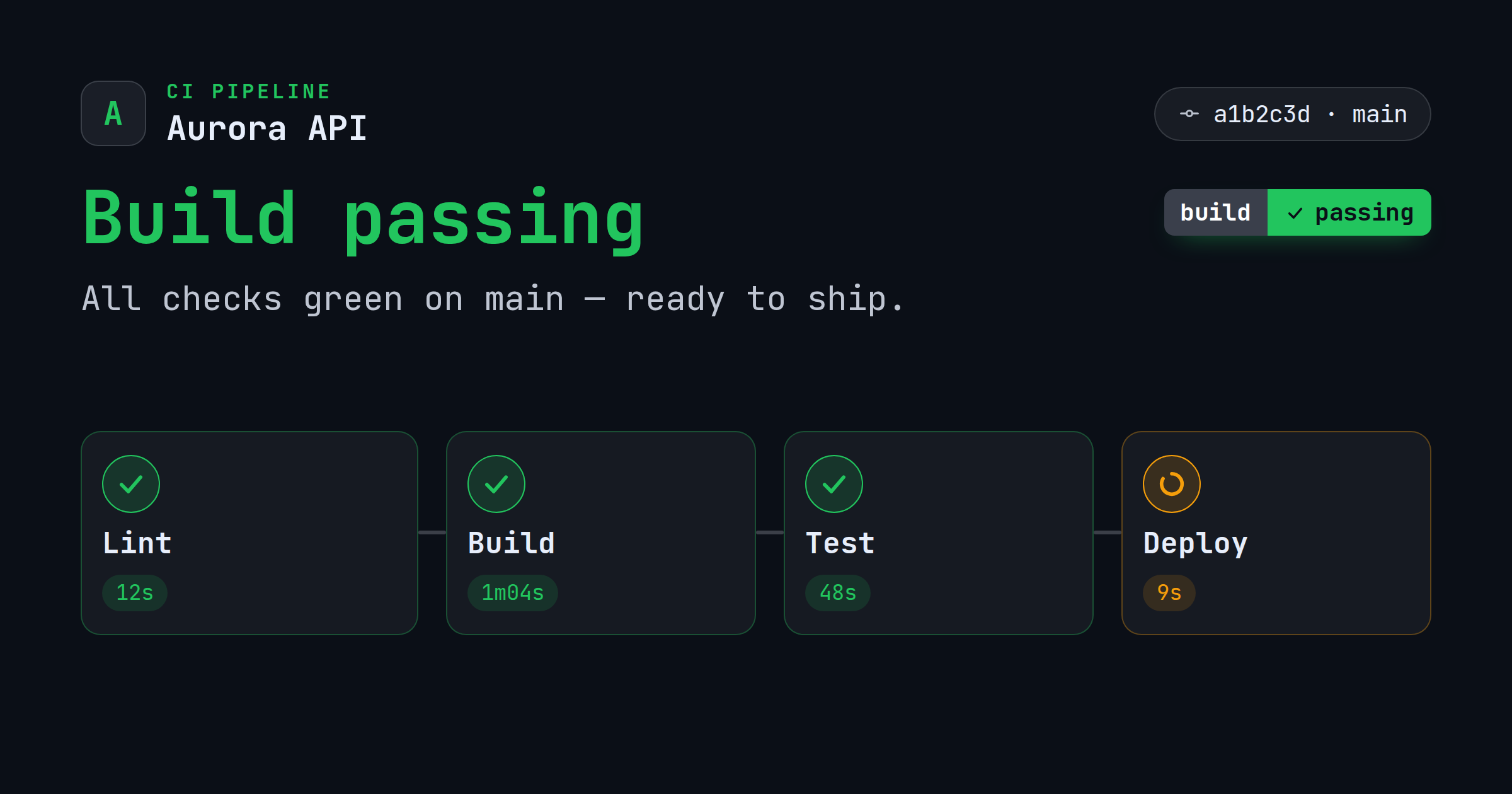
A CI build-status card: a product lockup with a 'CI Pipeline' eyebrow and a commit · branch line (your uploaded icon/logo, or a letter-mark fallback), a bold title and a shields-style build badge whose color is derived from the overall state, and a row of pipeline stage nodes each with a state-colored icon and duration.
It's built for the standard 1200×630 (1.91:1) share card and exports at 2× (2400×1260) for high-DPI screens. Customize the text, colors, fonts, and logo in your browser, then download a PNG — free, no signup, nothing uploaded.
3 ready-made presets
Each preset is a one-click starting look for the Build Status template — a different color and type combination you can still fully edit.
What you can edit
The Build Status template has 9 editable content fields. Recommended lengths keep your copy inside the safe area so nothing clips when the card is cropped.
| Field | Type | Max length | Example |
|---|---|---|---|
| App icon | Image | — | Square icon/logo (a letter-mark is used if empty) |
| Product | Single line | 30 chars | Aurora API |
| Eyebrow | Single line | 26 chars | CI Pipeline |
| Title* | Single line | 40 chars | Build passing |
| Subtitle | Multi-line | 90 chars | All checks green on main — ready to ship. |
| Overall state (passed/failed/running) | Single line | 16 chars | passed |
| Stages (Name | state | duration per line) | Multi-line | 200 chars | Lint | passed | 12s Build | passed | 1m04s Test | passed | 48s Deploy | running | 9s |
| Commit · branch | Single line | 30 chars | a1b2c3d · main |
| Badge | Single line | 24 chars | build: passing |
* required field. Tip: keep your “Title” short and punchy — the shorter the copy, the larger and more legible it renders in the feed.
Styling you control
Beyond the words, the Build Status template lets you tune:
- Background color & style
- Gradient fills
- Grid & pattern overlays
- Background image
- Fonts, size & alignment
- Logo placement
- Platform size switching
- Film-grain / noise
- Vignette
When to use it
The Build Status template lives in the developer collection — developer-native cards that speak to engineers. Reach for it specifically when one of these fits:
- A CLI tool or library
- An API or docs page
- A changelog or release
- A repo, PR, or build-status card
See the full developer template collection or read OG images for developers.
More developer templates
Make your build status card now
Free, private, and 100% in your browser — no signup, no watermark, nothing uploaded.
Open in the editor