OG images for developers: the dark-terminal look
Share a repo, a CLI tool, or a "show HN"-style launch, and the link preview is the first thing a technical audience sees. A generic gradient with a centered tagline reads as marketing. A dark window with a $ prompt, monospace type, and a neon accent reads as "this was made by someone who lives in a terminal." For developer content, that signal does real work. This post covers why the dark-terminal aesthetic resonates, how to build one in a couple of minutes, and how to pair it with GitHub and launch posts.
Why the terminal look works on technical audiences
Developers spend their day in a dark editor and a shell. An OG image that mirrors that environment feels native rather than promotional, and native is exactly the vibe you want when you are asking engineers to trust your tool. Three elements carry the aesthetic:
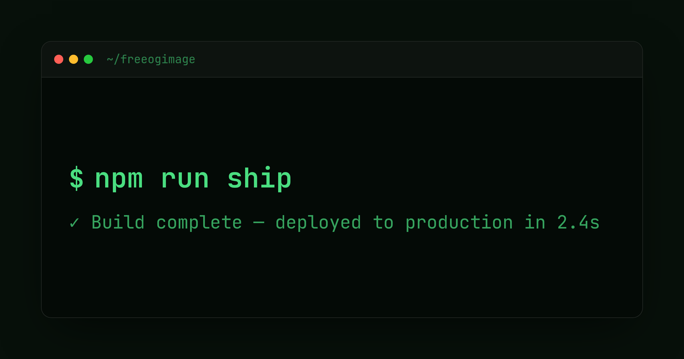
- Monospace type. A fixed-width font is the strongest single cue. It says "code" before anyone reads a word, and it makes a command like
npm i your-packagelook like something you would actually paste into a shell. - Terminal or window chrome. A title bar, the three traffic-light dots, and a prompt symbol frame your text as terminal output. That framing turns a plain headline into a command someone is running.
- A neon accent on dark. A single bright color (green, cyan, magenta) on a near-black background gives you high contrast and an unmistakable "syntax highlight" energy. Restraint matters here: one accent reads as intentional, three reads as a toy.
The deeper reason it works is honesty of register. Technical readers are quick to discount overproduced marketing. A spare, high-contrast, code-shaped image looks like it respects their time, which lowers the bar to clicking through.
How to make one
The dark-terminal template is built for exactly this. It gives you a command/title slot, an output/subtitle slot, a prompt symbol, and a logo, all inside terminal window chrome. Here is a fast path to a sharp result.
- Open the template. Start from the dark-terminal editor so the chrome and monospace defaults are already in place.
- Pick a preset. Classic Green is the canonical "terminal" look. Dracula and Nord are the popular dark-IDE palettes many developers already theme their editors with, so they feel instantly familiar. Solarized is the calmer, lower-contrast option.
- Write the command line. Put your single most important string in the command slot. For a library, that is the install command (
npm i fast-thingorpip install fastthing). For a CLI, the invocation (fast-thing build --watch). For a project, the repo name or a one-line pitch. - Use the output line as the subtitle. Treat it like real terminal output: a short result or tagline. "Done in 0.4s" or "Zero-config bundling for the edge" both work. Keep it to a few words.
- Set the prompt symbol and logo. A
$or>prompt sells the effect; drop your logo in the corner for light branding. - Choose your platform and export. The default is 1200x630 (1.91:1), which Facebook, LinkedIn, Slack, Discord, and most unfurlers expect. For an X card, switch to summary_large_image (1200x675, up to 1600x900). FreeOGImage exports at 2x, so your 1200x630 design comes out crisp at 2400x1260 on retina screens.
Two readability rules apply to every developer image. Keep the important content centered and treat the outer ~10% as a danger zone that can get cropped. And keep contrast high: bright monospace text on near-black is already ideal, so do not dim the accent in the name of subtlety.
Pairing with GitHub and launch posts
The terminal look pays off most when the surrounding context is also technical.
- GitHub social previews. A repo's social image is set in Settings to Social preview, and GitHub recommends roughly 1280x640 (an image around 1.91:1). Export your dark-terminal design at the OG default and it will sit comfortably in that ratio. When the repo gets shared on X or in a Slack channel, the install command in your preview is doing the pitch for you.
- Launch posts. For a Show HN, a Product Hunt update, or a "v1.0 is live" thread, lead with the command that gets someone started. A preview that literally shows
brew install yourtoolis more persuasive to engineers than a stylized hero shot, because it answers "how do I try this" in the thumbnail. - Release and changelog notes. Reuse the same template with the version string as the command (
yourtool@2.0.0) and the headline change as the output line. Consistent terminal previews across releases make your project recognizable in the feed.
If the pure-terminal frame is not the right fit, the pattern-grid template is the natural companion for developer content. Its Blueprint, Iso Grid, and Dotted presets give you a structured, technical backdrop with the same dark, engineered feel, but with room for a longer title and subtitle when you have more to say than a single command. Reach for it for architecture posts, docs, and conceptual pieces; reach for dark-terminal when a command is the message.
Wiring it up
However you export, the metadata is the same. Host the PNG at a public HTTPS URL and point og:image at that absolute URL. Relative paths are the most common reason a preview shows up blank. Keep the file under 5 MB and use PNG for crisp monospace text.
<meta property="og:image" content="https://example.com/og/cli-launch.png" />
<meta property="og:image:width" content="1200" />
<meta property="og:image:height" content="630" />
<meta name="twitter:card" content="summary_large_image" />
Everything runs in your browser: no signup, no watermark, and nothing you make is uploaded anywhere. Browse the rest of the layouts on the templates page, or read more guides on the blog.
Ready to ship a preview that looks like it came straight out of your shell? Open the dark-terminal editor and build one.
Make your own with the Dark Terminal template — free, private, no signup.
Open the editor