Quote and testimonial social cards, the easy way
A glowing testimonial buried in your inbox does nothing. The same words, set on a clean card with a name and an avatar, become social proof you can post anywhere. Quote cards are some of the highest-leverage images you can make: a customer already wrote the copy, you just need to frame it so it reads at thumbnail size and looks like it belongs to your brand.
This post covers how to turn quotes, testimonials, and tweets into shareable cards, the design rules that keep them legible, and a fast, repeatable workflow tied to the quote template.
What goes on a testimonial social card
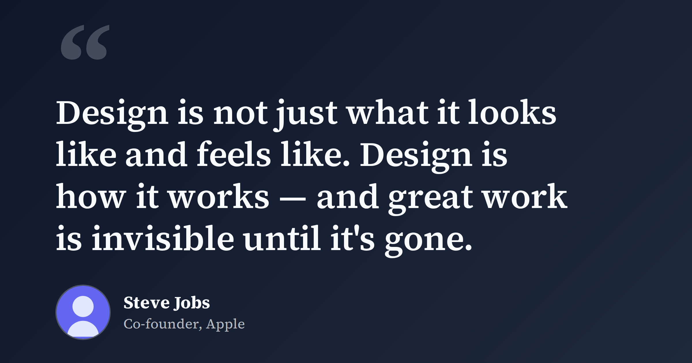
A quote card has a simple job: deliver one strong line and tell people who said it. Keep it to three parts.
- The quote. One sentence or two at most. Pull the single most convincing line from a longer review and trim everything that does not earn its place. "Cut our deploy time in half" beats a four-sentence paragraph that nobody finishes reading in a feed.
- Attribution. A real name, and ideally a role and company: "Maria Chen, CTO at Northwind." Specific attribution is what makes a testimonial believable. An anonymous quote reads like marketing; a named one reads like a person.
- An avatar or logo. A small profile photo or company mark adds a face to the words and makes the card feel human. If you do not have a photo, a company logo works fine.
That is the whole recipe. Resist adding a CTA, a second quote, a star rating, and your own logo all at once. The card is a quote, not a landing page.
Three sources, one format
The same layout handles most of what you will want to share:
- Customer testimonials. Reviews from email, your help desk, a survey, or a sales call. Always ask permission before you publish someone's words and name.
- Tweets and posts about you. When someone praises your product publicly, a typeset card is cleaner and more durable than a screenshot. Screenshots age badly, pick up compression artifacts, and break the moment the original post is deleted. A card with your colors and fonts stays sharp and on-brand, and looks like part of your feed rather than a foreign object pasted into it.
- Press and podcast lines. A sharp sentence from a review, an interview, or an article makes a great card. Attribute it to the publication or the author.
Design tips that keep it readable
Most quote cards fail for the same reason: the text is too small or too low-contrast to read in a scrolling feed. A few rules fix that.
- Legibility first. Make the quote the largest element on the card by a wide margin. If you can read it at a glance on your phone, it works; if you have to squint, cut words until the type can grow.
- High contrast. Dark text on a light background, or light text on a deep solid or subtle gradient. Avoid placing text over a busy photo or a low-contrast color pair.
- Let it breathe. Generous margins keep the words off the edges. Feeds crop differently across platforms, so treat the outer edges as a danger zone and keep the quote and attribution centered and well inside the safe area.
- A clear hierarchy. Quote big, name medium, role and company small. Three sizes is plenty. The eye should land on the quote, then drop to who said it.
- Use quotation marks as a design element. A large opening quote mark signals "this is a quote" instantly, before anyone reads a word.
- Keep attribution honest. Do not paraphrase someone into saying something they did not, and do not stitch two sentences together with an ellipsis if it changes the meaning. Trustworthy social proof is the entire point.
The quote template is built around this structure, with a prominent quote slot, an attribution line, and room for an avatar, so you fill in fields instead of fighting a layout.
A one-minute workflow
- Open the quote template. Start from the editor so the structure is already right. Set your brand colors, background, and fonts once.
- Paste and trim the quote. Drop in the testimonial and cut it down to one punchy line. Add the name, role, and company.
- Add the avatar. Everything stays on your device, so nothing you drop in is uploaded anywhere.
- Export at the right size. 1200x630 is the Open Graph default and covers Facebook, LinkedIn, Slack, and Discord. For X, summary_large_image accepts up to 1600x900 (1200x675 also works). Square 1080x1080 is handy for Instagram. FreeOGImage exports at 2x, so the design stays crisp on high-DPI screens.
- Wire it into the page if the card is the preview for a specific URL. Use an absolute URL for
og:image, and keep the file under 5 MB as a PNG or JPG.
<meta property="og:image" content="https://example.com/og/testimonial-chen.png" />
<meta property="og:image:width" content="1200" />
<meta property="og:image:height" content="630" />
<meta name="twitter:card" content="summary_large_image" />
<meta name="twitter:image" content="https://example.com/og/testimonial-chen.png" />
PNG is the better format here because quote cards are mostly text and flat color, which stay sharp without compression artifacts. A relative path is the most common reason a preview shows up blank, so use the full absolute URL.
Make it a habit
The best part of quote cards is how cheap they get once your colors and fonts are set. Each new testimonial is a couple of minutes of pasting and trimming. Keep a running list of good quotes as they come in, and post one whenever a feed needs something more convincing than another feature announcement. A steady drip of named, on-brand testimonials builds more trust than any claim you make about yourself.
Browse other layouts on the templates page or read more guides on the blog. When you have a quote worth sharing, open the quote template in the editor and make a card in a minute, no signup, no watermark, nothing uploaded.
Make your own with the Quote template — free, private, no signup.
Open the editor