open graph
OG images for directory and comparison sites
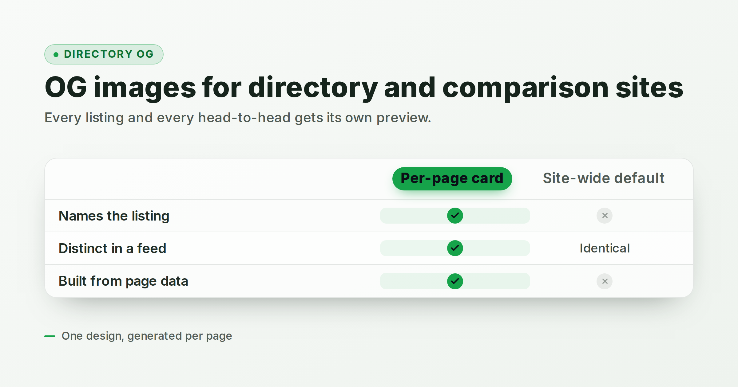
A directory is a site made almost entirely of near-identical pages. An alternatives directory like findalternative.to has a profile page per tool, a head-to-head page per pair, and a landing page per category: hundreds of URLs whose only real difference is which names they contain. That is precisely the case the usual Open Graph advice handles worst. Most guides assume you are hand-making a preview for a dozen pages, so the standard fallback for a directory is one site-wide image on everything, and a link to "Notion alternatives" unfurls as the same picture as a link to "1Password vs Bitwarden."
This post covers what a listing or comparison card actually has to say, how to build one in the editor, and how to generate the other several hundred from your own page data.
Why directory pages break the usual OG advice
Ordinary OG advice scales with effort: you have twenty important pages, so you make twenty good images. Directories invert that ratio. The page count is the product, and it grows every time you add a tool or a category. Nobody is hand-designing a card for /asana/about.
So directories tend to land on one of two defaults, and both waste the preview:
- One site-wide image on every page. Every share looks identical, which means the preview tells a reader nothing about the page they were actually sent. Worse, it makes your links look templated in a feed, which is the exact impression a comparison site does not want to give.
- No
og:imageat all. Then the platform picks something from the page, or shows a bare text stub. You have handed the most visible part of your link to a scraper's guess.
The preview is the only part of your page that travels. On a directory, it travels constantly, because listing and comparison pages are inherently shareable: people paste them into a thread precisely to settle an argument about which tool to use.
What a listing or comparison card has to say
The test is simple. Someone should be able to tell which page a link points at without reading the URL. That means the card carries the specifics, not your brand slogan:
- Profile pages need the tool name, its category, and a one-line statement of what it is. The name should be the largest thing on the card.
- Head-to-head pages need both names, visually balanced. If one side is bigger or brighter, you have accidentally editorialized before the reader has clicked. A neutral two-column layout does the work.
- Category and roundup pages need the category and some sense of scale or membership: a count, or the two or three names a reader will recognize.
- Every card benefits from one differentiator, the thing a reader wants settled: a verdict line, a price, a "free tier: yes."
Resist putting a feature matrix on the card just because the page has one. At preview size a five-by-four grid of checkmarks is grey noise. Two or three rows is the ceiling if you want it legible as a thumbnail.
Build the card once in the editor
The comparison-table template is built for this shape. It gives you an eyebrow, a headline, a subtitle, a set of product columns with the first one highlighted, feature rows, and a detail line.
- Open the template. Start from the comparison-table editor so the column grid and highlight are already in place.
- Set the columns. The
colsslot is a single line separated by middle dots:Bitwarden · 1Password. The first column is treated as yours and gets the accent highlight. Two or three columns read well at thumbnail size; four is the maximum. - Keep the rows short. The
rowsslot takes one row per line, pipe-separated:Free tier | Yes | Limited. Values render as a check, a muted cross, or verbatim text, so "Free tier", "Self-hosted", and "Starts at" carry more than a generic "Feature 1." The template caps at five rows, but three is usually the right number. - Write the headline as the page, not the site. "Bitwarden vs 1Password" beats "Compare password managers on our directory."
- Use the detail line for the verdict. One clause. It is the line a reader quotes back.
- Export at the right size. The default is 1200x630 (1.91:1), which Facebook, LinkedIn, Slack, Discord, and most unfurlers expect. For an X card, switch to summary_large_image. FreeOGImage exports at 2x, so a 1200x630 design comes out crisp at 2400x1260.
If a full matrix is more than the page needs, the comparison template is the simpler sibling: a headline over two labeled columns with a verdict pill, which suits an "us vs them" or a single head-to-head cleanly. For a "best N tools" roundup, the listicle template gives you numbered ranks instead of a grid.
Two rules apply to all of them. Keep the important content centered and treat the outer ten percent as a crop danger zone. And keep contrast high, because a comparison card is dense by nature and low-contrast type is the first thing to fail at thumbnail size. There is more on sizing in the OG image dimensions guide.
Generate one per page automatically
Designing the card is the small half of the problem. The large half is producing several hundred of them without a build step that takes an hour.
FreeOGImage exposes the same renderer behind a URL, so you can point og:image straight at it and pass your page's data as query parameters. The convenience parameters are template, preset, platform, title, description, and slot.<id> for any individual slot. Since you are generating these from page data anyway, build the URL in code and let URLSearchParams handle the encoding:
function comparisonCard({ a, b, summary, rows, verdict }) {
  const params = new URLSearchParams({
    template: "comparison-table",
    title: `${a} vs ${b}`,
    "slot.eyebrow": "COMPARE",
    "slot.cols": `${a} · ${b}`, // columns split on the middle dot
    "slot.subtitle": summary,
    "slot.rows": rows.join("\n"), // "Feature | cell | cell" per line
    "slot.detail": verdict,
  });
  return `https://freeogimage.com/api/og?${params}`;
}

const ogImage = comparisonCard({
  a: "Bitwarden",
  b: "1Password",
  summary: "Free tiers, self-hosting, and passkey support compared.",
  rows: ["Free tier | Yes | Limited", "Self-hosted | Yes | No", "Passkeys | Yes | Yes"],
  verdict: "Both have free tiers; only one self-hosts",
});
That URL returns a PNG at export resolution, ready to drop into <meta property="og:image">. Because the inputs are just your page's own fields, the function lives wherever your listing pages already render: call it in the same component that prints the <h1>, and every tool you add gets a correct card the moment its page exists. Any slot you leave out keeps the template's sample value, so pass every slot that carries real content. For designs too complex to express in query parameters, the API also accepts a full base64url config blob, and the API reference documents every template's slots, presets, and global options.
Two practical notes. The service is stateless: it renders your config and returns your image, storing and logging nothing. And if you would rather not depend on a third-party origin in production, generate the PNGs at build time instead, write them into your own static assets, and point og:image at your domain. Same renderer, same output, no runtime dependency.
Wire up the tags and test before you ship
However the image is produced, the metadata rules are unchanged, and the single most common reason a directory preview breaks is a relative image URL. og:image must be an absolute https:// URL.
<meta property="og:title" content="Bitwarden vs 1Password" />
<meta property="og:image" content="https://example.com/og/bitwarden-vs-1password.png" />
<meta property="og:image:width" content="1200" />
<meta property="og:image:height" content="630" />
<meta name="twitter:card" content="summary_large_image" />
Because your pages are generated from a template, a mistake in the metadata is a mistake on every page at once. That cuts both ways: it is worth testing exactly one representative page of each type before you ship the set. Paste the head markup into the OG image checker to see the card rendered for each platform and get a validation report, or build the tags from scratch with the meta tag generator. The pre-publish testing guide walks through the full workflow, including re-scraping platform caches after a fix.
Check a profile page, a head-to-head page, and a category page. Those are the three shapes your directory will actually be shared as.
Everything in the editor runs in your browser: no signup, no watermark, and nothing you design is uploaded anywhere. Browse the rest of the layouts on the templates page, or read more guides on the blog.
Ready to give every listing its own preview? Open the comparison-table editor and build the first one.
Make your own comparison table
Free, private, and 100% in your browser — no signup, no watermark, nothing uploaded.
Open the editor