Make a podcast or episode cover in 60 seconds
You just finished editing an episode. Now you need a cover image for the share link, the YouTube thumbnail, the Instagram post, and maybe the podcast feed itself, and you do not want to open Photoshop for the fourth time this week. The good news: an episode or event card is a solved layout. Title, host, date, cover art. Once you have a repeatable workflow, each new episode takes about a minute. This guide walks through that workflow using the FreeOGImage event template, then covers sizing for social versus podcast platforms and how to keep a season looking consistent.
The 60-second workflow
Episode cards all share the same anatomy, so the trick is to lock the layout once and only swap the text per episode.
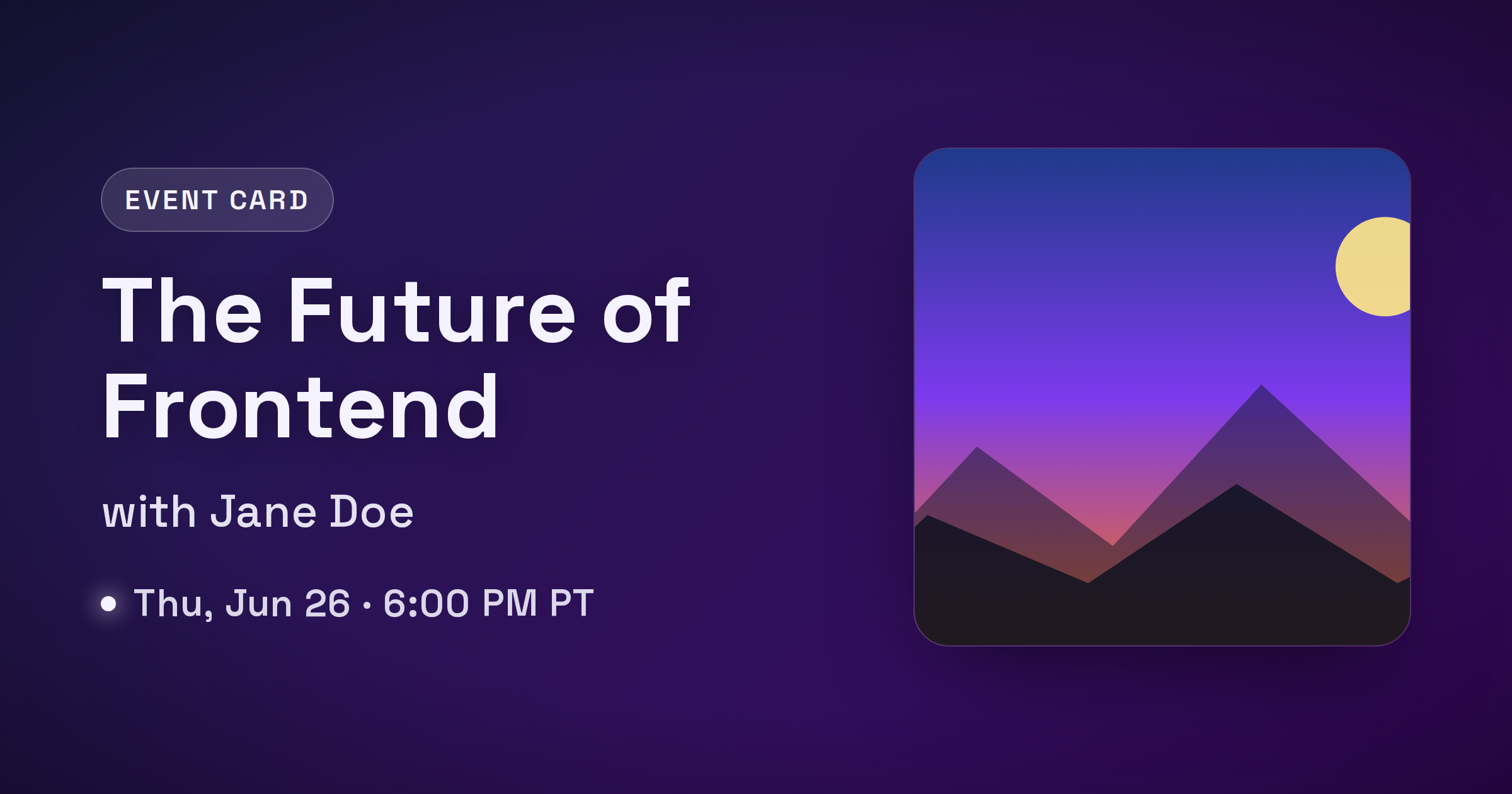
- Open the event template. Head to the event template in the editor. It has slots for a title, a host or speaker, a date or episode line, optional cover art, and a logo, which is exactly the set of fields a podcast or event card needs.
- Pick a preset as your starting point. The template ships with three: Talk, Episode, and Webinar. For a podcast episode, start with Episode (clean dark background, left-aligned bold type). For a live recording or guest event, Talk or Webinar give you a richer gradient.
- Fill the three text slots. Set the title to your episode name, the host slot to your host or guest line ("Hosted by Alex Rivera" or "with Jane Doe"), and the date slot to whatever matters most: an air date, an episode number, or a runtime like "Episode 042 - 58 min."
- Add your art and logo. Drop in your show artwork or guest headshot as the cover image, and add your show logo so the card is unmistakably yours. Everything stays in your browser, so nothing is uploaded.
- Export. Download the PNG. FreeOGImage exports at 2x, so a 1200x630 design comes out crisp at 2400x1260 on retina screens and YouTube thumbnails.
That is the whole loop. For the next episode you reopen the same design, change three lines of text and the art, and export again.
Writing the three lines
The text does more work than the art, because the card is shown small. Keep each line tight.
- Title. This is the headline. Make it the episode's hook, not its full registered name. "Building in Public: Lessons from Year One" beats "The Founder Show Episode 42 - Building in Public." Big, heavy type wins in a feed.
- Host or guest. One short line. For interviews, the guest name is usually the draw, so lead with it: "with Dr. Maya Chen."
- Date or episode. Pick the single most useful detail. For an evergreen episode, an episode number plus runtime ("Episode 042 - 58 min") helps; for a live event, a date and time ("Thu, Jun 26 - 6:00 PM PT") drives RSVPs.
If a line does not earn its place at thumbnail size, cut it.
Sizing: social cards vs podcast platforms
There are two different jobs here, and they need different files. Do not try to make one image serve both.
Social share cards (link previews). When someone shares your episode URL on Facebook, LinkedIn, Slack, Discord, or X, the unfurled preview is a wide landscape image. Use the standard Open Graph size:
- Open Graph default and Facebook: 1200x630 (1.91:1)
- LinkedIn: 1200x627
- X/Twitter
summary_large_image: up to 1600x900 (1200x675 also works)
The event template is built for this landscape format. Set the platform in the editor to export the right dimensions, keep important content centered, and treat the outer ~10% as a danger zone that may get cropped.
Podcast cover art (the feed icon). This is the square thumbnail that shows up in Apple Podcasts and Spotify, and it is governed by the directories, not Open Graph. Apple requires square artwork between 1400x1400 and 3000x3000 pixels. That is your show art, usually a single fixed image per show rather than something you regenerate per episode. If you want a per-episode square for social posts, export a 1080x1080 square version from the editor, but keep your actual feed artwork separate and within the directory specs.
The short version: landscape cards (1200x630 and friends) are for link previews and social posts, and the square 1080x1080 is for Instagram or a per-episode tile, while your real podcast feed icon stays a dedicated 1400x1400+ asset.
Keeping a season consistent
Consistency is what makes a feed of episode cards look like a brand instead of a pile of one-offs. A few habits do most of the work.
- Reuse one design. Save your finished card and reopen it per episode. Same template, same preset, same logo placement. Only the title, host, date, and art change.
- Lock the type and color. Once you choose a font weight, text color, and background, leave them. The event presets keep a fixed typographic style, so if you stick to one preset your whole season reads as a set.
- Keep the logo in the same spot. A consistent logo position is the single strongest signal that two cards belong to the same show.
- Vary only the art. Different guest photo or episode illustration, identical frame. That contrast (stable layout, changing subject) is exactly what a good series cover system looks like.
When you publish, point og:image at an absolute HTTPS URL (a relative path is the most common reason a preview shows up blank), keep the file under 5 MB, and use PNG for crisp text:
<meta property="og:image" content="https://example.com/og/episode-042.png" />
<meta property="og:image:width" content="1200" />
<meta property="og:image:height" content="630" />
<meta name="twitter:card" content="summary_large_image" />
Everything runs in your browser: no signup, no watermark, and nothing you make is uploaded anywhere. Browse the other layouts on the templates page, or read more guides on the blog.
Your next episode ships faster than your last one. Open the event template and make a cover in about a minute.
Make your own with the Event Card template — free, private, no signup.
Open the editor