Changelog and release social images that get clicks
You shipped something. You wrote the release notes. Then you dropped a bare link into a tweet, a LinkedIn post, and your team's Slack, and it unfurled as a gray box with a domain underneath. That is the most common way a good release gets ignored. A branded changelog card fixes it: a small, readable image that says the version, the headline, and what changed before anyone clicks.
This post covers why a release card earns more attention, exactly what to put on it, and a repeatable workflow so making one stops being a chore.
Why a release card beats a bare link
When you post a link without a custom image, the platform scrapes whatever og:image it can find. For most changelog and docs pages, that is nothing, a stale logo, or a screenshot that means nothing at thumbnail size. The result is a low-contrast, low-information preview in a feed that is already fighting for attention.
A purpose-built card flips that. It does three things a raw link cannot:
- It communicates before the click. People scrolling a feed read the image, not the URL. A card that says "v2.4 — Faster builds" tells them whether this release is relevant in half a second.
- It looks intentional. A consistent, branded card signals that the update is real and maintained, not an afterthought. Over time, readers start recognizing your release cards the way they recognize a logo.
- It travels well. The same image works in a tweet, a LinkedIn post, a Slack channel, a Discord announcement, and an email. One asset, every surface.
None of this requires a design team. It requires a template you can fill in fast.
What to put on a changelog card
Resist the urge to cram the whole changelog onto the image. The card is a teaser, not the document. Aim for one glanceable hierarchy:
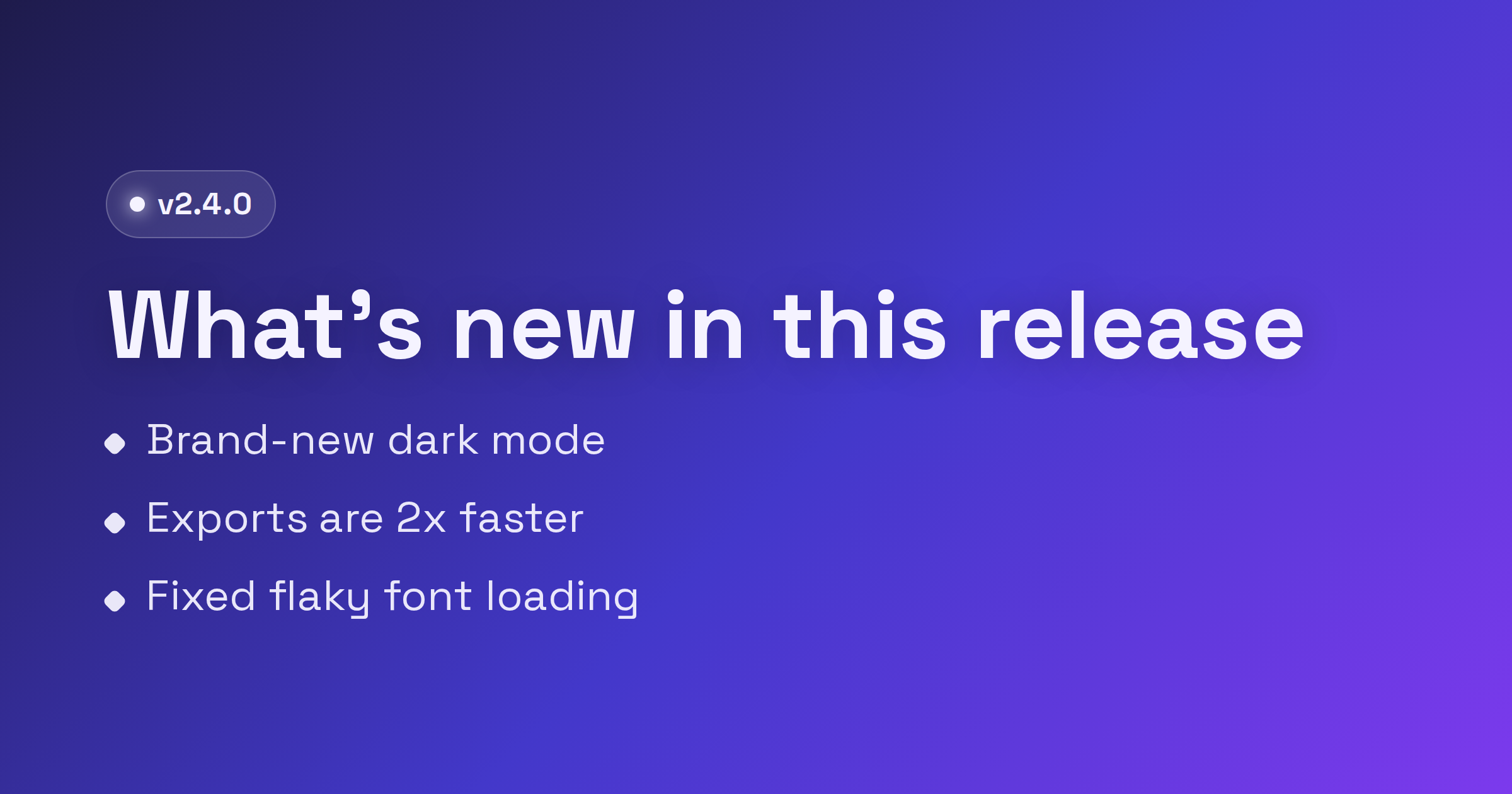
- Version number. Make it unmistakable:
v2.4,2026.6, orRelease 14. This is the anchor people scan for, so give it weight and put it where the eye lands first. - One headline. A short, plain-language summary of why this release matters. "Faster builds and a new API" beats "Q2 maintenance release." Lead with the benefit, not the ticket number.
- Two or three bullets. The highlights, not the full list. Pick the changes a reader actually cares about and phrase each as a quick win: "50% faster cold starts," "New webhook events," "Dark mode for the dashboard." Stop at three. A fourth bullet starts shrinking the type and burying the message.
A few things to leave off the image: long paragraphs, every bug fix, internal codenames, and tiny footnote text. Those belong in the linked release notes. Also keep your most important content centered. Feeds crop differently across platforms, so treat the outer edges as a danger zone and do not push the version or headline into a corner.
The changelog template is built around exactly this structure: a prominent version, a headline slot, and a tidy bullet list, so you are filling in fields rather than fighting a layout.
A repeatable workflow
The goal is to make the card a five-minute step in your release process, every time, with a consistent look. Here is a workflow that holds up:
- Open the changelog template. Start from the editor so the structure is already right. Set your brand colors, background, and logo once.
- Fill in the three slots. Drop in the version, write the one-line headline, and pick your two or three highlight bullets straight from the release notes.
- Export at the default size. 1200x630 is the Open Graph default and covers Facebook, LinkedIn, Slack, Discord, and most other unfurls. FreeOGImage exports at 2x, so your 1200x630 design comes out at 2400x1260 and stays crisp on high-DPI screens.
- Wire it into your release page. Set
og:imageto an absolute URL, with width and height tags so scrapers do not have to guess.
<meta property="og:image" content="https://example.com/og/v2-4.png" />
<meta property="og:image:width" content="1200" />
<meta property="og:image:height" content="630" />
<meta property="og:title" content="v2.4 — Faster builds and a new API" />
- Add the X card tags if Twitter traffic matters. Otherwise X falls back to your Open Graph image and you are done.
<meta name="twitter:card" content="summary_large_image" />
<meta name="twitter:image" content="https://example.com/og/v2-4.png" />
- Validate before you announce. Paste the live release URL into a platform's link debugger, or simply share it into a private Slack or Discord channel, and confirm the unfurl looks right.
Two practical notes on the file itself: use an absolute URL for og:image (a relative path is the single most common reason a preview shows up blank), and keep the file under 5 MB in PNG or JPG. PNG is the better choice here because changelog cards are mostly text, flat color, and a logo, all of which stay sharp as a PNG.
Make it a habit, not a project
The reason most teams skip the release card is that it feels like a one-off design task. The fix is to treat it like a checklist item: same template, same three slots, new version. Once your colors and logo are set, each new card is a couple of minutes of typing. Save the design in the editor and you can clone it for the next release instead of starting over.
Do that consistently and your changelog stops being a buried docs page. It becomes a stream of recognizable, clickable updates that show people you are shipping.
Browse other layouts on the templates page or read more guides on the blog. When you are ready to announce your next release, open the changelog template in the editor and ship a card in a minute, no signup, no watermark, nothing uploaded.
Make your own with the Changelog template — free, private, no signup.
Open the editor